Browse all DESIGN.md examples

Layout Principles

Browse DESIGN.md examples that explain layout principles through spacing logic, grid behavior, hierarchy, and section rhythm.

175 curated examples24 per pagePage 5 of 8

What To Look For

Study how these examples describe white space, grid logic, pacing, and layout hierarchy in a way implementation teams can actually reuse.

What To Compare

Focus on spacing rules, density control, rhythm between sections, alignment logic, and whether the layout principles feel operational instead of decorative.

Design Analysis

Common layout principles signals

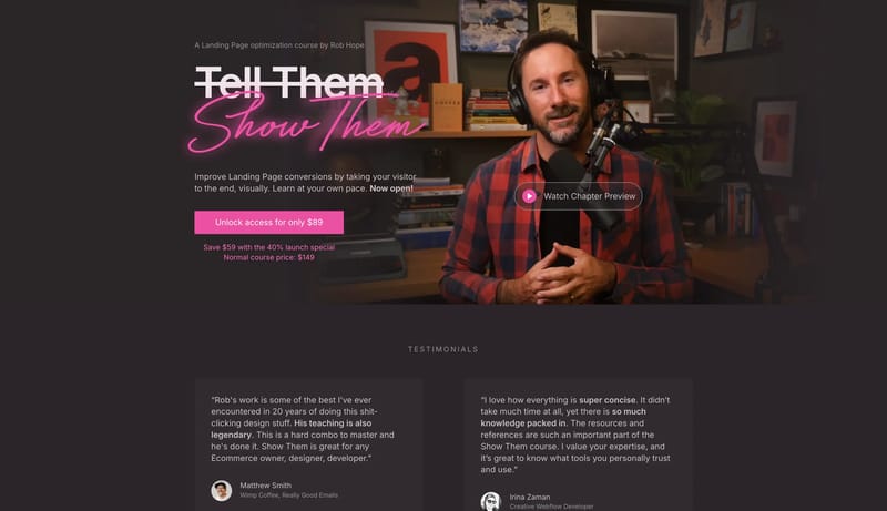
Neon Mentor Studio is a dark editorial system for selling expertise through intimacy and conviction. It should feel like a warm studio at night: documentary portraiture, smoky panels, blunt display typography, and one ha... Drafting Paper Workspace is a tactil...

Recurring System Signals

  • Primary ( EC51A2): Purchase path and handwritten neon energy.
  • Secondary ( 342D31): Proof panels and grouped dark surfaces.
  • Tertiary ( CDC0C6): Body text and warm-muted foreground.
  • Display: Blunt modern grotesk for the main informational statement.
  • Body: Same family with relaxed spacing for persuasive reading.
  • Accent: One handwritten script layer used selectively to create emotional heat.

Related Keywords

OverviewImage DirectionColorsTypographyTertiary ( CDC0C6): Body text and warm-muted foregroundBody: Plain and evenly spacedBlend operational clarity with a calm cultural atmosphereKeep the shell predominantly whiteKeep the page mostly pale and airyLayoutTertiary is a quiet taupe for muted copyTertiary is a small blue utility accent

Show Them

Home

2026-01-21

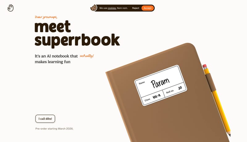
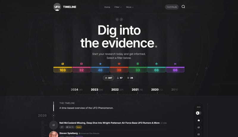
Neon Mentor Studio is a dark editorial system for selling expertise through intimacy and conviction. It should feel like a warm studio at night: documentary portraiture, smoky panels, blunt display typography, and one ha...

  • Primary ( EC51A2): Purchase path and handwritten neon energy.
  • Secondary ( 342D31): Proof panels and grouped dark surfaces.
Open example

Paper

Home

2026-01-22

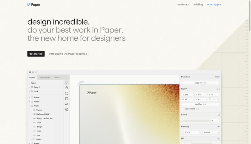
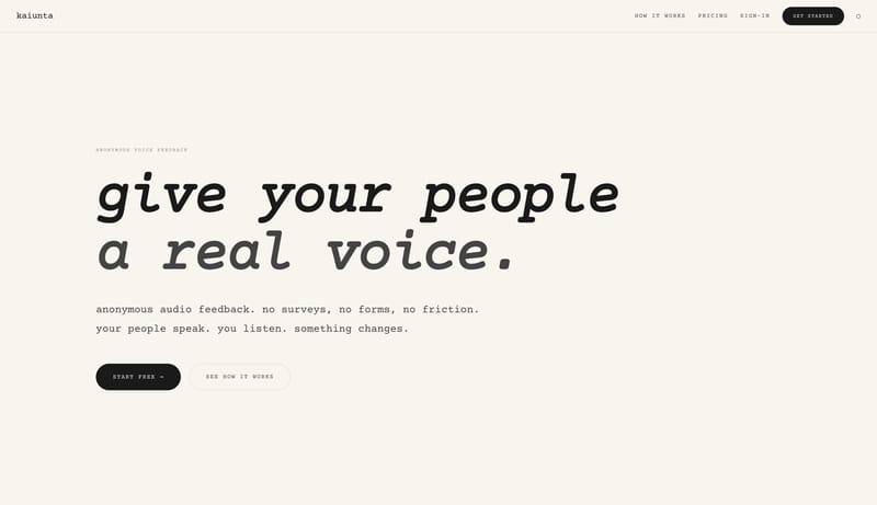
Drafting Paper Workspace is a tactile light system that feels measured, warm, and anti-generic. The page should behave like a drafting board translated into software marketing: warm paper tone, subtle texture, ruled marg...

  • Primary ( 151515): Ink text and the main CTA fill.
  • Secondary ( F0EBDD): Grouped surface and soft panel tone.
Open example

Muse

Home

2026-01-20

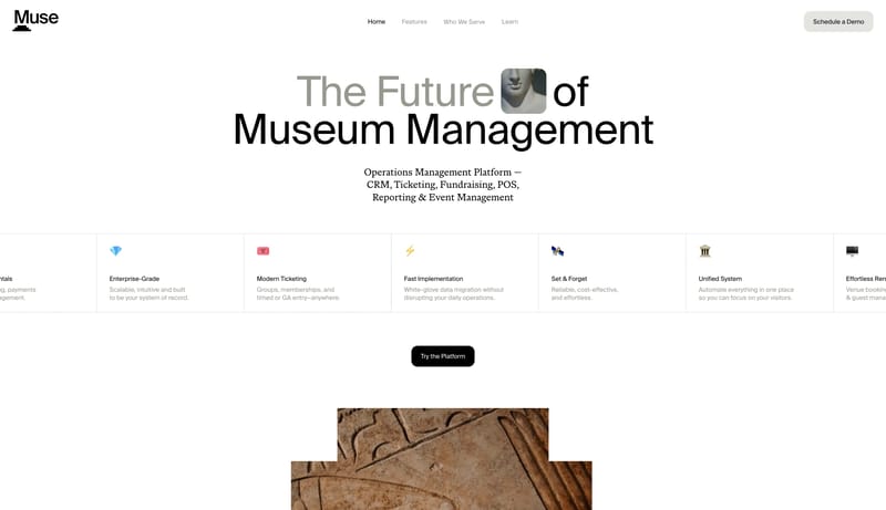
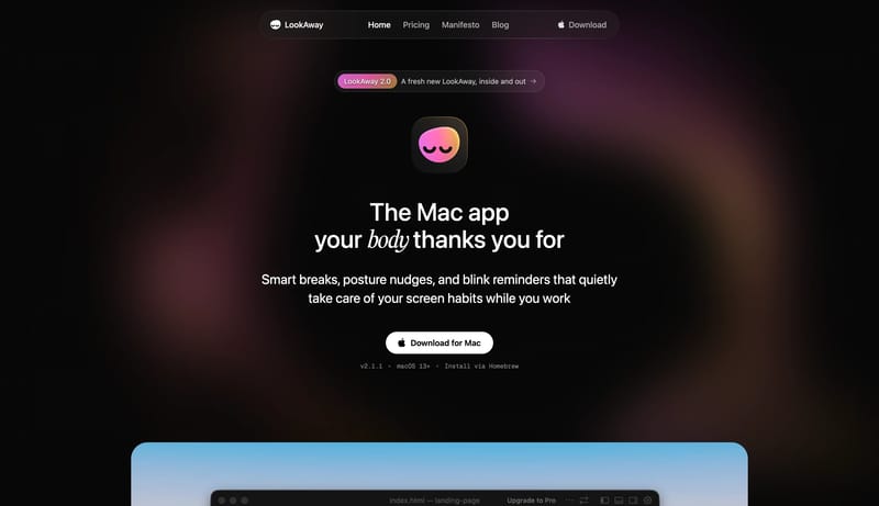
Blend operational clarity with a calm cultural atmosphere. Use giant sans word stacks and soft serif body support. Let architecture and artifact imagery provide warmth without cluttering the UI. Favor facades, galleries,...

  • Blend operational clarity with a calm cultural atmosphere.
  • Use giant sans word stacks and soft serif body support.
Open example
Continue Exploring

Use these adjacent facet and workflow pages to connect layout principles analysis with other structured design-system concerns across the site.

Layout Principles FAQ

What should I study on this page?

Study how these examples describe white space, grid logic, pacing, and layout hierarchy in a way implementation teams can actually reuse.

Why browse this as a dedicated DESIGN.md collection?

A focused collection makes it easier to compare how teams describe one system concern consistently across many examples instead of mixing unrelated signals on a single page.