Show Them

Show Them

Improve conversions by bringing your landing page visitors closer to their desired result. Launch special now live →

3.0
2
Visits
Visit

Available Pages

Version History

Design Analysis

Show Them Home design analysis

--- version: alpha name: Neon Mentor Studio description: Dark editorial course-marketing system with mauve-black surfaces, hot pink handwritten accenting, documentary studio imagery, a sharp purchase CTA, and a smoky out...

Key Takeaways

  • Primary ( EC51A2): Purchase path and handwritten neon energy.
  • Secondary ( 342D31): Proof panels and grouped dark surfaces.
  • Tertiary ( CDC0C6): Body text and warm-muted foreground.
  • Display: Blunt modern grotesk for the main informational statement.
  • Body: Same family with relaxed spacing for persuasive reading.
  • Accent: One handwritten script layer used selectively to create emotional heat.

Overview

Neon Mentor Studio is a dark editorial system for selling expertise through intimacy and conviction. It should feel like a warm studio at night: documentary portraiture, smoky panels, blunt display typography, and one handwritten pink flourish that turns the page from merely functional into something memorable.
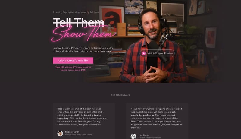
Image Direction

Use portrait-led stills, desk-studio environments, and dark proof surfaces. The imagery should feel warm, real, and close enough to suggest direct access rather than corporate distance.

Colors

The palette is dark, warm, and centered around one hot purchase accent.

  • Primary ( EC51A2): Purchase path and handwritten neon energy.
  • Secondary ( 342D31): Proof panels and grouped dark surfaces.
  • Tertiary ( CDC0C6): Body text and warm-muted foreground.

Typography

The system works by layering two voices.

  • Display: Blunt modern grotesk for the main informational statement.
  • Body: Same family with relaxed spacing for persuasive reading.
  • Accent: One handwritten script layer used selectively to create emotional heat.
SpacePlay/PauseSeek 1sShiftSeek 10s