Design Analysis
Common layout principles signals
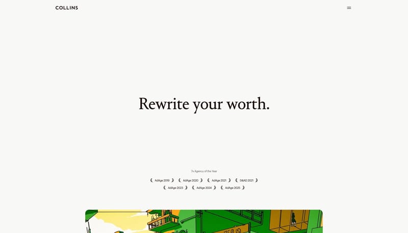
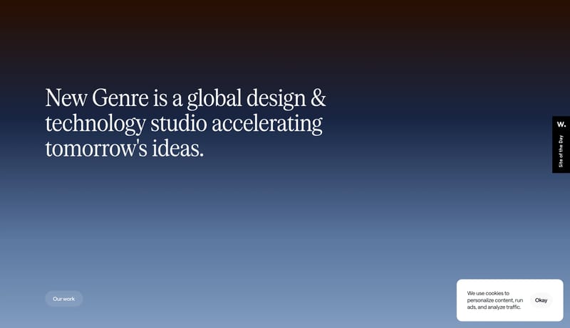
Build the experience like a gallery brochure with unusually large breathing room. Let serif headlines carry the emotional weight while the interface chrome stays almost invisible. Use the dark stage sparingly, as punctua... This design language is a high-contr...
Build the experience like a gallery brochure with unusually large breathing room. Let serif headlines carry the emotional weight while the interface chrome stays almost invisible. Use the dark stage sparingly, as punctua...
- Build the experience like a gallery brochure with unusually large breathing room.
- Let serif headlines carry the emotional weight while the interface chrome stays almost invisible.
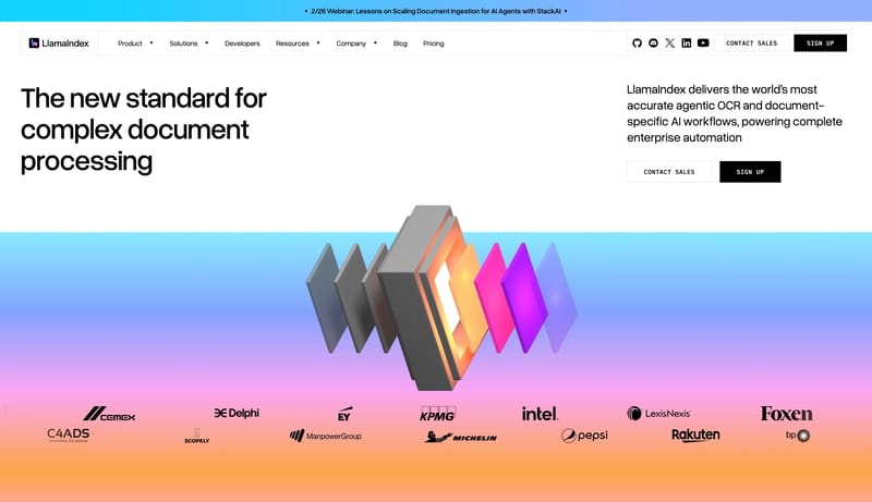
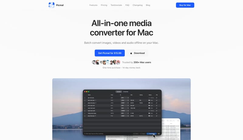
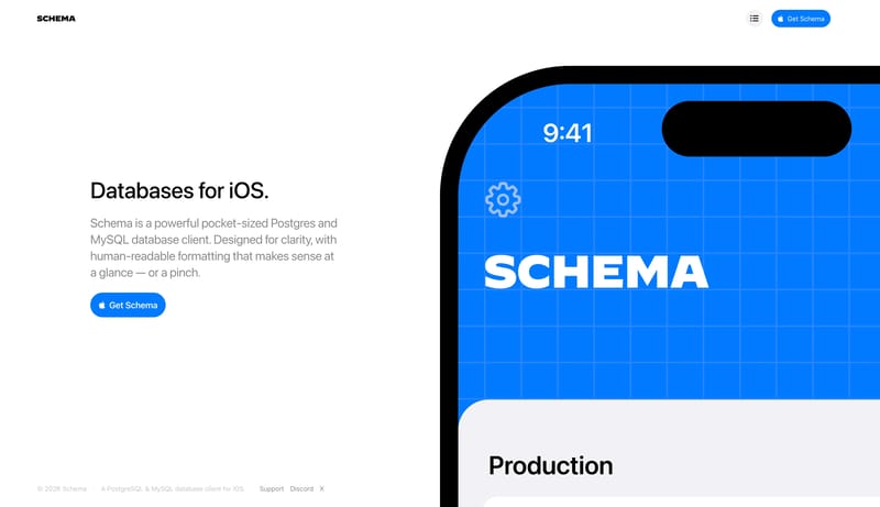
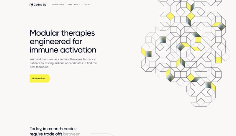
Open exampleThis design language is a high-contrast engineering system for document intelligence and agent workflows. It uses white space, hard black controls, large rounded-grotesk type, technical tables, and structured gradient ob...
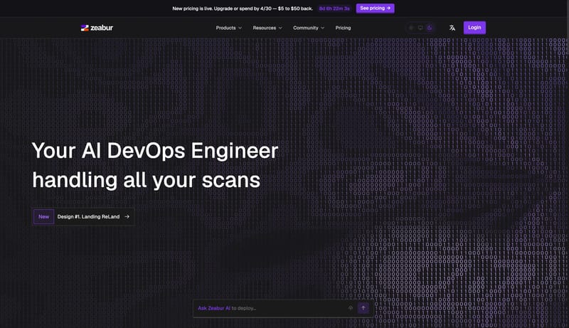
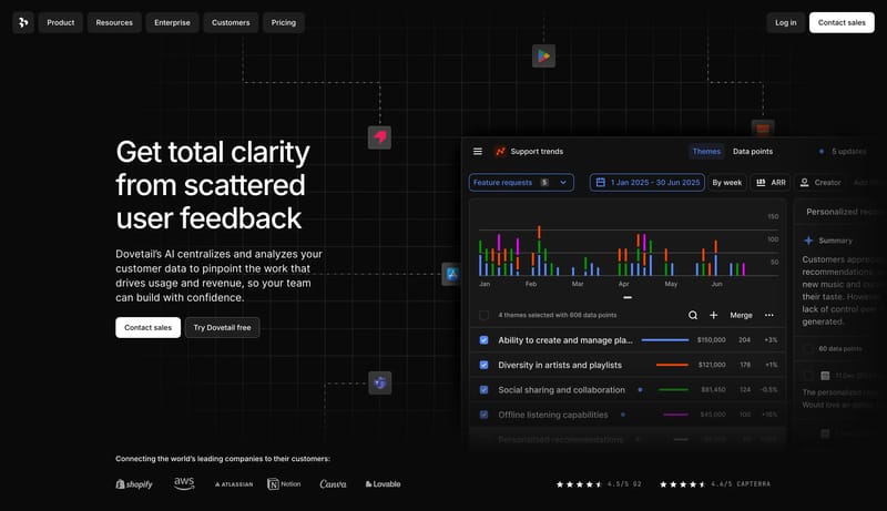
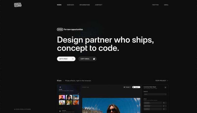
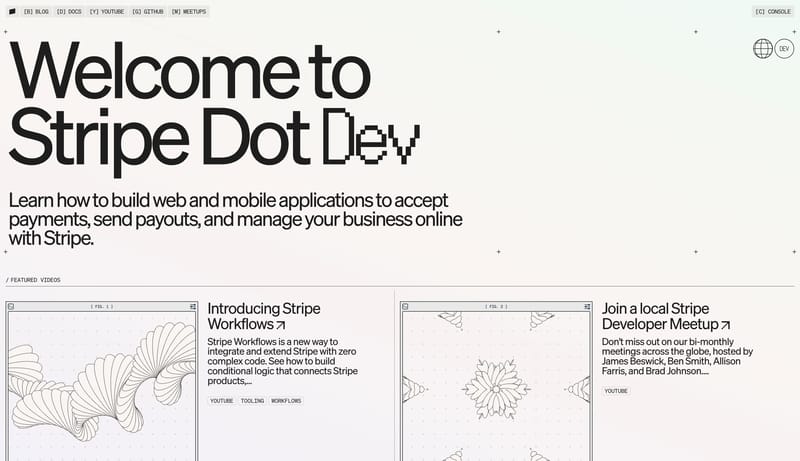
Open exampleThis design language is a dark infrastructure-console system for cloud deployment, AI tooling, and developer operations. It should feel technical, precise, and command-driven: large sparse heroes introduce the product, t...
Open example