Overview
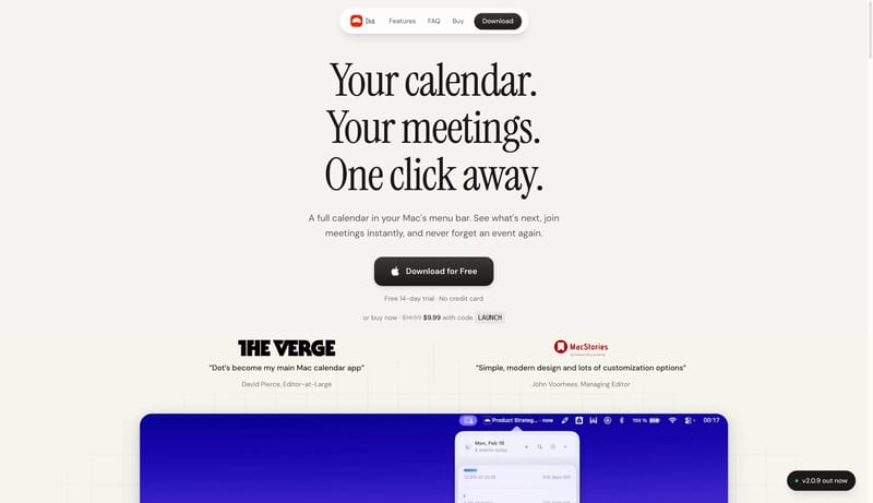
This design language presents a desktop utility as quiet, warm, and immediately understandable. The page should feel like a refined paper surface with one centered promise, a floating pill nav, a dark tactile action, and a small amount of calendar evidence. Use one product object per viewport. Calendar cards, menu-bar strips, and release pills should be compact proof points, not a crowded dashboard.