Design Analysis
Common layout principles signals
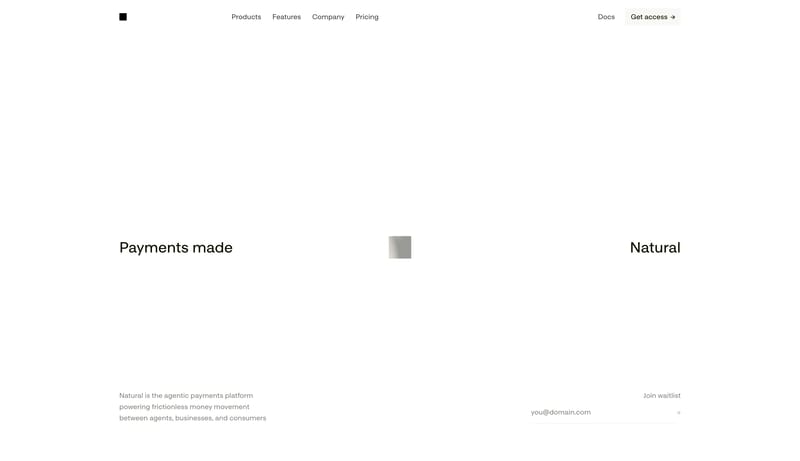
Build for a technical product that expresses confidence through restraint, not density. Let the page feel almost unfinished at first glance, but precisely so. Emptiness is part of the design language. Keep every artifact... Editorial Advisor Ledger is a high-t...
Build for a technical product that expresses confidence through restraint, not density. Let the page feel almost unfinished at first glance, but precisely so. Emptiness is part of the design language. Keep every artifact...
- Build for a technical product that expresses confidence through restraint, not density.
- Let the page feel almost unfinished at first glance, but precisely so. Emptiness is part of the design language.
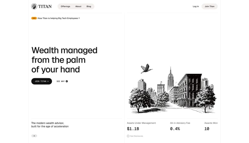
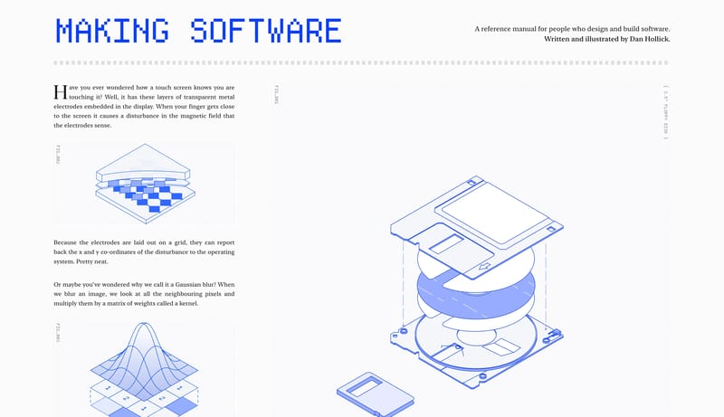
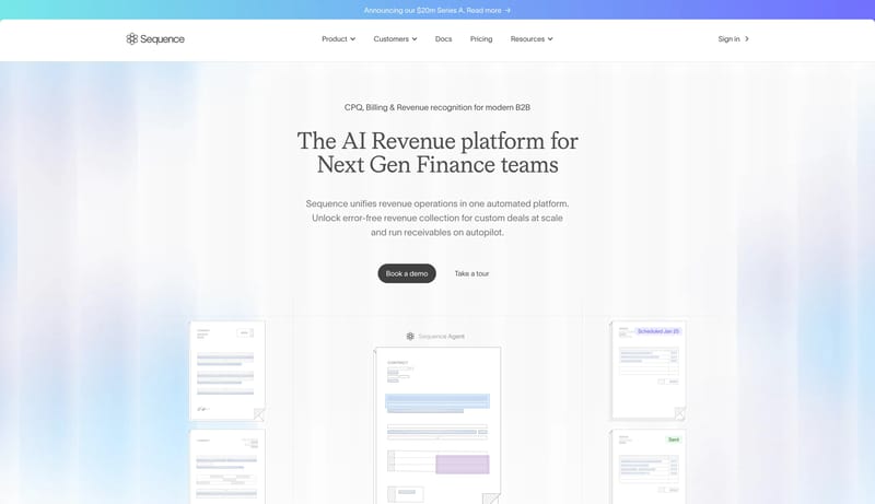
Open exampleEditorial Advisor Ledger is a high-trust financial system that feels more like a modern ledger than a fintech app. Hairline rules, warm ivory grouping, and etched monochrome illustration create an atmosphere of patience...
- Primary ( 111111): Main text and primary CTA fill.
- Secondary ( F2EEE8): Warm ivory chip grouping and subtle surface emphasis.
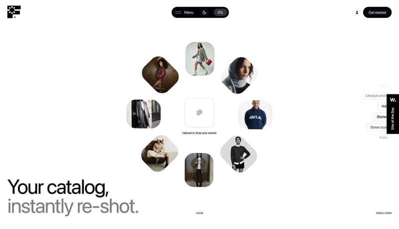
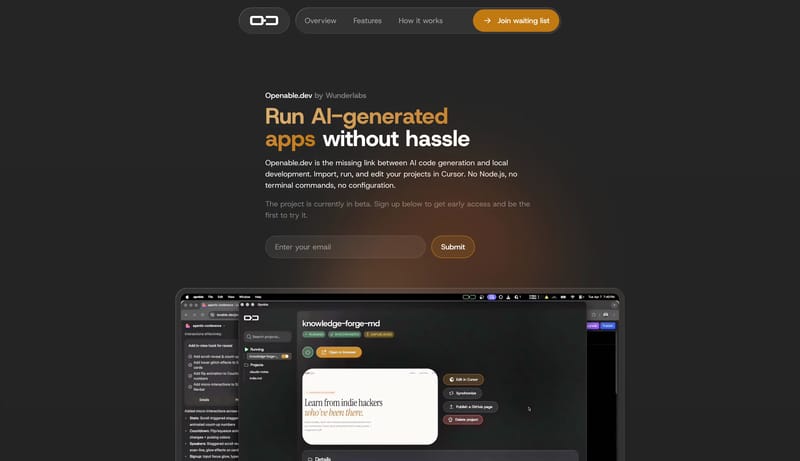
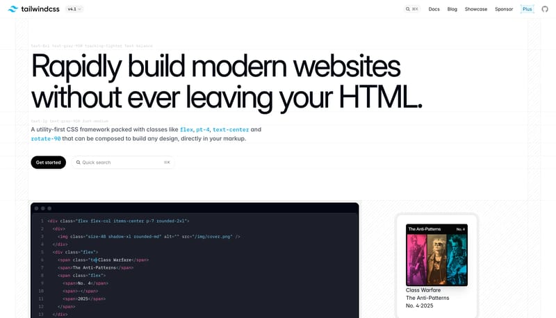
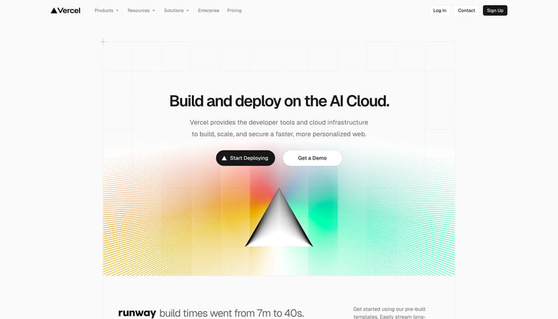
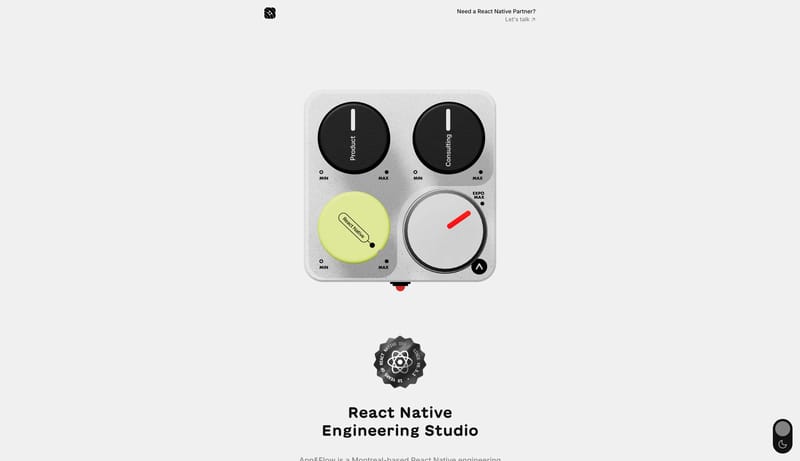
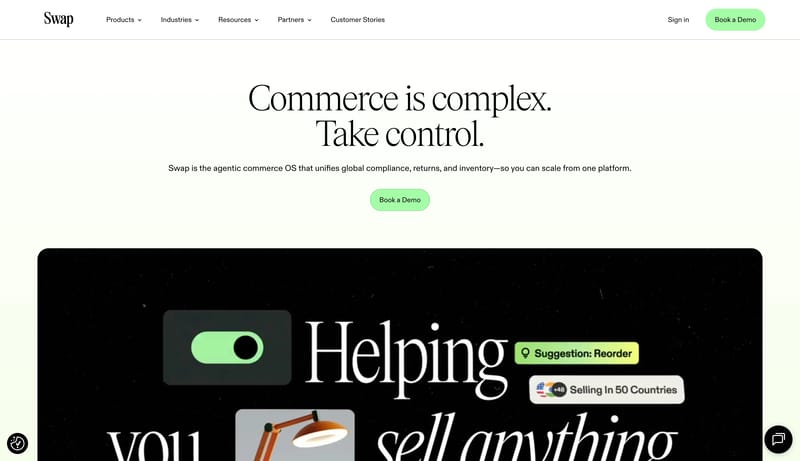
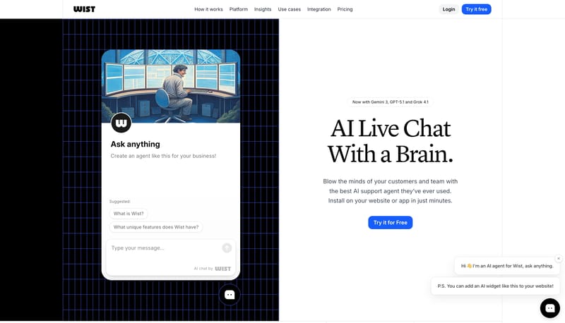
Open exampleBuild a technical product shell with one clear signal accent and a disciplined content hierarchy. Let the product frame, proof panels, or code-adjacent motifs carry credibility instead of decorative gradients. Use motion...
- Build a technical product shell with one clear signal accent and a disciplined content hierarchy.
- Let the product frame, proof panels, or code-adjacent motifs carry credibility instead of decorative gradients.
Open example