Browse all DESIGN.md examples

Layout Principles

Browse DESIGN.md examples that explain layout principles through spacing logic, grid behavior, hierarchy, and section rhythm.

175 curated examples24 per pagePage 7 of 8

What To Look For

Study how these examples describe white space, grid logic, pacing, and layout hierarchy in a way implementation teams can actually reuse.

What To Compare

Focus on spacing rules, density control, rhythm between sections, alignment logic, and whether the layout principles feel operational instead of decorative.

Design Analysis

Common layout principles signals

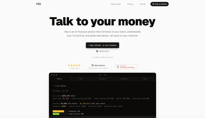
Build for a product that wants to sound useful, local, and technically honest. Keep the page stripped down. Big typography and product proof should do almost all the work. Avoid the usual glossy fintech tone. This system... Build for a wellness product that wa...

Recurring System Signals

  • Build for a product that wants to sound useful, local, and technically honest.
  • Keep the page stripped down. Big typography and product proof should do almost all the work.
  • Avoid the usual glossy fintech tone. This system should feel closer to a good CLI tool than to a finance lifestyle brand.
  • Use dark terminal or app windows as the main visual proof.
  • Support them with simple light cards and plain documentation layouts.
  • Keep color bursts small and data-driven, mostly inside the product frame.

Related Keywords

OverviewImage DirectionColorsTypographyPrimary ( 444444): Main text and structural inkKeep all visible type mono and pixel-drivenPrimary ( 002B31): the main authority-setting stageSecondary ( F6F7F4): light surface and high-legibility textDisplay: very large, low-drama weight, and tightly trackedBody: precise and calm, never salesyLabels: compact and neutral, supporting navigation and metadataLayout

Ray

Home

2026-04-30

Build for a product that wants to sound useful, local, and technically honest. Keep the page stripped down. Big typography and product proof should do almost all the work. Avoid the usual glossy fintech tone. This system...

  • Build for a product that wants to sound useful, local, and technically honest.
  • Keep the page stripped down. Big typography and product proof should do almost all the work.
Open example

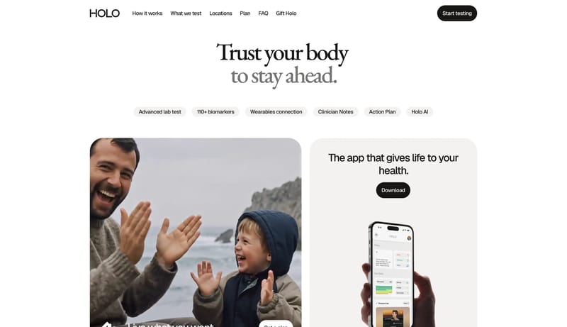
Holo

Home

2026-03-31

Build for a wellness product that wants to feel trustworthy, modern, and unrushed. Let the hero feel editorial rather than app-store promotional. One large serif statement should do most of the emotional work. Keep the s...

  • Build for a wellness product that wants to feel trustworthy, modern, and unrushed.
  • Let the hero feel editorial rather than app-store promotional. One large serif statement should do most of the emotional work.
Open example

Backdrop

Home

2026-04-30

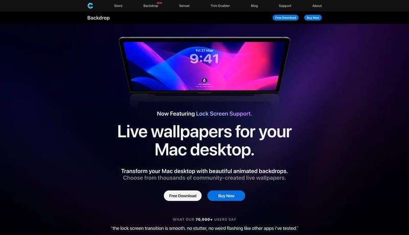
Build for a premium Mac-utility storefront with strong Apple-adjacent polish. Let the first impression come from cinematic product art and large dark product banners. Keep the voice direct and product-centered rather tha...

  • Build for a premium Mac-utility storefront with strong Apple-adjacent polish.
  • Let the first impression come from cinematic product art and large dark product banners.
Open example

Continue Exploring

Use these adjacent facet and workflow pages to connect layout principles analysis with other structured design-system concerns across the site.

Layout Principles FAQ

What should I study on this page?

Study how these examples describe white space, grid logic, pacing, and layout hierarchy in a way implementation teams can actually reuse.

Why browse this as a dedicated DESIGN.md collection?

A focused collection makes it easier to compare how teams describe one system concern consistently across many examples instead of mixing unrelated signals on a single page.