Overview
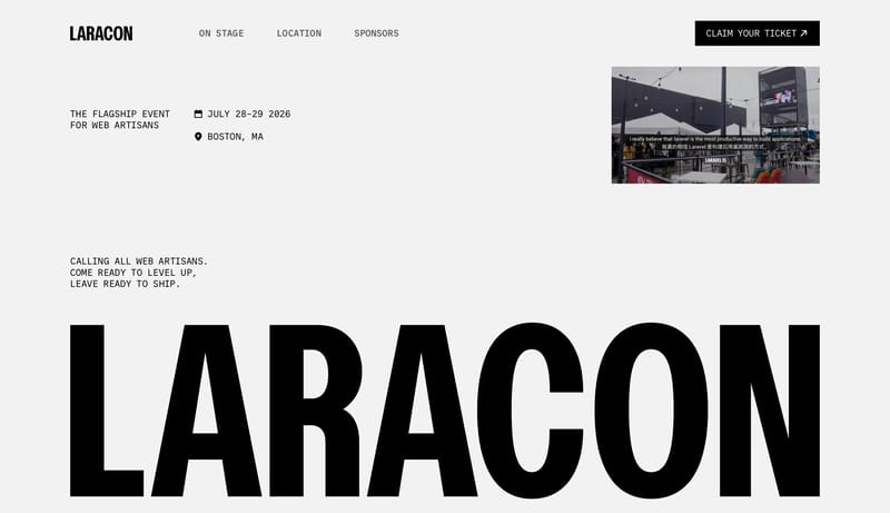
Design event pages like a typographic poster first and a website second. The identity should come from giant black mono forms, disciplined white space, and one or two sharp accents rather than a busy conference-brand toolkit.

The flagship Laravel conference.
Design Analysis
Design event pages like a typographic poster first and a website second. The identity should come from giant black mono forms, disciplined white space, and one or two sharp accents rather than a busy conference-brand too...
Design event pages like a typographic poster first and a website second. The identity should come from giant black mono forms, disciplined white space, and one or two sharp accents rather than a busy conference-brand toolkit.
Use media as hard rectangular evidence blocks inside a predominantly typographic composition. The real image direction is the type itself: huge, black, compressed, and blunt against a white field.
Work in black and white, with vermilion as a rare strike. Use line gray only where you need a quiet separator. Avoid building secondary palette systems.
Mono is the hero voice here. Use it for poster statements, navigation, dates, and labels. A cleaner sans can support explanatory copy, but it should never compete with the mono structure.