Gleap
Home
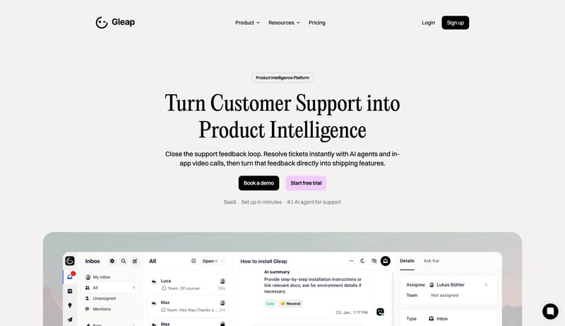
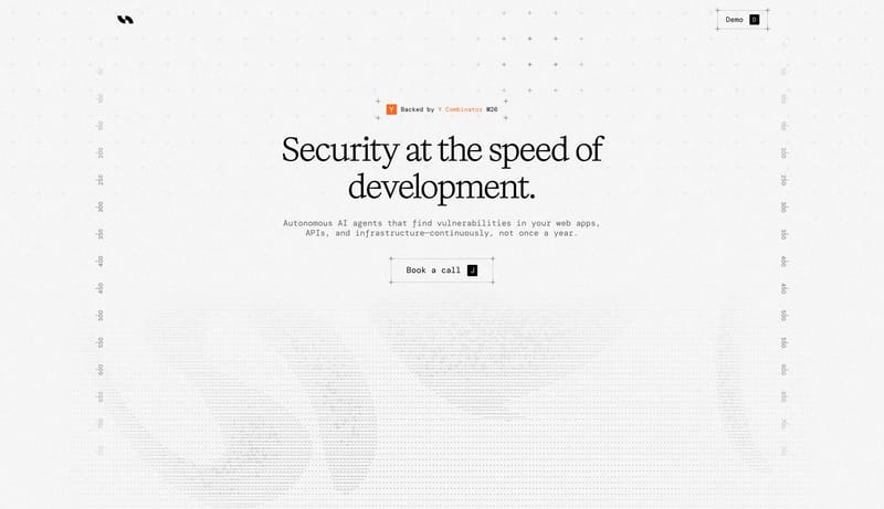
Use a white, editorial SaaS language: large serif headlines, compact black actions, pastel secondary CTAs, rounded product panels, and calm pricing cards.
Open exampleBrowse DESIGN.md examples that explain layout principles through spacing logic, grid behavior, hierarchy, and section rhythm.
What To Look For
Study how these examples describe white space, grid logic, pacing, and layout hierarchy in a way implementation teams can actually reuse.
What To Compare
Focus on spacing rules, density control, rhythm between sections, alignment logic, and whether the layout principles feel operational instead of decorative.
Design Analysis
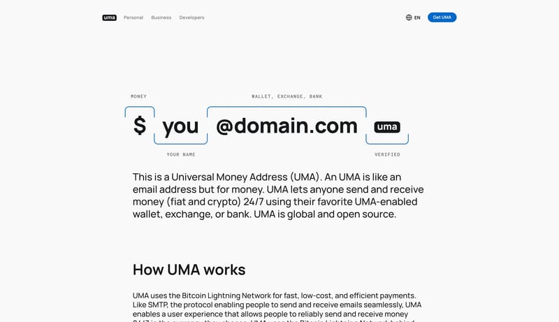
Use a white, editorial SaaS language: large serif headlines, compact black actions, pastel secondary CTAs, rounded product panels, and calm pricing cards. This design language explains a payment-address protocol through large, simple visual objects. The interf...
Gleap
Home
Use a white, editorial SaaS language: large serif headlines, compact black actions, pastel secondary CTAs, rounded product panels, and calm pricing cards.
Open exampleUniversal Money Address
Home
This design language explains a payment-address protocol through large, simple visual objects. The interface should feel open, trustworthy, and obvious: a white canvas, bold address syntax, blue verification marks, round...
Open exampleUserJot
Home
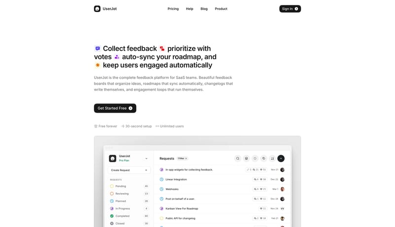
This design language is for a transparent SaaS product that proves itself by showing the actual interface. It uses a white canvas, compact black pill actions, warm orange signals, and large framed product-window previews...
Open exampleUse these adjacent facet and workflow pages to connect layout principles analysis with other structured design-system concerns across the site.
Hub
Return to the main DESIGN.md hub to scan the broader dataset and compare across multiple system concerns.
Related Hub
Branch into topic pages grouped by repeated visual signals when you want a broader inspiration lens beside this system-focused facet.
Adjacent Facet
Examples where type scale, display choices, and reading hierarchy are described clearly enough to guide implementation.
Adjacent Facet
Collections focused on palette logic, semantic tokens, contrast handling, and accent usage.
Adjacent Facet
Examples that document reusable components, states, variants, and interaction expectations.
Workflow Collection
DESIGN.md-style references, token-driven systems, and tools for AI-readable design workflows.
Workflow Collection
References for Figma AI, Figma Make, MCP-assisted design workflows, and editable UI generation.
Study how these examples describe white space, grid logic, pacing, and layout hierarchy in a way implementation teams can actually reuse.
A focused collection makes it easier to compare how teams describe one system concern consistently across many examples instead of mixing unrelated signals on a single page.