Design Analysis
Common layout principles signals
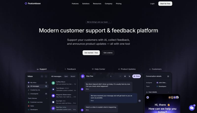
Build the experience around one centered handset and a small set of floating status cards. Let the system feel trustworthy and crystal clear rather than adventurous or noisy. Use the cobalt strip as the clearest signal o... This design language is a dark, poli...
Build the experience around one centered handset and a small set of floating status cards. Let the system feel trustworthy and crystal clear rather than adventurous or noisy. Use the cobalt strip as the clearest signal o...
- Build the experience around one centered handset and a small set of floating status cards.
- Let the system feel trustworthy and crystal clear rather than adventurous or noisy.
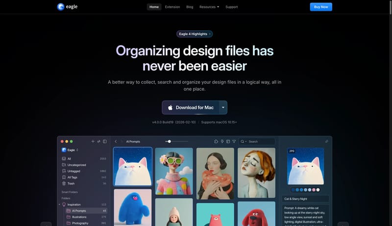
Open exampleThis design language is a dark, polished system for creative asset workflows. It should feel like a premium desktop tool: black canvas, luminous blue controls, large app-window proof, and feature cards that behave like w...
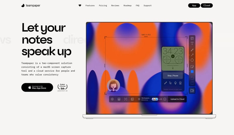
Open exampleThis design language is a sparse screen-capture workspace with giant black statements, monospaced explanatory copy, compact black navigation, and large product screenshots. The interface should feel practical and asserti...
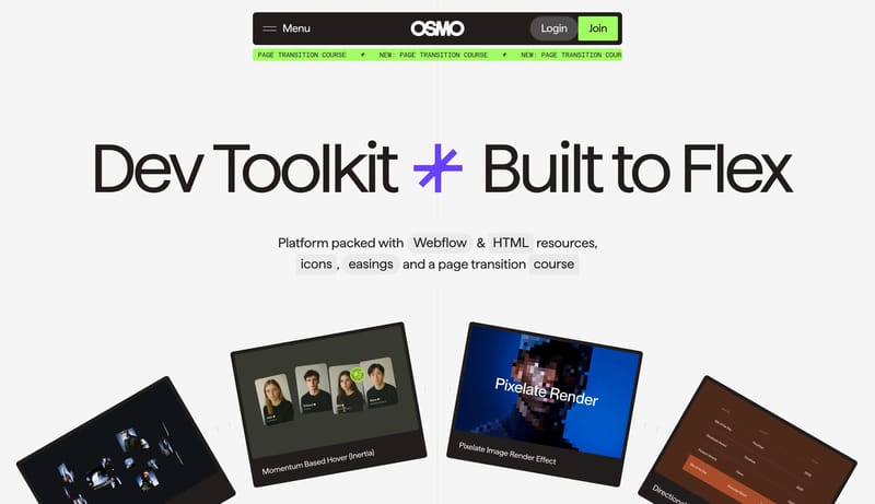
Open example