Design Analysis
Common component rules signals
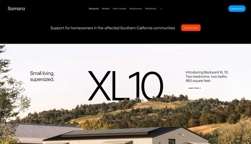
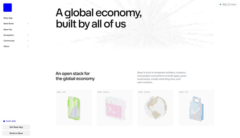
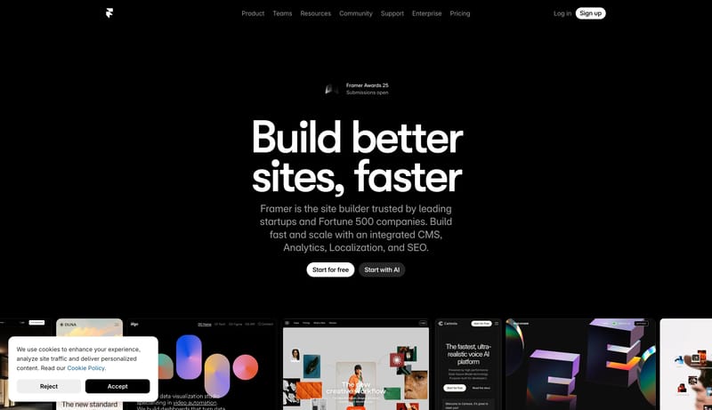
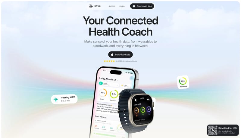
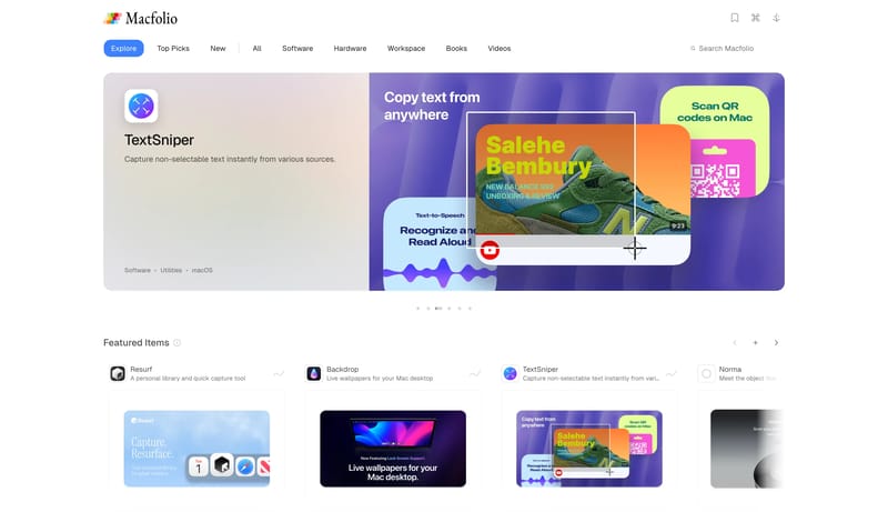
Build a property-marketing shell where imagery, place, and atmosphere do more work than interface novelty. Keep the framework premium and calm even when the brand uses bold introductory motion or color-coded navigation.... Build a property-marketing shell wher...
Recurring System Signals
- Build a property-marketing shell where imagery, place, and atmosphere do more work than interface novelty.
- Keep the framework premium and calm even when the brand uses bold introductory motion or color-coded navigation.
- Use copy blocks and CTAs to support the place narrative, not to overwhelm it.
- Favor architecture, interiors, landscapes, and lifestyle scenes with strong cropping discipline.
- Use large-format imagery or video-like hero framing before relying on UI decoration.
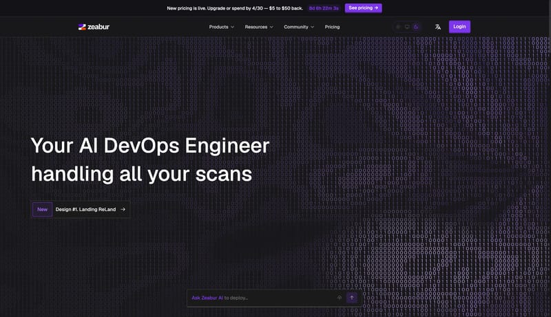
- Motion libraries detected in capture: gsap, ScrollTrigger. Treat them as sequence scaffolding rather than decoration.
Related Keywords
OverviewImage DirectionEntry & Arrival MotionColorsTypographyLayoutDisplay: rounded, friendly, and tightly trackedBody: concise and direct, without startup-corporate stiffnessPrimary ( 002B31): the main authority-setting stageSecondary ( F6F7F4): light surface and high-legibility textDisplay: very large, low-drama weight, and tightly trackedBody: precise and calm, never salesy
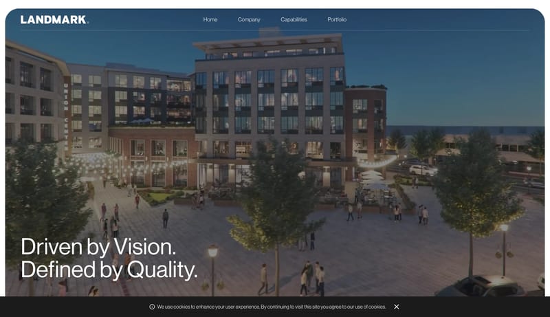
Build a property-marketing shell where imagery, place, and atmosphere do more work than interface novelty. Keep the framework premium and calm even when the brand uses bold introductory motion or color-coded navigation....
- Build a property-marketing shell where imagery, place, and atmosphere do more work than interface novelty.
- Keep the framework premium and calm even when the brand uses bold introductory motion or color-coded navigation.
Open exampleBuild a property-marketing shell where imagery, place, and atmosphere do more work than interface novelty. Keep the framework premium and calm even when the brand uses bold introductory motion or color-coded navigation....
- Build a property-marketing shell where imagery, place, and atmosphere do more work than interface novelty.
- Keep the framework premium and calm even when the brand uses bold introductory motion or color-coded navigation.
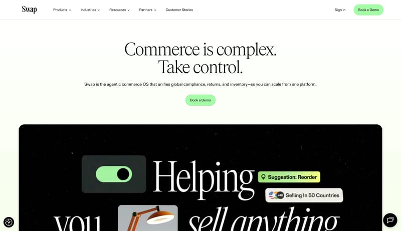
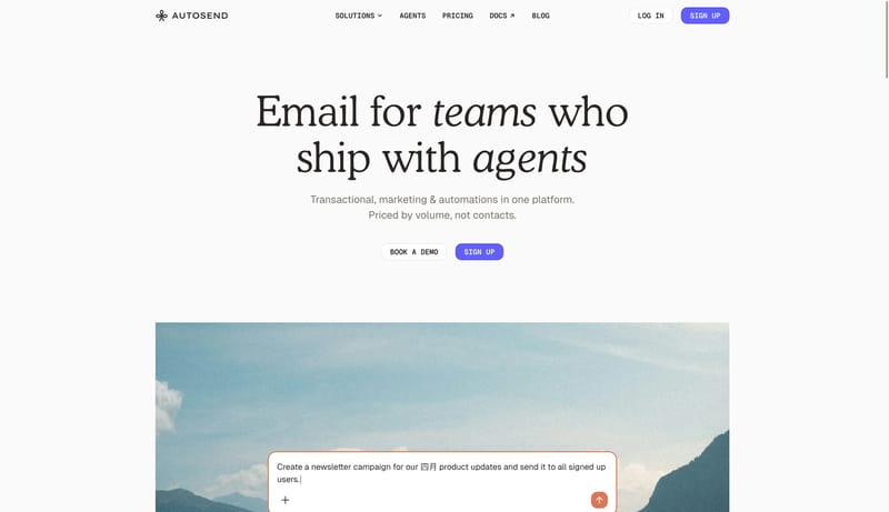
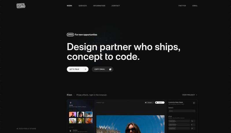
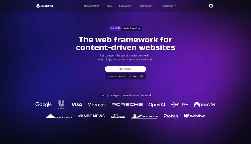
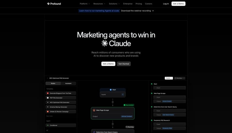
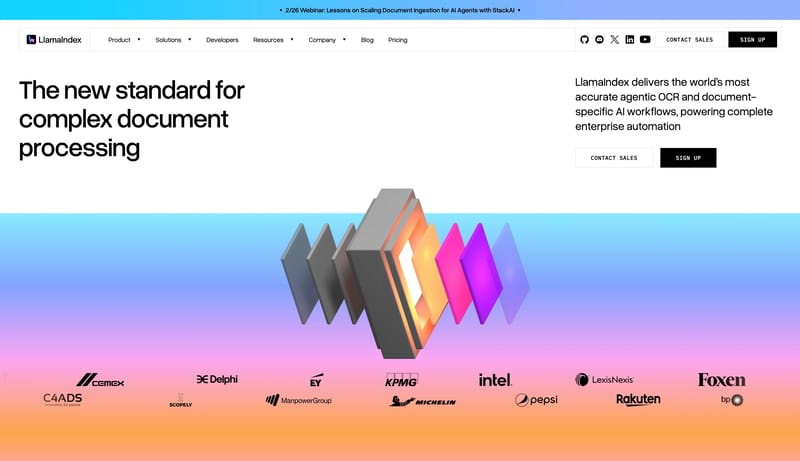
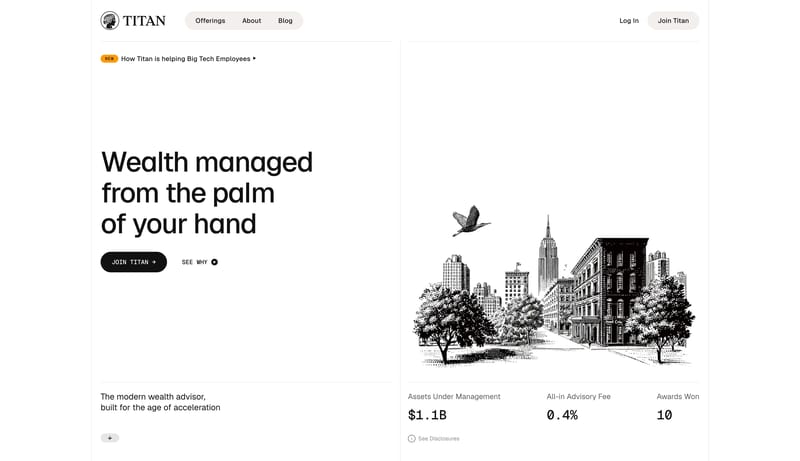
Open exampleThis design language combines an editorial white landing page with developer-grade controls. The core feeling is direct and technical without becoming cold: huge soft serif headlines, monospaced navigation, violet CTAs,...
Open example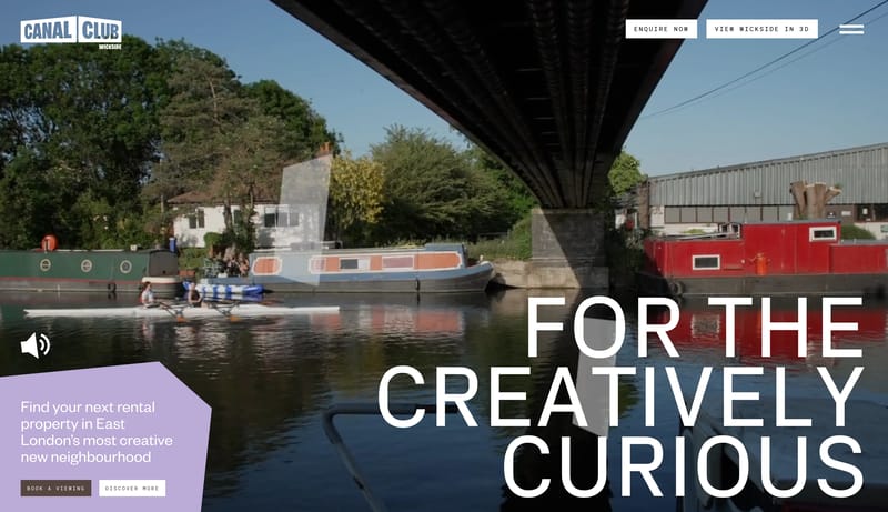


