Analogue Agency
Home
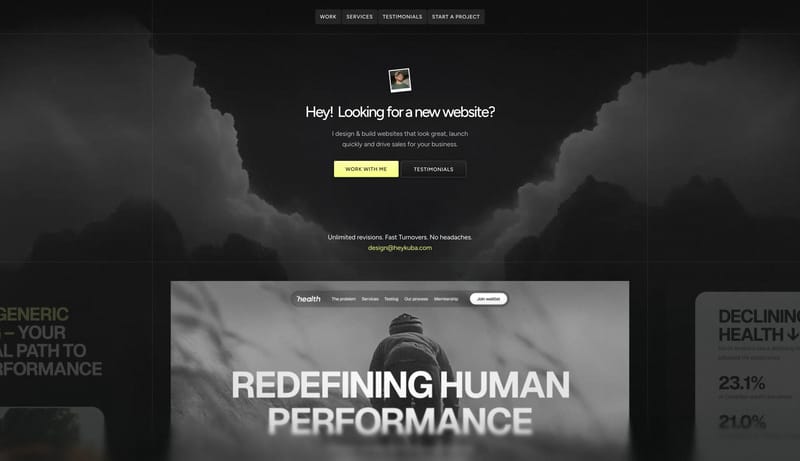
This system should feel like a design portfolio that trusts scale more than interface decoration. Build it from giant grotesk statements, deliberate emptiness, and a sharp alternation between pale gallery surfaces and bl...
Open example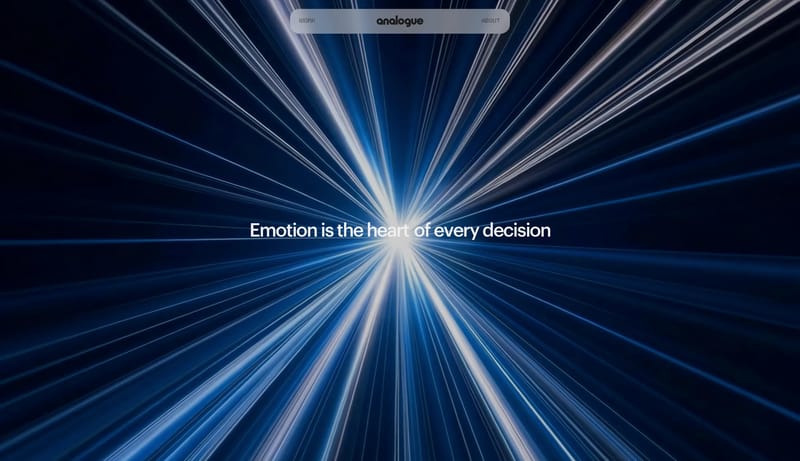


