Design Analysis
Common component rules signals
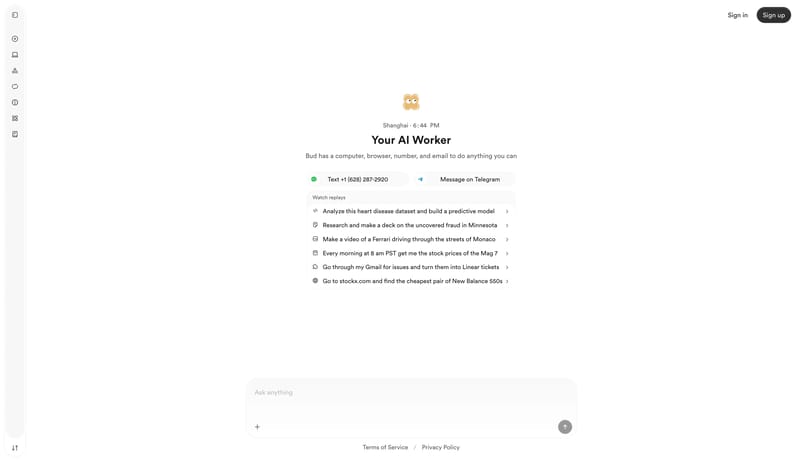
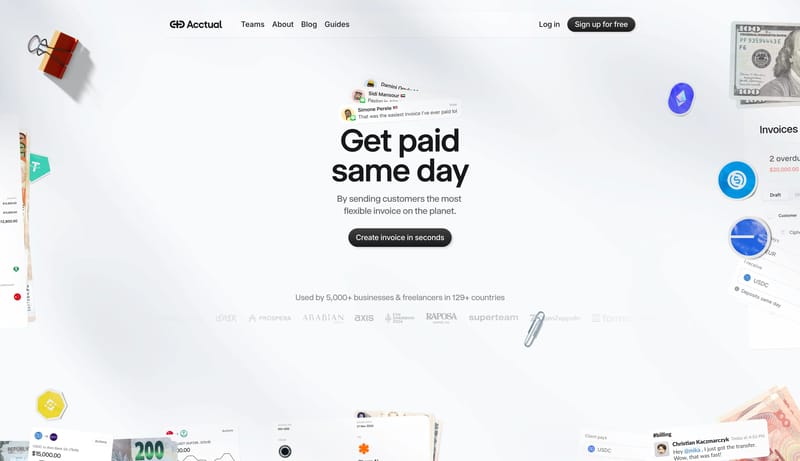
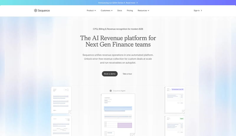
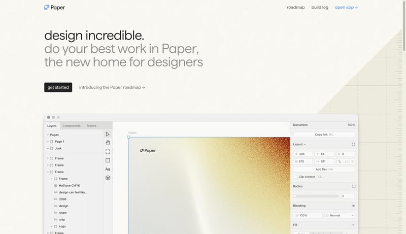
Soft Agent Workspace is a light-first system that makes advanced software feel collaborative and approachable. The first impression should be one giant italic statement over a near-white canvas, followed by a polished wh... This design language is a polished d...
Recurring System Signals
- Primary ( 222222): High-intent button fill and dark utility emphasis.
- Secondary ( FFFFFF): Card, button, and workspace window surface.
- Tertiary ( 0072F5): Small interactive signal, link, and icon accent.
- Display: Oversized, italic, tightly tracked, and highly confident.
- Body: Calm, friendly, and evenly spaced.
- Labels: Slightly weightier than body copy to preserve clarity on very light surfaces.
Related Keywords
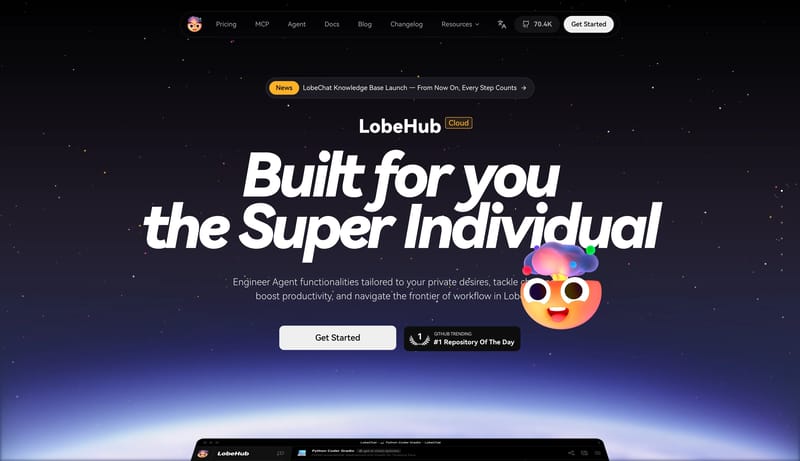
OverviewImage DirectionColorsTypographyDisplay: Oversized, italic, tightly tracked, and highly confidentBody: Calm, friendly, and evenly spacedLayoutKeep imagery diagrammatic and instructional rather than aspirationalKeep body copy calm and evenly spacedPrimary is charcoal and powers the main CTASecondary is a pale neutral support surfaceUse one plain grotesk throughout
Soft Agent Workspace is a light-first system that makes advanced software feel collaborative and approachable. The first impression should be one giant italic statement over a near-white canvas, followed by a polished wh...
- Primary ( 222222): High-intent button fill and dark utility emphasis.
- Secondary ( FFFFFF): Card, button, and workspace window surface.
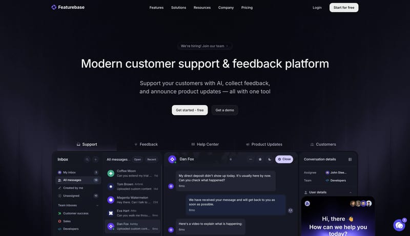
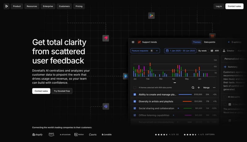
Open exampleThis design language is a polished dark SaaS stage for support, feedback, and product communication. It relies on large centered Inter headlines, black-purple atmosphere, clear CTA contrast, and real product panels direc...
Open exampleThis design language is a quiet workspace for delegating tasks to an AI assistant. The screen should feel spacious, personal, and utilitarian: a mostly white canvas, a slim persistent tool rail, one centered work object,...
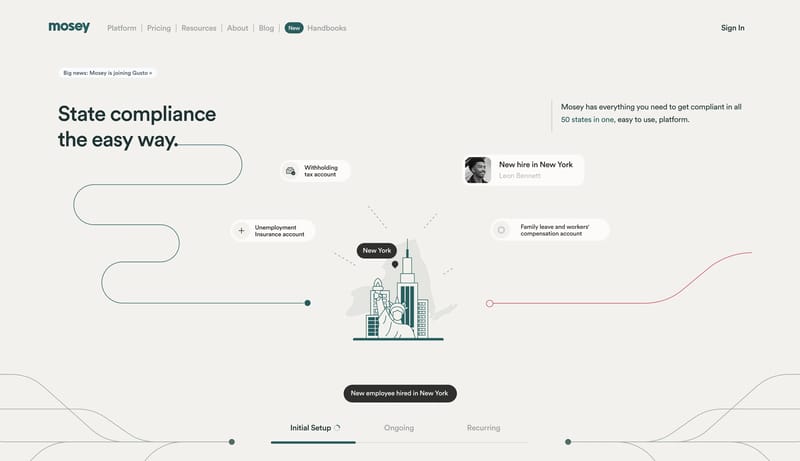
Open example