Browse all DESIGN.md examples

Component Rules

Browse DESIGN.md examples that make component rules explicit through buttons, navigation, cards, variants, and state definitions.

178 curated examples24 per pagePage 8 of 8

What To Review

Compare how teams define reusable components, state logic, emphasis levels, and naming conventions so implementation becomes less ambiguous.

What To Compare

Look for state coverage, component naming clarity, variant strategy, interaction rules, and whether the system is strong enough to support repeated UI work without ad hoc decisions.

Design Analysis

Common component rules signals

Build the first fold as a clean conversion stage, then let the aura and illustration introduce energy below it. Keep the tone sales-forward and legible rather than dreamy. Use the line illustration to avoid a generic das... Build the system as white space, gia...

Recurring System Signals

  • Build the first fold as a clean conversion stage, then let the aura and illustration introduce energy below it.
  • Keep the tone sales-forward and legible rather than dreamy.
  • Use the line illustration to avoid a generic dashboard-only SaaS mood.
  • Use grainy lilac and coral aura bands, one clean dashboard crop, and black line illustration accents.
  • Keep the main shell oatmeal and calm around them.
  • Use oatmeal and black as the structural base.

Related Keywords

OverviewImage DirectionColorsTypographyUse oatmeal and black as the structural baseLet monochrome pills keep the interaction posture groundedKeep proof tidy and clearly categorizedUse white and dark graphite as the baseKeep the personality soft rather than hyper-illustratedLayoutKeep proof object-based and reflective rather than productizedKeep the page mostly off-white and slate

Amplemarket

Home

2026-01-20

Build the first fold as a clean conversion stage, then let the aura and illustration introduce energy below it. Keep the tone sales-forward and legible rather than dreamy. Use the line illustration to avoid a generic das...

  • Build the first fold as a clean conversion stage, then let the aura and illustration introduce energy below it.
  • Keep the tone sales-forward and legible rather than dreamy.
Open example

Mixpanel

Home

2026-01-14

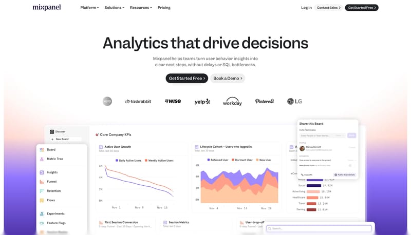
Build the system as white space, giant dark statements, and one orderly row of signal tiles. Use lilac and violet to energize proof without changing the page shell into an accent wash. Let monochrome pills keep the inter...

  • Build the system as white space, giant dark statements, and one orderly row of signal tiles.
  • Use lilac and violet to energize proof without changing the page shell into an accent wash.
Open example

Giga

Home

2026-01-14

Build the experience as a calm horizon photograph with minimal white interface punctuation. Let the page feel cinematic and humane rather than technical for its own sake. Use small chips and one white pill to keep the in...

  • Build the experience as a calm horizon photograph with minimal white interface punctuation.
  • Let the page feel cinematic and humane rather than technical for its own sake.
Open example


Continue Exploring

Use these adjacent facet and workflow pages to connect component rules analysis with other structured design-system concerns across the site.

Component Rules FAQ

What should I study on this page?

Compare how teams define reusable components, state logic, emphasis levels, and naming conventions so implementation becomes less ambiguous.

Why browse this as a dedicated DESIGN.md collection?

A focused collection makes it easier to compare how teams describe one system concern consistently across many examples instead of mixing unrelated signals on a single page.