Browse all DESIGN.md examples

Component Rules

Browse DESIGN.md examples that make component rules explicit through buttons, navigation, cards, variants, and state definitions.

151 curated examples24 per pagePage 4 of 7

What To Review

Compare how teams define reusable components, state logic, emphasis levels, and naming conventions so implementation becomes less ambiguous.

What To Compare

Look for state coverage, component naming clarity, variant strategy, interaction rules, and whether the system is strong enough to support repeated UI work without ad hoc decisions.

Design Analysis

Common component rules signals

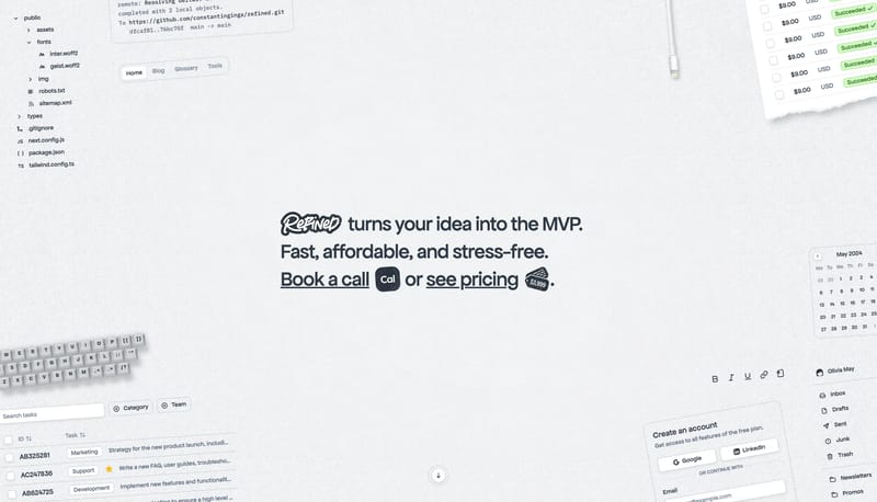
--- version: alpha name: "Desk Artifact Launchpad" description: "A bright launch-page language built from a central bold message, softly textured paper ground, floating desk artifacts, and rounded utility cards." colors:... --- version: alpha name: Storybook L...

Recurring System Signals

  • Build the experience like a launch message dropped onto a real desk.
  • Keep one bold headline at the center and let smaller utility artifacts orbit around it.
  • Use paper texture, cropped peripherals, and rounded cards to create tactility without visual heaviness.
  • Use desk objects, receipts, task fragments, inbox snippets, and simple form cards as the recurring image system.
  • Crop objects at the frame edge so the scene feels larger than the viewport.
  • Keep the object layer supportive. The main message should still dominate the first read.

Related Keywords

OverviewImage DirectionColorsTypographyLayoutEntry & Arrival MotionKeep supporting imagery minimal and mostly structuralPrimary ( 040404): the dominant black fieldDisplay: large and calm, never ornamentalBody: minimal and low-noiseUtility: tiny, edge-positioned, and secondarySecondary ( 111111): Utility surfaces and card fill

Refined

Home

2026-01-06

--- version: alpha name: "Desk Artifact Launchpad" description: "A bright launch-page language built from a central bold message, softly textured paper ground, floating desk artifacts, and rounded utility cards." colors:...

  • Build the experience like a launch message dropped onto a real desk.
  • Keep one bold headline at the center and let smaller utility artifacts orbit around it.
Open example
SuperrBook

Home

2026-02-13

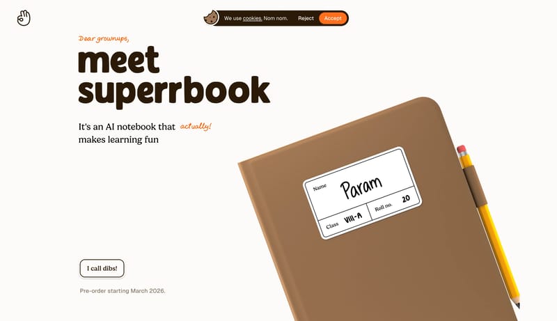
--- version: alpha name: Storybook Learning Notebook description: A warm storybook learning-product language with ivory paper, chocolate serif typography, hand-drawn orange annotations, illustrated notebook scenes, meado...

Open example

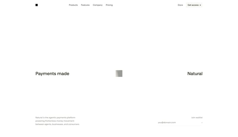
Natural

Home

2026-03-31

--- version: alpha name: "Monospaced Agent Payments Canvas" description: "A sparse product-marketing system with mono typography, sharp micro-rectangles, and large quiet fields around tiny technical artifacts." colors: p...

  • Build for a technical product that expresses confidence through restraint, not density.
  • Let the page feel almost unfinished at first glance, but precisely so. Emptiness is part of the design language.
Open example
Component Rules FAQ

What should I study on this page?

Compare how teams define reusable components, state logic, emphasis levels, and naming conventions so implementation becomes less ambiguous.

Why browse this as a dedicated DESIGN.md collection?

A focused collection makes it easier to compare how teams describe one system concern consistently across many examples instead of mixing unrelated signals on a single page.