Overview
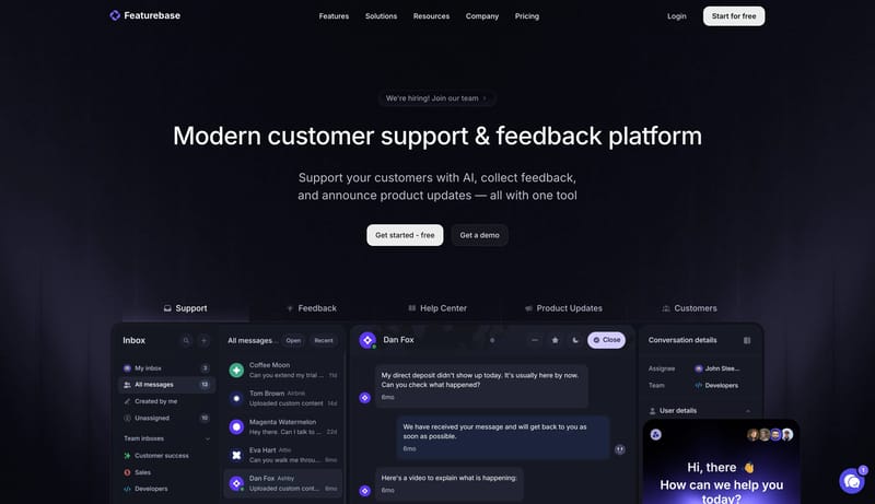
This design language is a polished dark SaaS stage for support, feedback, and product communication. It relies on large centered Inter headlines, black-purple atmosphere, clear CTA contrast, and real product panels directly below the hero.

Streamline feedback collection, support your customers, and announce product updates — all with one tool
Design Analysis
This design language is a polished dark SaaS stage for support, feedback, and product communication. It relies on large centered Inter headlines, black-purple atmosphere, clear CTA contrast, and real product panels direc...
This design language is a polished dark SaaS stage for support, feedback, and product communication. It relies on large centered Inter headlines, black-purple atmosphere, clear CTA contrast, and real product panels directly below the hero.
Use 050608 as the page canvas and 101219 for cards and product panels. Use F8F9FC for primary text and the main CTA surface. Use 5A46E8 for secondary actions, active tabs, chat controls, and selected states. Use B2B8CD for muted copy and 242837 for borders. Green should only signal resolved, shipped, or successful states.
Use Inter throughout. Headlines should be large, centered, and confident, around 72px / 80px for the hero and 40px / 48px for sections. Body copy remains 16px / 24px and muted. Controls use medium weight so nav, tabs, and pricing switches feel crisp on dark backgrounds.
Lead with a dark centered hero, a short CTA row, then a broad product screenshot. Product-mode pages should use tab rails or segmented controls to switch contexts without changing the overall stage. Pricing layouts should keep cards aligned and comparable. Avoid mixing many unrelated card sizes in one row.