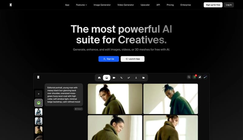
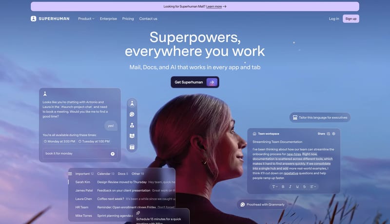
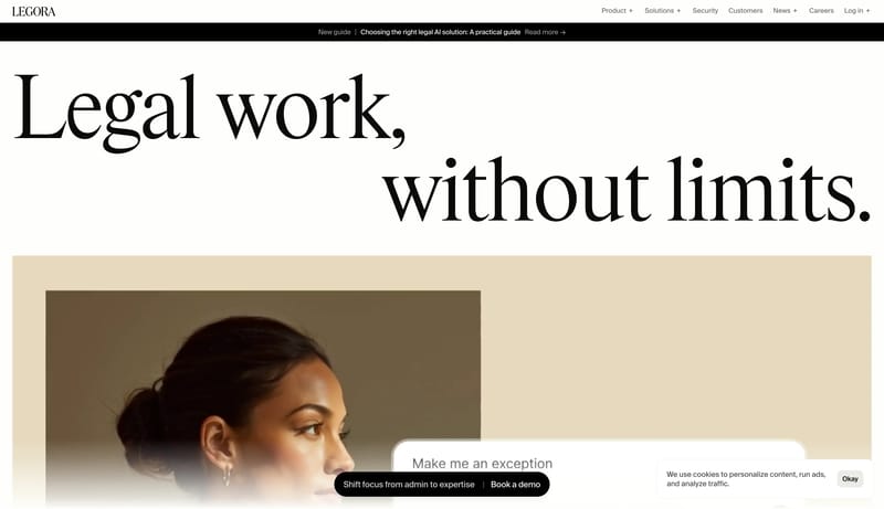
Browse all DESIGN.md examples

Component Rules

Browse DESIGN.md examples that make component rules explicit through buttons, navigation, cards, variants, and state definitions.

178 curated examples24 per pagePage 2 of 8

What To Review

Compare how teams define reusable components, state logic, emphasis levels, and naming conventions so implementation becomes less ambiguous.

What To Compare

Look for state coverage, component naming clarity, variant strategy, interaction rules, and whether the system is strong enough to support repeated UI work without ad hoc decisions.

Design Analysis

Common component rules signals

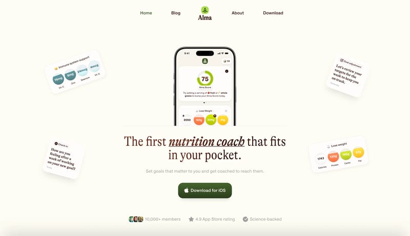
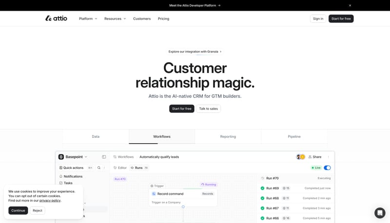
Bright Wellness Sheet is a friendly product-marketing system that relies on air, scale, and soft product illustration instead of lifestyle overload. The page should feel optimistic and helpful, with the product screensho... Build a service-page system that fee...

Recurring System Signals

  • Primary ( 171717): Headline ink and the default CTA fill.
  • Secondary ( F6F6F3): Quiet supporting surfaces where content needs grouping.
  • Tertiary ( FF8A26): Cheerful highlight for brand cues and hero objects.
  • Use one rounded grotesk across headlines, body copy, and labels.
  • Make the hero headline oversized and center aligned before adding any extra decoration.
  • Keep supporting copy light and readable, never compressed or all-caps.

Related Keywords

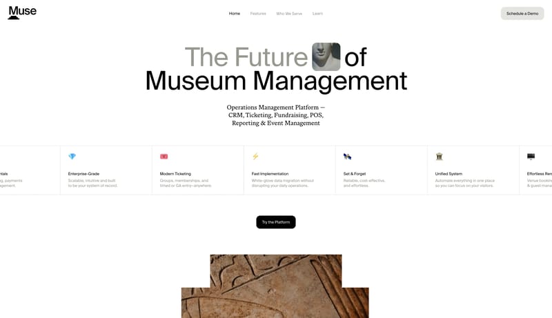
OverviewImage DirectionColorsTypographyTertiary is a small blue utility accentUse one blunt, geometric sans throughoutMake the display extremely large and simpleUse a simple UI sans for everything operationalSecondary ( FFFDFC): Card and note surfaceTertiary ( A7C93D): Score and success accentLabels: Slightly firmer grotesk for compact UI clarityBlend operational clarity with a calm cultural atmosphere

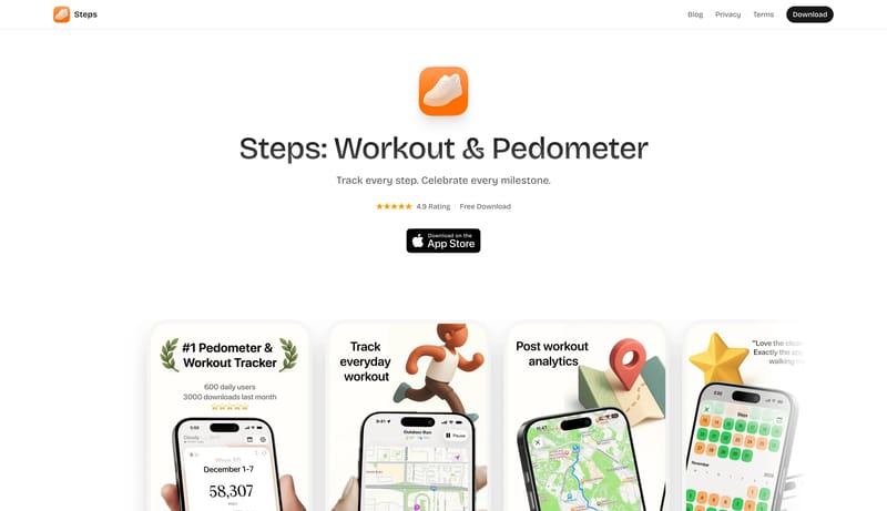
Steps

Home

2026-02-05

Bright Wellness Sheet is a friendly product-marketing system that relies on air, scale, and soft product illustration instead of lifestyle overload. The page should feel optimistic and helpful, with the product screensho...

  • Primary ( 171717): Headline ink and the default CTA fill.
  • Secondary ( F6F6F3): Quiet supporting surfaces where content needs grouping.
Open example

Div Block Studio

Home

2026-02-01

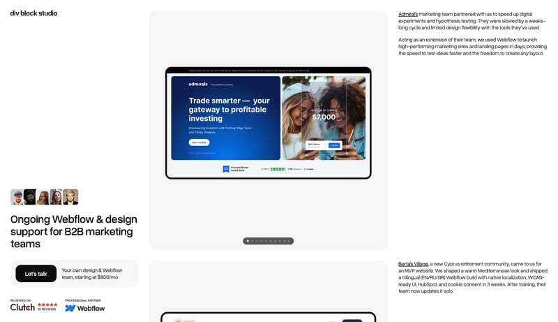
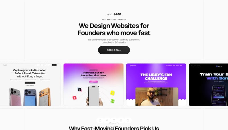
Build a service-page system that feels clear, dependable, and quietly premium. A clean Webflow-operator system built from white space, black call-to-action blocks, blue atmospheric blur, and oversized case panels.

Open example

Jeton

Home

2026-01-23

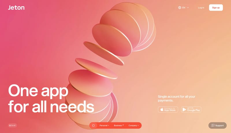
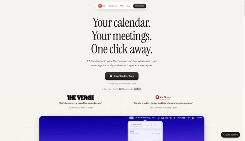
Coral Orbit Wallet is a bold consumer-finance system that relies on color, scale, and soft 3D form more than dense explanation. It should feel large, mobile-native, and unmistakably upbeat: giant white statements, coral...

  • Primary is white and used for the most visible text and bright action surfaces.
  • Secondary is a muted taupe used for quiet support capsules.
Open example

Continue Exploring

Use these adjacent facet and workflow pages to connect component rules analysis with other structured design-system concerns across the site.

Component Rules FAQ

What should I study on this page?

Compare how teams define reusable components, state logic, emphasis levels, and naming conventions so implementation becomes less ambiguous.


Why browse this as a dedicated DESIGN.md collection?

A focused collection makes it easier to compare how teams describe one system concern consistently across many examples instead of mixing unrelated signals on a single page.