
Analogue Agency

Analogue Agency

A premier destination for award-winning branding and digital design solutions. partner with our seasoned experts to elevate your brand's presence and achieve lasting impact. explore our work.

3.0
1
Visits
Visit

Available Pages

Version History

Design Analysis

Analogue Agency Home design analysis

--- version: alpha name: Editorial Contrast Stage description: A portfolio language built on giant grotesk type, floating pill navigation, pale-to-black chapter contrast, and a subtle global cursor follower. colors: prim...

Overview

This system should feel like a design portfolio that trusts scale more than interface decoration. Build it from giant grotesk statements, deliberate emptiness, and a sharp alternation between pale gallery surfaces and black manifesto chapters. The page should never feel crowded, even when the text is large. The shell needs a floating center-weighted navigation pill that feels detached from the content grid. Everything beneath it should read as slow-moving chapters rather than stacked widgets. A project introduction can be almost entirely subject, field color, and one word or phrase.
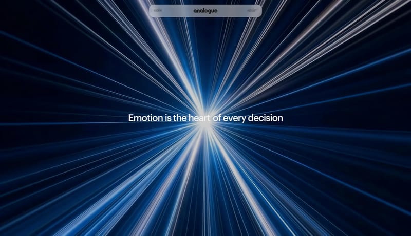
Image Direction

Use imagery like editorial staging. One oversized subject should dominate a chapter, often against a cold or pale field with minimal framing. Crop aggressively, preserve lots of emptiness, and avoid busy multi-image collage unless a section explicitly needs contrast. The image system should feel gallery-like and self-possessed.

Colors

The main field is soft gallery gray, not pure white. Pair it with dense black text, then switch decisively into near-black chapters with white text when the tone needs to become manifesto-like. Keep cold pale cyan or similar tones as environmental accents for select case-study surfaces, not as a universal brand fill. This palette works because it stays restrained. Do not add extra saturated accent colors to compensate for the minimalism.

Typography

Use a large contemporary grotesk for nearly everything important. Statements should be wide, heavy enough to feel decisive, and close-tracked. Let the text block itself become a compositional object. Use the dotted mono-like accent face only for labels, tiny captions, or technical punctuation. It should behave as contrast seasoning, not as a second body type.

SpacePlay/PauseSeek 1sShiftSeek 10s