Overview
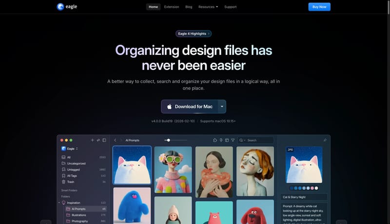
This design language is a dark, polished system for creative asset workflows. It should feel like a premium desktop tool: black canvas, luminous blue controls, large app-window proof, and feature cards that behave like workflow panels.

A better way to collect, search and organize your design files in a logical way and all in one place.
Design Analysis
This design language is a dark, polished system for creative asset workflows. It should feel like a premium desktop tool: black canvas, luminous blue controls, large app-window proof, and feature cards that behave like w...
This design language is a dark, polished system for creative asset workflows. It should feel like a premium desktop tool: black canvas, luminous blue controls, large app-window proof, and feature cards that behave like workflow panels.
Use 000000 as the dominant canvas and 0B1118 for dark section depth. Use 121A24 for raised panels, purchase flows, inputs, and nested cards. Use F8FAFC for main text and A8B0BA for secondary copy. Use 0072EF for primary actions and selection. Use 6AAFFF, cyan, violet, and orange as small feature-mode accents or gradient headline edges.
Use an Inter-style grotesk throughout. Hero and section headlines sit around 60px / 66px with medium-heavy weight. Card titles are compact and confident, around 20px / 30px. Use gradient text only for select headline words, numeric moments, or section markers. Body copy should stay short and muted.
Lead with one large product window or browser-window proof object. Section headers are centered, followed by wide cards or media panels. Feature pages can use one active row inside a large card to show the current workflow mode. Store and support flows should stay contained in dark rounded panels with clear internal dividers.