Effect
Home
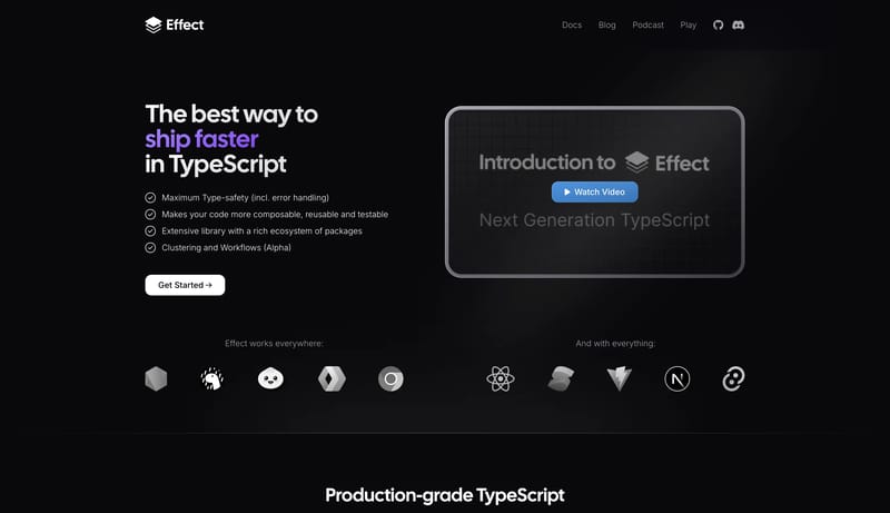
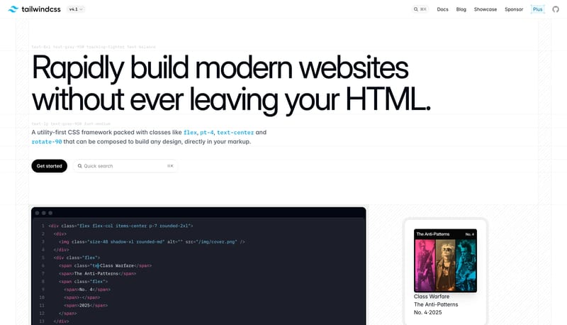
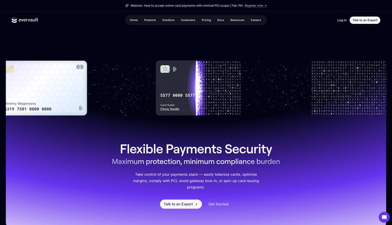
Design developer-tool pages that feel credible on both the marketing and documentation sides. The dark hero should feel polished and ambitious, while the docs shell should flip into a highly usable light product without...
Open exampleBrowse DESIGN.md examples that make component rules explicit through buttons, navigation, cards, variants, and state definitions.
What To Review
Compare how teams define reusable components, state logic, emphasis levels, and naming conventions so implementation becomes less ambiguous.
What To Compare
Look for state coverage, component naming clarity, variant strategy, interaction rules, and whether the system is strong enough to support repeated UI work without ad hoc decisions.
Design Analysis
Design developer-tool pages that feel credible on both the marketing and documentation sides. The dark hero should feel polished and ambitious, while the docs shell should flip into a highly usable light product without... Build a system that feels clear, modu...
Effect
Home
Design developer-tool pages that feel credible on both the marketing and documentation sides. The dark hero should feel polished and ambitious, while the docs shell should flip into a highly usable light product without...
Open exampleNotion
Home
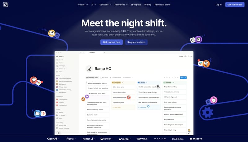
Build a system that feels clear, modular, and confidently helpful. A productivity marketing system that pairs a deep midnight hero with bright product canvases, periwinkle actions, and white modular cards.
Open exampleSlush
Home
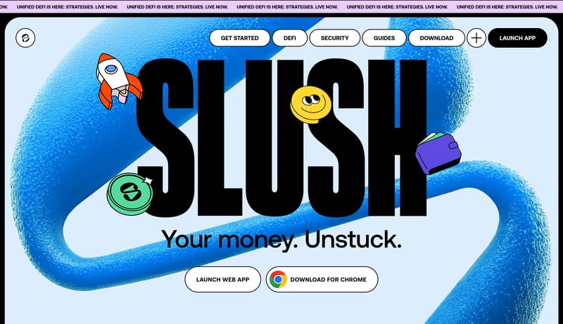
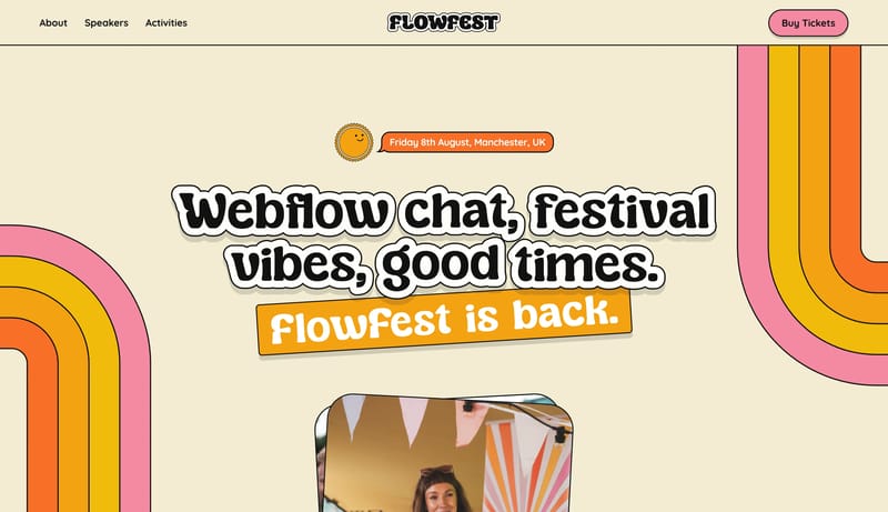
Sticker Rally Pop is a loud chaptered marketing system built for youth-coded financial products. Giant condensed headlines, sticker objects, and abrupt poster-color changes create the identity, while utility controls sta...
Use these adjacent facet and workflow pages to connect component rules analysis with other structured design-system concerns across the site.
Hub
Return to the main DESIGN.md hub to scan the broader dataset and compare across multiple system concerns.
Related Hub
Branch into topic pages grouped by repeated visual signals when you want a broader inspiration lens beside this system-focused facet.
Adjacent Facet
Examples where type scale, display choices, and reading hierarchy are described clearly enough to guide implementation.
Adjacent Facet
Collections focused on palette logic, semantic tokens, contrast handling, and accent usage.
Adjacent Facet
Examples that describe spacing, grid, rhythm, hierarchy, and structural decision-making.
Workflow Collection
DESIGN.md-style references, token-driven systems, and tools for AI-readable design workflows.
Workflow Collection
References for Figma AI, Figma Make, MCP-assisted design workflows, and editable UI generation.
Compare how teams define reusable components, state logic, emphasis levels, and naming conventions so implementation becomes less ambiguous.
A focused collection makes it easier to compare how teams describe one system concern consistently across many examples instead of mixing unrelated signals on a single page.