Samara
Home
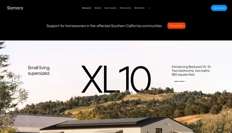
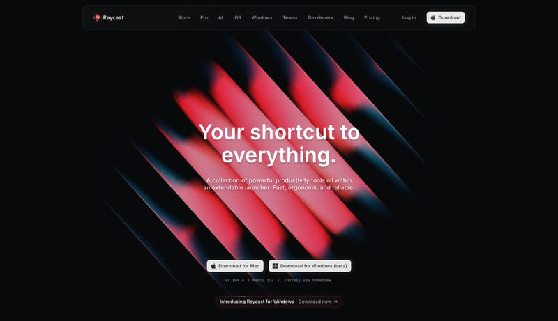
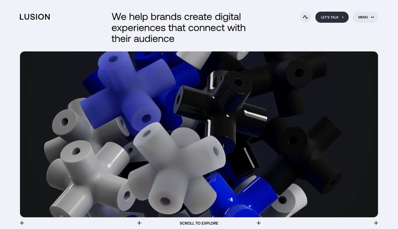
Builder Blue Pastoral Modernism is a light-first residential system that uses editorial restraint, pale natural surfaces, and decisive blue action moments to make modular housing feel trustworthy instead of speculative....
Open exampleBrowse DESIGN.md examples that emphasize typography systems, type scale, font pairing, and hierarchy as reusable implementation guidance.
What To Study
Compare how these systems define display type, body fonts, scale jumps, density, and readability rules instead of leaving typography as vague visual taste.
What To Compare
Focus on font roles, scale naming, line-height intent, responsive hierarchy, and whether the system makes typography easy for engineers and AI tools to apply consistently.
Design Analysis
Builder Blue Pastoral Modernism is a light-first residential system that uses editorial restraint, pale natural surfaces, and decisive blue action moments to make modular housing feel trustworthy instead of speculative.... Dot Matrix Industrial Consumer Tech i...
Samara
Home
Builder Blue Pastoral Modernism is a light-first residential system that uses editorial restraint, pale natural surfaces, and decisive blue action moments to make modular housing feel trustworthy instead of speculative....
Open exampleNothing
Home
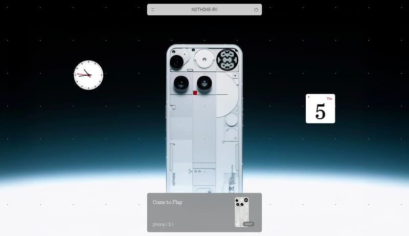
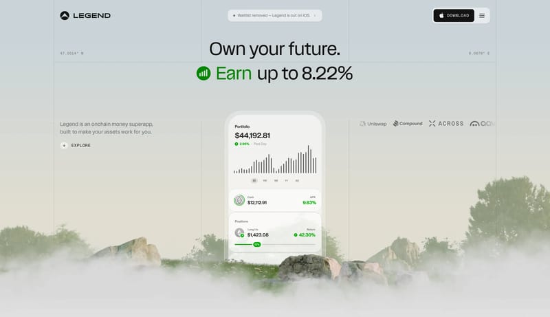
Dot Matrix Industrial Consumer Tech is a hardware-first system that uses white gallery space, black utility bars, and industrial product close-ups to create a highly ownable retail language. It should feel graphic, spars...
Open exampleStripe Sessions 2026
Home
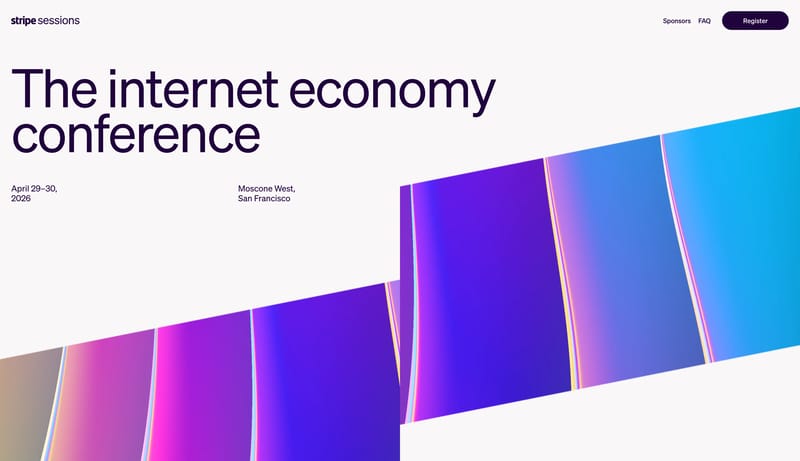
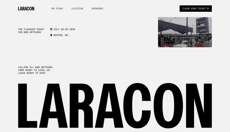
Design light event pages that feel premium, editorial, and current. The system should balance oversized headings and generous white space with one unmistakable prismatic visual language that makes the conference feel viv...
Open exampleUse these adjacent facet and workflow pages to connect typography systems analysis with other structured design-system concerns across the site.
Hub
Return to the main DESIGN.md hub to scan the broader dataset and compare across multiple system concerns.
Related Hub
Branch into topic pages grouped by repeated visual signals when you want a broader inspiration lens beside this system-focused facet.
Adjacent Facet
Collections focused on palette logic, semantic tokens, contrast handling, and accent usage.
Adjacent Facet
Examples that document reusable components, states, variants, and interaction expectations.
Adjacent Facet
Examples that describe spacing, grid, rhythm, hierarchy, and structural decision-making.
Workflow Collection
DESIGN.md-style references, token-driven systems, and tools for AI-readable design workflows.
Workflow Collection
References for Figma AI, Figma Make, MCP-assisted design workflows, and editable UI generation.
Compare how these systems define display type, body fonts, scale jumps, density, and readability rules instead of leaving typography as vague visual taste.
A focused collection makes it easier to compare how teams describe one system concern consistently across many examples instead of mixing unrelated signals on a single page.