
Wimp Decaf

Wimp Decaf

Welcome to Wimp, a very chill revolution. No pitchforks or storming the castle — just decaf, the underdog of coffee, coming to play with the big kids.

4.0
4
Visits
Visit

Available Pages

Version History

Design Analysis

Wimp Decaf Home design analysis

--- version: alpha name: "Cream Pop Pantry" description: "Playful pantry-commerce system with cream shells, giant compressed headlines, and a loud orange retail accent." colors: primary: " 2A292B" secondary: " EFE5DA" te...

Key Takeaways

  • Primary ( 2A292B): Headline ink and core interface text.
  • Secondary ( EFE5DA): Navigation shell and grouped support surfaces.
  • Tertiary ( FF5C00): CTA fill and flavor label signal.
  • Let the display face do the personality work through compression and scale.
  • Keep body copy straightforward and readable to anchor the joke.
  • Avoid mixing in extra decorative type families.

Overview

Cream Pop Pantry is a warm, funny retail system that wins through contrast: giant compressed headlines, tactile pack shots, and a cheerful orange signal inside otherwise calm cream surfaces. It should feel more like an art-directed pantry zine than a polished SaaS storefront.
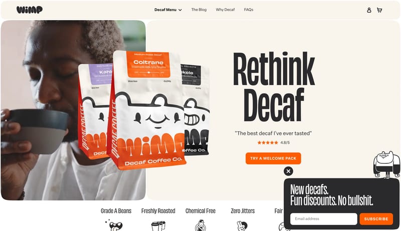
Image Direction

Use close, tactile photography and keep the product silhouette unmistakable. Collage layouts can be a little messy, but the palette should stay tightly controlled around cream, black, and orange.

Colors

  • Primary ( 2A292B): Headline ink and core interface text.
  • Secondary ( EFE5DA): Navigation shell and grouped support surfaces.
  • Tertiary ( FF5C00): CTA fill and flavor label signal.

Typography

  • Let the display face do the personality work through compression and scale.
  • Keep body copy straightforward and readable to anchor the joke.
  • Avoid mixing in extra decorative type families.
SpacePlay/PauseSeek 1sShiftSeek 10s