
Nothing

Nothing

Here at Nothing, we’re building a world where tech is fun again. Remember a time where every new product made you excited? We’re bringing that back.

3.0
1
Visits
Visit

Categories

Styles

Available Pages

Version History

Design Analysis

Nothing Home design analysis

--- version: "alpha" name: "Dot Matrix Industrial Consumer Tech" description: "A consumer-hardware system built from bright white space, dot-grid framing, black utility bars, translucent chrome, and stark product photogr...

Overview

Dot Matrix Industrial Consumer Tech is a hardware-first system that uses white gallery space, black utility bars, and industrial product close-ups to create a highly ownable retail language. It should feel graphic, sparse, and obsessed with the object itself.
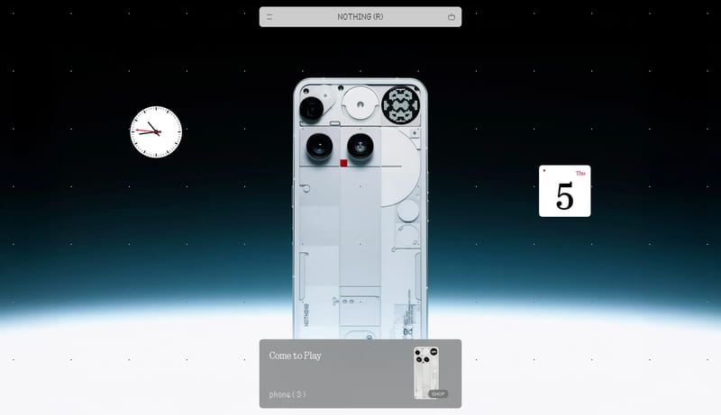
Image Direction

Use close, sharply lit product photography, isolated objects, transparent or exploded hardware details, and staggered supporting tiles. Images should feel like industrial exhibits more than lifestyle scenes.

Colors

Most of the interface stays white, black, and machine gray, with tiny red cues appearing only where they reinforce industrial precision. Resist the urge to add warmth or decorative color systems. The products should provide the visual excitement.

Typography

Lean into pixelated or digital-industrial display treatments, but give them enough space to remain legible. Supporting text can feel technical and almost documentation-like. Avoid soft editorial typography that would dilute the object-driven stance.

SpacePlay/PauseSeek 1sShiftSeek 10s