Browse all DESIGN.md examples

Typography Systems

Browse DESIGN.md examples that emphasize typography systems, type scale, font pairing, and hierarchy as reusable implementation guidance.

178 curated examples24 per pagePage 7 of 8

What To Study

Compare how these systems define display type, body fonts, scale jumps, density, and readability rules instead of leaving typography as vague visual taste.

What To Compare

Focus on font roles, scale naming, line-height intent, responsive hierarchy, and whether the system makes typography easy for engineers and AI tools to apply consistently.

Design Analysis

Common typography systems signals

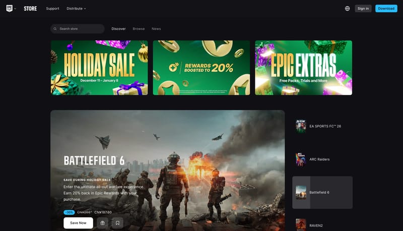
Build the interface as a dark browse shell where artwork is the product and chrome exists to support it. Lead with one dominant billboard card, then continue discovery through shelves, rails, and stacked merchandise modu... Build the experience like a warm edi...

Recurring System Signals

  • Build the interface as a dark browse shell where artwork is the product and chrome exists to support it.
  • Lead with one dominant billboard card, then continue discovery through shelves, rails, and stacked merchandise modules.
  • Keep utility controls compact and bright only where they need to cut through the dark field.
  • Use cinematic key art, box-art crops, genre tiles, and promotional banners as the primary visual material.
  • Keep artwork high contrast and saturated against nearly black chrome.
  • Organize many artworks through disciplined rails and rounded card frames.

Related Keywords

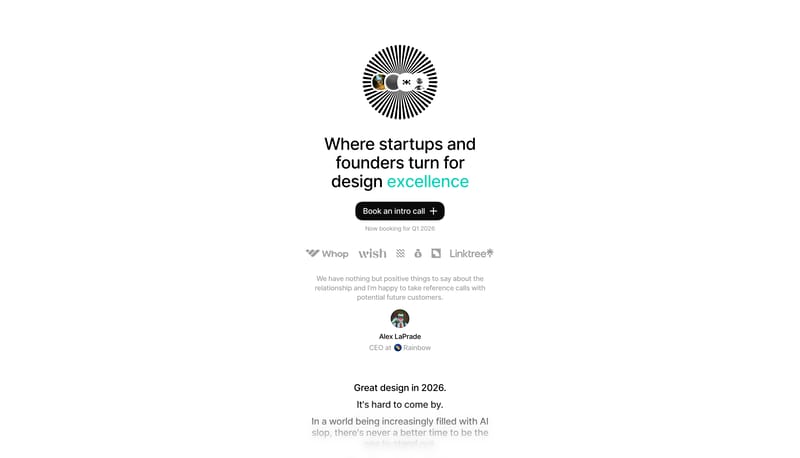
OverviewImage DirectionColorsTypographyFavor honesty and clarity over spectacleLet whitespace do most of the talkingBuild the experience like a quiet exhibition catalogLayout

Epic Games Store

Home

2026-01-08

Build the interface as a dark browse shell where artwork is the product and chrome exists to support it. Lead with one dominant billboard card, then continue discovery through shelves, rails, and stacked merchandise modu...

  • Build the interface as a dark browse shell where artwork is the product and chrome exists to support it.
  • Lead with one dominant billboard card, then continue discovery through shelves, rails, and stacked merchandise modules.
Open example

N1

Home

2026-01-08

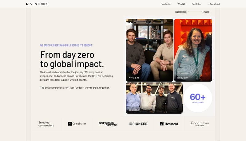
Build the experience like a warm editorial ledger rather than a glossy technology pitch. Let the grid structure carry trust. Sections should feel ordered, factual, and carefully paced. Use small indigo labels to frame ca...

  • Build the experience like a warm editorial ledger rather than a glossy technology pitch.
  • Let the grid structure carry trust. Sections should feel ordered, factual, and carefully paced.
Open example

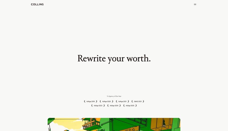
COLLINS

Home

2025-12-30

Build the experience like a gallery brochure with unusually large breathing room. Let serif headlines carry the emotional weight while the interface chrome stays almost invisible. Use the dark stage sparingly, as punctua...

  • Build the experience like a gallery brochure with unusually large breathing room.
  • Let serif headlines carry the emotional weight while the interface chrome stays almost invisible.
Open example

Continue Exploring

Use these adjacent facet and workflow pages to connect typography systems analysis with other structured design-system concerns across the site.

Typography Systems FAQ

What should I study on this page?

Compare how these systems define display type, body fonts, scale jumps, density, and readability rules instead of leaving typography as vague visual taste.

Why browse this as a dedicated DESIGN.md collection?

A focused collection makes it easier to compare how teams describe one system concern consistently across many examples instead of mixing unrelated signals on a single page.