Krea
Home
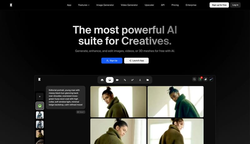
Build a dark system that feels like a capable creative-tool marketplace rather than a minimal landing page. A dark creative-tool marketplace system built from black app chrome, rounded sidebar rails, massive action pills...
Open exampleBrowse DESIGN.md examples that emphasize typography systems, type scale, font pairing, and hierarchy as reusable implementation guidance.
What To Study
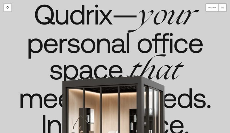
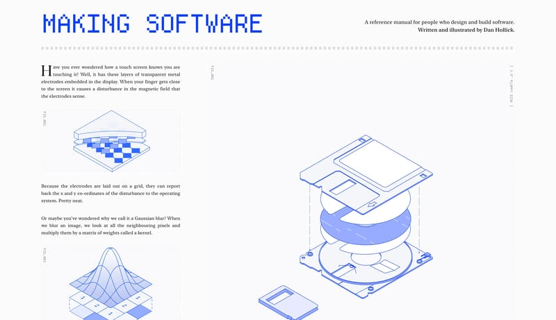
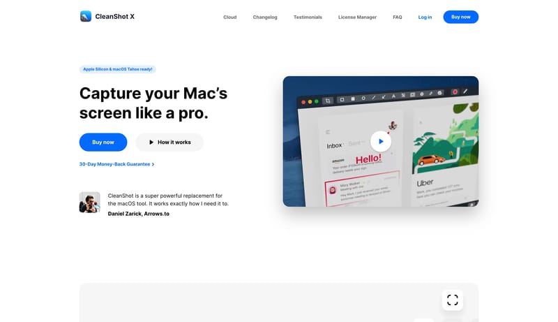
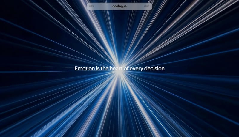
Compare how these systems define display type, body fonts, scale jumps, density, and readability rules instead of leaving typography as vague visual taste.
What To Compare
Focus on font roles, scale naming, line-height intent, responsive hierarchy, and whether the system makes typography easy for engineers and AI tools to apply consistently.
Design Analysis
Build a dark system that feels like a capable creative-tool marketplace rather than a minimal landing page. A dark creative-tool marketplace system built from black app chrome, rounded sidebar rails, massive action pills... Build a dark system that feels exact...
Krea
Home
Build a dark system that feels like a capable creative-tool marketplace rather than a minimal landing page. A dark creative-tool marketplace system built from black app chrome, rounded sidebar rails, massive action pills...
Open exampleKiro
Home
Build a dark system that feels exacting, technical, and fast to trust. A dark developer system built from near-black shells, violet call-to-action energy, and terminal-first proof panels.
Open exampleHurdle
Home
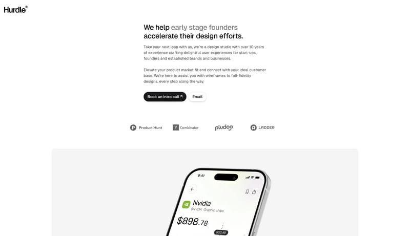
Build a service-page system that feels calm, trustworthy, and founder-friendly. A minimal founder-support system built from white space, black capsule CTAs, soft gray cards, and calm product proof.
Open exampleUse these adjacent facet and workflow pages to connect typography systems analysis with other structured design-system concerns across the site.
Hub
Return to the main DESIGN.md hub to scan the broader dataset and compare across multiple system concerns.
Related Hub
Branch into topic pages grouped by repeated visual signals when you want a broader inspiration lens beside this system-focused facet.
Adjacent Facet
Collections focused on palette logic, semantic tokens, contrast handling, and accent usage.
Adjacent Facet
Examples that document reusable components, states, variants, and interaction expectations.
Adjacent Facet
Examples that describe spacing, grid, rhythm, hierarchy, and structural decision-making.
Workflow Collection
DESIGN.md-style references, token-driven systems, and tools for AI-readable design workflows.
Workflow Collection
References for Figma AI, Figma Make, MCP-assisted design workflows, and editable UI generation.
Compare how these systems define display type, body fonts, scale jumps, density, and readability rules instead of leaving typography as vague visual taste.
A focused collection makes it easier to compare how teams describe one system concern consistently across many examples instead of mixing unrelated signals on a single page.