Browse all DESIGN.md examples

Typography Systems

Browse DESIGN.md examples that emphasize typography systems, type scale, font pairing, and hierarchy as reusable implementation guidance.

178 curated examples24 per pagePage 3 of 8

What To Study

Compare how these systems define display type, body fonts, scale jumps, density, and readability rules instead of leaving typography as vague visual taste.

What To Compare

Focus on font roles, scale naming, line-height intent, responsive hierarchy, and whether the system makes typography easy for engineers and AI tools to apply consistently.

Design Analysis

Common typography systems signals

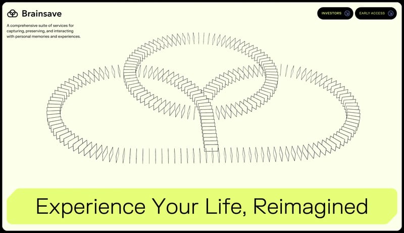
Use darkness as the main material. Let lime function as a signal rather than a blanket fill. Make the interface feel like an experimental lab prototype, not a mainstream SaaS dashboard. Use framed prototype surfaces and... Build the page from calm white space,...
Recurring System Signals

  • Use darkness as the main material.
  • Let lime function as a signal rather than a blanket fill.

  • Make the interface feel like an experimental lab prototype, not a mainstream SaaS dashboard.
  • Use framed prototype surfaces and small glow fields.
  • Keep glows peripheral and purposeful.
  • Protect black negative space so the signals feel rare and valuable.

Related Keywords

OverviewImage DirectionColorsTypographyUse darkness as the main materialUse framed prototype surfaces and small glow fieldsKeep glows peripheral and purposefulUse clean device mockups and health-oriented app close-upsKeep product imagery crisp and centeredLayoutKeep the interface almost austereWhite should dominate

Brainsave

Home

2026-03-31

Use darkness as the main material. Let lime function as a signal rather than a blanket fill. Make the interface feel like an experimental lab prototype, not a mainstream SaaS dashboard. Use framed prototype surfaces and...

  • Use darkness as the main material.
  • Let lime function as a signal rather than a blanket fill.

Open example

Bevel

Home

2026-03-31

Build the page from calm white space, soft gradients, and device proof. Anchor trust with one charcoal action button or one dark reassurance block per chapter. Keep the surface polished and modern without tipping into ge...

  • Build the page from calm white space, soft gradients, and device proof.
  • Anchor trust with one charcoal action button or one dark reassurance block per chapter.
Open example

Beside

Home

2026-03-31

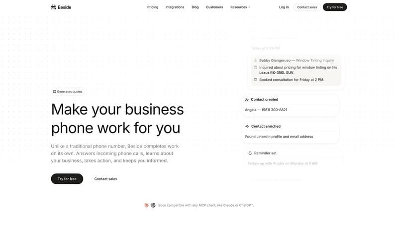
Keep the interface almost austere. Use white space and quiet confidence as the premium signal. Let the black CTA and subtle warm accents carry the few moments of emphasis. White should dominate. Black should be used for...


  • Keep the interface almost austere.
  • Use white space and quiet confidence as the premium signal.
Open example

Continue Exploring

Use these adjacent facet and workflow pages to connect typography systems analysis with other structured design-system concerns across the site.

Typography Systems FAQ

What should I study on this page?

Compare how these systems define display type, body fonts, scale jumps, density, and readability rules instead of leaving typography as vague visual taste.

Why browse this as a dedicated DESIGN.md collection?

A focused collection makes it easier to compare how teams describe one system concern consistently across many examples instead of mixing unrelated signals on a single page.