Attio

Attio

Powerful, flexible and data-driven, Attio makes it easy to build the exact CRM your business needs.

4.0
9
Visits
Visit

Available Pages

Design Analysis

Attio Home design analysis

--- version: alpha name: "Softframe Command Grid" description: "A calm CRM marketing language built from near-white fields, faint structural guides, rounded-rectangle controls, and polished product-window surfaces." colo...

Key Takeaways

  • Build the experience as a near-white CRM field that feels spacious, exact, and product-led.
  • Let faint guide systems, soft product windows, and crisp black CTAs carry the structure instead of dense feature clutter.
  • Keep the control language disciplined: the site relies on rounded rectangles, not pills.
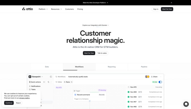
  • Use prompt bars, tabbed product windows, workflow surfaces, pricing cards, and structured proof modules as the main visual objects.
  • Keep one product artifact in focus beneath each large statement instead of stacking many equal-weight screenshots.
  • Let guide lines or dot fields remain visible around the product object so the composition still feels governed when it is sparse.

Overview

  • Build the experience as a near-white CRM field that feels spacious, exact, and product-led.
  • Let faint guide systems, soft product windows, and crisp black CTAs carry the structure instead of dense feature clutter.
  • Keep the control language disciplined: the site relies on rounded rectangles, not pills.
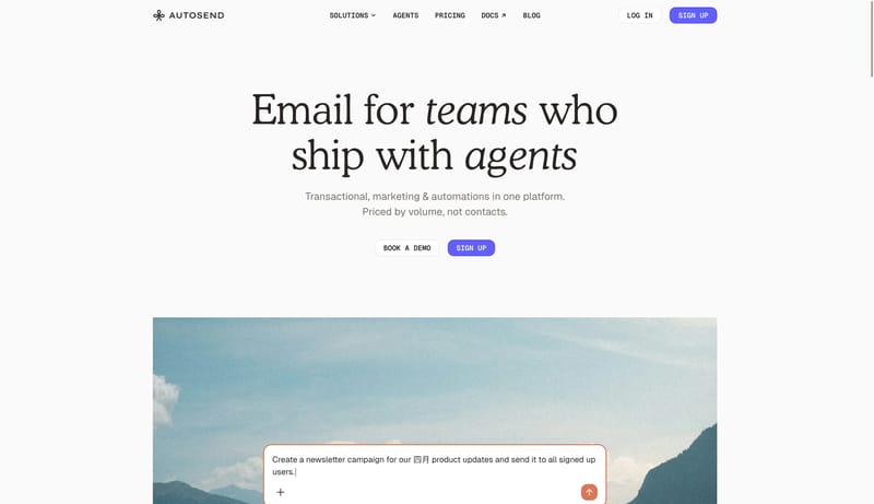
Image Direction

  • Use prompt bars, tabbed product windows, workflow surfaces, pricing cards, and structured proof modules as the main visual objects.
  • Keep one product artifact in focus beneath each large statement instead of stacking many equal-weight screenshots.
  • Let guide lines or dot fields remain visible around the product object so the composition still feels governed when it is sparse.

Colors

  • FBFBFB and FFFFFF should dominate the page shell and keep the system airy.
  • 242629 is the anchor for CTAs, top-banner punctuation, and strong text moments.
  • F8F9FA, E4E7EC, and D1D3D6 should define product shells, guides, and quiet outlines without turning gray into a theme.

Typography

  • Use Inter Display for hero statements and major section headlines.
  • Use Inter for body copy, controls, labels, and product-supporting text.
  • Keep the hierarchy clean and product-confident rather than editorially expressive.
SpacePlay/PauseSeek 1sShiftSeek 10s