Design Analysis
Common typography systems signals
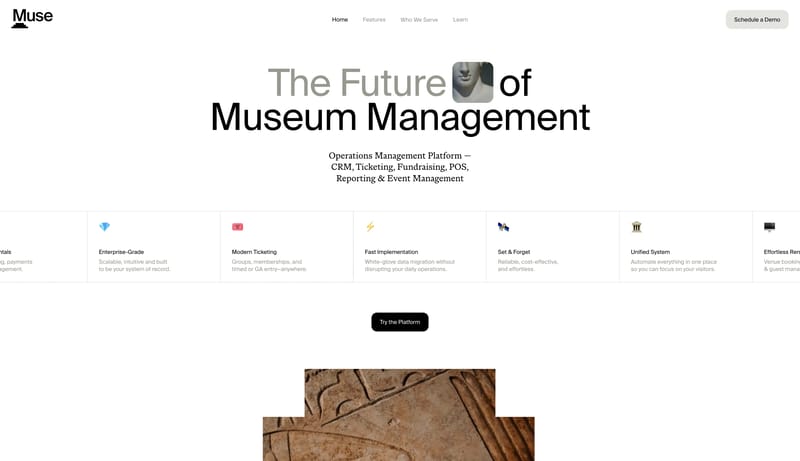
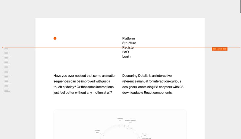
--- version: alpha name: "Ledger Artifact Minimalism" description: "A sparse archival portfolio language built from white voids, thin rules, barcode-like utility detail, and restrained dark artifact imagery." colors: pri... --- version: alpha name: "Gallery St...
--- version: alpha name: "Ledger Artifact Minimalism" description: "A sparse archival portfolio language built from white voids, thin rules, barcode-like utility detail, and restrained dark artifact imagery." colors: pri...
- Build the experience as an index, dossier, or ledger rather than a promotional portfolio.
- Let whitespace do most of the talking.
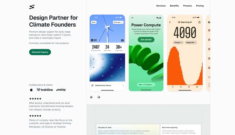
Open example--- version: alpha name: "Gallery Strip Minimalism" description: "A quiet studio portfolio language built from a narrow information rail, a long vertical gallery strip, and almost no decorative chrome." colors: primary:...
- Build the experience like a quiet exhibition catalog.
- Use a narrow left rail for metadata, navigation, and lightweight framing.
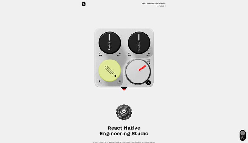
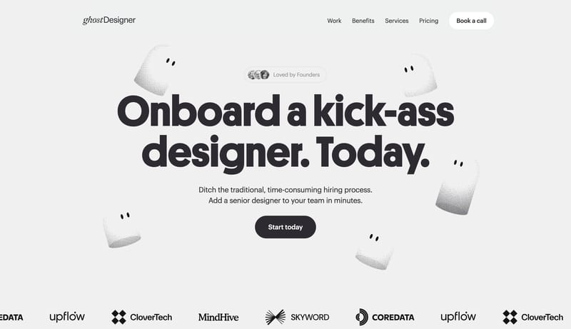
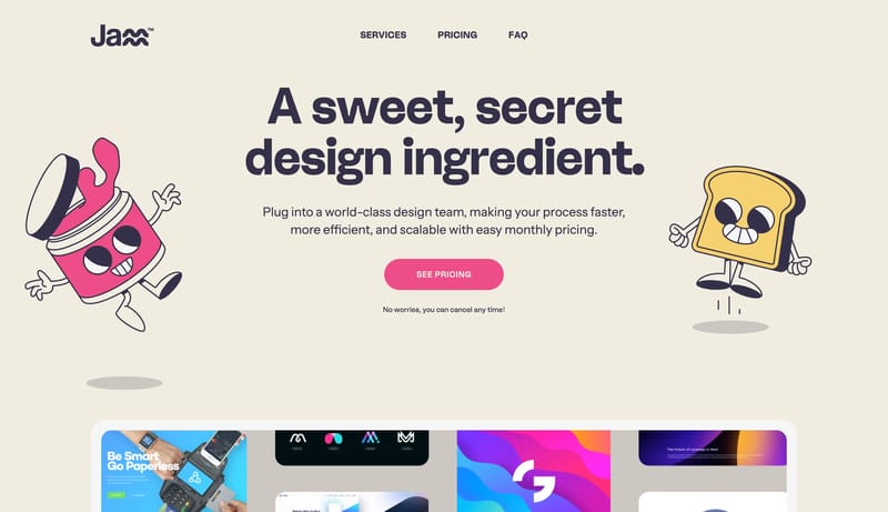
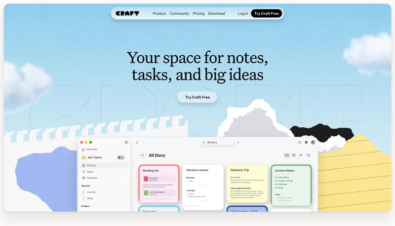
Open example--- version: alpha name: "Desk Artifact Launchpad" description: "A bright launch-page language built from a central bold message, softly textured paper ground, floating desk artifacts, and rounded utility cards." colors:...
- Build the experience like a launch message dropped onto a real desk.
- Keep one bold headline at the center and let smaller utility artifacts orbit around it.
Open example