
Framer

Framer

Build a free website with Framer—enjoy full design freedom, powerful CMS, built-in SEO, and real-time collaboration. Create professional, fully custom sites with the no-code builder loved by designers and high-performing teams.

4.0
3
Visits
Visit

Available Pages

Version History

Design Analysis

Framer Home design analysis

--- version: alpha name: Midnight Builder Marquee description: Black-stage marketing system with oversized white type, cool gray support copy, medium-radius rounded-rectangle CTAs, and polished preview-led proof. colors:...

Key Takeaways

  • Primary ( FFFFFF): Display text and the highest-intent CTA fill.
  • Secondary ( 1B1B1B): Quiet dark support action fill and panel tone.
  • Tertiary ( 8E8E93): Support copy, muted navigation, and low-priority labels.
  • Display: Very large, bold, tightly tracked, and tightly leaded.
  • Body: Neutral and readable, with restrained width under the hero.
  • Labels: Slightly heavier than body copy so small navigation items do not disappear on black.

Overview

Midnight Builder Marquee is a black-first launch system that sells speed and polish through reduction. The shell should feel almost empty at first glance: one oversized white headline, one short block of cool-gray support copy, and one tight CTA cluster. Credibility comes from the scale discipline and the quality of the preview frames, not from decorative effects.
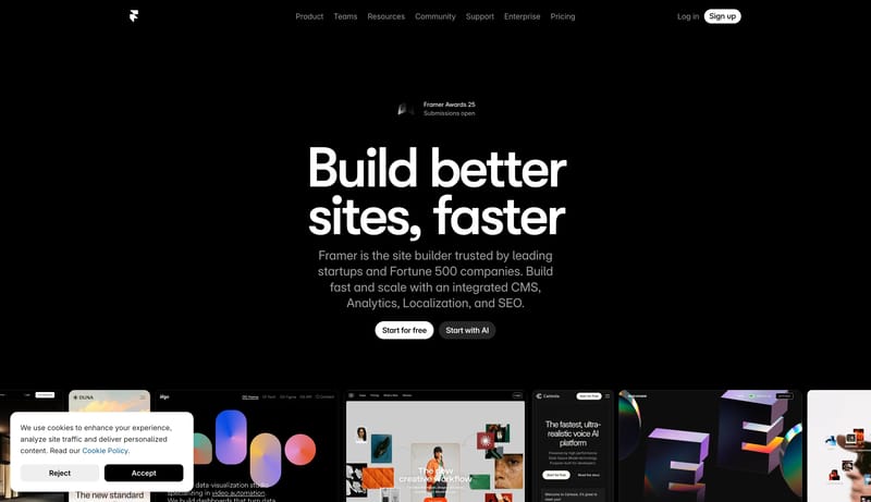
Image Direction

Use framed website previews and polished product-like crops as the main proof layer. Images should look clean, editorial, and high-finish, with strong contrast against the black shell and minimal browser chrome.

Colors

The palette is brutally limited and depends on contrast discipline.

  • Primary ( FFFFFF): Display text and the highest-intent CTA fill.
  • Secondary ( 1B1B1B): Quiet dark support action fill and panel tone.
  • Tertiary ( 8E8E93): Support copy, muted navigation, and low-priority labels.

Typography

Use one clean grotesk across display, body, and utility text. The system gets its character from size, line breaks, and contrast, not from font mixing.

  • Display: Very large, bold, tightly tracked, and tightly leaded.
  • Body: Neutral and readable, with restrained width under the hero.
  • Labels: Slightly heavier than body copy so small navigation items do not disappear on black.
SpacePlay/PauseSeek 1sShiftSeek 10s