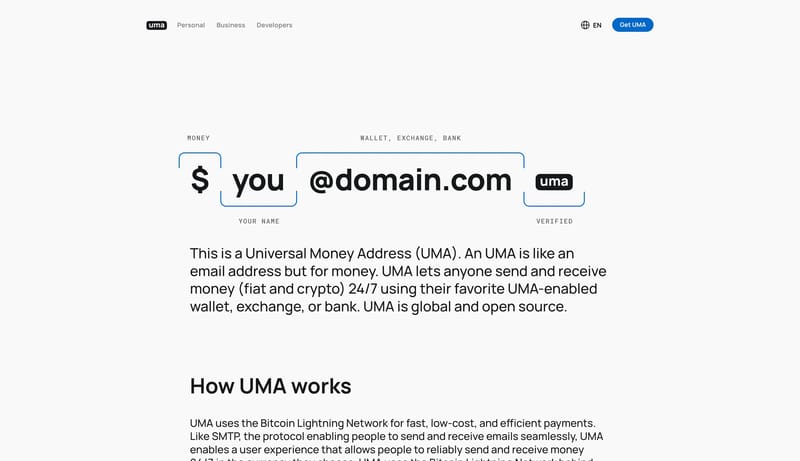
Universal Money Address

Universal Money Address

The Universal Money Address (UMA) open-source standard combines human-readable Lightning Addresses and enhanced messaging services with the Lightning Network’s real-time, global payment rails to make sending money as easy as sending an email. It connects regulated financial institutions and payments providers across borders and uses the Bitcoin’s Lightning Network for global settlement with messaging to support endpoints in any currency.

3.0
6
Visits
Visit

Available Pages

Version History

Design Analysis

Universal Money Address Home design analysis

--- version: alpha name: Verified Money Address description: A minimal payment-address design language with oversized address syntax, blue verification marks, rounded calculators, and optional dark business-stage moments...

Overview

This design language explains a payment-address protocol through large, simple visual objects. The interface should feel open, trustworthy, and obvious: a white canvas, bold address syntax, blue verification marks, rounded payment calculators, and green certainty signals. Use one dominant object per screen. A giant address, a rate calculator, or a wallet card should do more work than a grid of marketing cards.

Colors

Use F9F9F9 as the primary canvas and 16171A for text and address syntax. Use 0068C9 as the verification/action color: CTAs, brackets, links, and active protocol marks. Use 35C84A only for checks and transfer-success states. Use EDEDED for calculator shells and quiet controls, and white for input fields and raised cards. Dark sections can use a near-black surface when the page needs an enterprise or wallet-stage moment.

Typography

Use a Manrope-style geometric sans. Main headlines can be large and heavy, around 64px / 72px or 56px / 56px, because the system is sparse. Section headings sit around 48px / 60px; explanatory copy can be 20px / 30px. Use uppercase spaced labels for protocol annotations, but keep them small. Do not let labels become the main hierarchy.

Layout

Use broad whitespace and contained widths. Homepage-style pages should center a single address diagram. Product pages can split into a two-column layout: benefit copy on the left and a calculator or wallet card on the right. Use bracket frames and labels to explain address parts. Use rounded panels for calculators and payment objects. Dark hero sections should be reserved for business-facing emphasis, not used as the default.

SpacePlay/PauseSeek 1sShiftSeek 10s