Overview
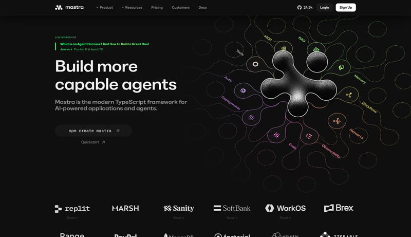
This design language turns data infrastructure into a crisp commercial interface. It uses white space, large editorial sans headlines, dashed utility borders, structured data cards, black commitment CTAs, and green live-action signals.

Access 150+ social & review sources through one API. Get real-time + 5 years historical data with 98.3% uptime. Trusted by enterprise platforms.
Design Analysis
This design language turns data infrastructure into a crisp commercial interface. It uses white space, large editorial sans headlines, dashed utility borders, structured data cards, black commitment CTAs, and green live-...
This design language turns data infrastructure into a crisp commercial interface. It uses white space, large editorial sans headlines, dashed utility borders, structured data cards, black commitment CTAs, and green live-action signals.
Use white as the primary page canvas and 0D0D0D for text, nav, key borders, and black CTAs. Use 3FE844 for the highest-priority action or live data signal. Use 2D62FF for links, selected product states, and active data categories. Use FAFAFA for nested data rows and D9D9D9 for grid lines and dashed fields.
Use a large editorial sans for hero and section headings, around 76px / 82px for top-level statements and 44px / 52px for sections. Use system sans for body copy, controls, labels, and forms. Use mono only when content looks like API metadata, sample payloads, or identifiers.
Lead with a large data promise and a direct CTA pair. Use grid cards for data products, sources, and metric proof. Form pages should use a split layout: large statement and supporting proof on the left, fields on the right. The grid should feel technical but not crowded. Each card needs enough whitespace for values and labels to scan quickly.
Core identity and authoring metadata from the refto.one design model.
A white data-infrastructure language with large editorial sans headings, dashed utility borders, black and neon-green actions, blue active links, structured data cards, and split form pages.
Technical, crisp, data-rich, and commercial, with white space, dashed utilities, and high-signal green actions.
Fields outside the primary renderer remain visible here as structured fallback content.
Primitive palettes and resolved token colors for the active preview mode.
Spacing scales rendered as tokens with a simple length specimen.
Corner radii tokens with a live surface sample.
Font families from the current design YAML, including fallback stacks and usage character.
Top-level typography scale rendered as live text specimens.
Top-level typography line-height values from the design YAML.
| Property | Value |
|---|---|
hero | 82px |
page_title | 66px |
section_title | 52px |
body | 26px |
control | 20px |
Top-level typography weights from the design YAML.
| Property | Value |
|---|---|
display | 500 |
title | 600 |
section | 600 |
control | 600 |
body | 400 |
Fields outside the primary renderer remain visible here as structured fallback content.
Border tokens with resolved values.
Shadow tokens with resolved values and shadow samples where applicable.
Motion tokens rendered as resolved values for timing and personality.
Resolved border token values.
| Property | Value |
|---|---|
hairline | 1px solid #D9D9D9 |
dashed | 1px dashed #0D0D0D |
green | 1px solid #3FE844 |
Resolved shadow token values.
| Property | Value |
|---|---|
none | none |
data_card | 0 18px 48px rgba(13, 13, 13, 0.08) |
Resolved motion token values.
| Property | Value |
|---|---|
duration_fast | 120ms |
duration_base | 180ms |
easing | cubic-bezier(.2, 0, 0, 1) |
Low-complexity component tokens rendered as design-system specimens.
Schema-agnostic optional blocks from the design YAML. New option keys render here automatically.
Schema-agnostic optional blocks from the design YAML. New option keys render here automatically.
Compact list of patterns the design system explicitly avoids.


