Browse all DESIGN.md examples

Layout Principles

Browse DESIGN.md examples that explain layout principles through spacing logic, grid behavior, hierarchy, and section rhythm.

175 curated examples24 per pagePage 3 of 8

What To Look For

Study how these examples describe white space, grid logic, pacing, and layout hierarchy in a way implementation teams can actually reuse.

What To Compare

Focus on spacing rules, density control, rhythm between sections, alignment logic, and whether the layout principles feel operational instead of decorative.

Design Analysis

Common layout principles signals

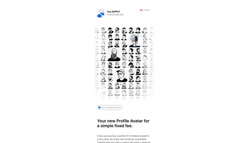
Design this system as a tiny, deliberate stack of cards in the middle of a large white page. The main idea is restraint: one narrow column, soft fog-gray surfaces, clear black copy, and just enough color to mark the main... Creative Monolith Stage is an art-le...

Recurring System Signals

  • Primary is an acid green reserved for the main action.
  • Secondary is a warm stone support surface for secondary action.
  • Tertiary is a showcase accent that can appear in creative proof blocks.
  • Use a dramatic high-contrast serif for the largest statements.
  • Use a simple UI sans for everything operational.
  • Keep the display type huge enough to compete with the artwork.

Related Keywords

OverviewImage DirectionColorsTypographyUse a simple UI sans for everything operationalSecondary ( FFFDFC): Card and note surfaceTertiary ( A7C93D): Score and success accentLabels: Slightly firmer grotesk for compact UI clarityUse black pills as the clearest action voiceKeep the palette almost monochrome and warmLayoutKeep proof and action modules simple and grounded

tiny.SUPPLY

Home

2026-01-26

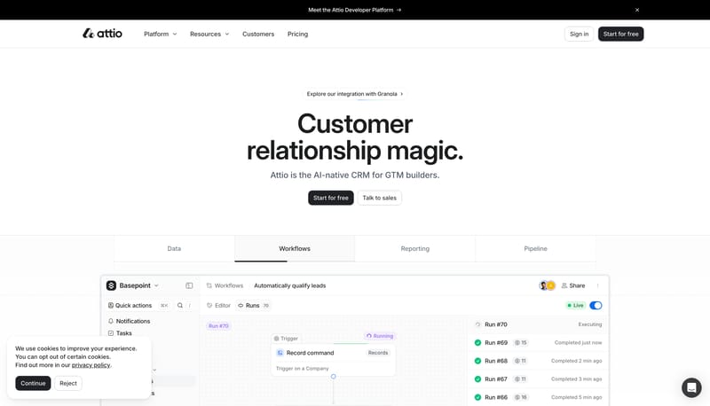
Design this system as a tiny, deliberate stack of cards in the middle of a large white page. The main idea is restraint: one narrow column, soft fog-gray surfaces, clear black copy, and just enough color to mark the main...

Open example

Affinity

Home

2026-01-23

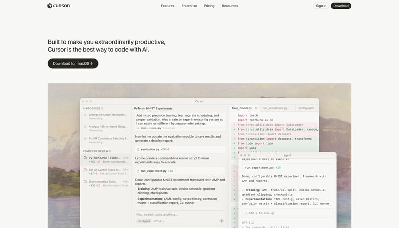
Creative Monolith Stage is an art-led software system that treats the page like a black gallery wall. It should feel oversized, theatrical, and unmistakably visual: massive serif display type, vivid artwork intrusions, a...

  • Primary is an acid green reserved for the main action.
  • Secondary is a warm stone support surface for secondary action.
Open example

Alma

Home

2026-01-21

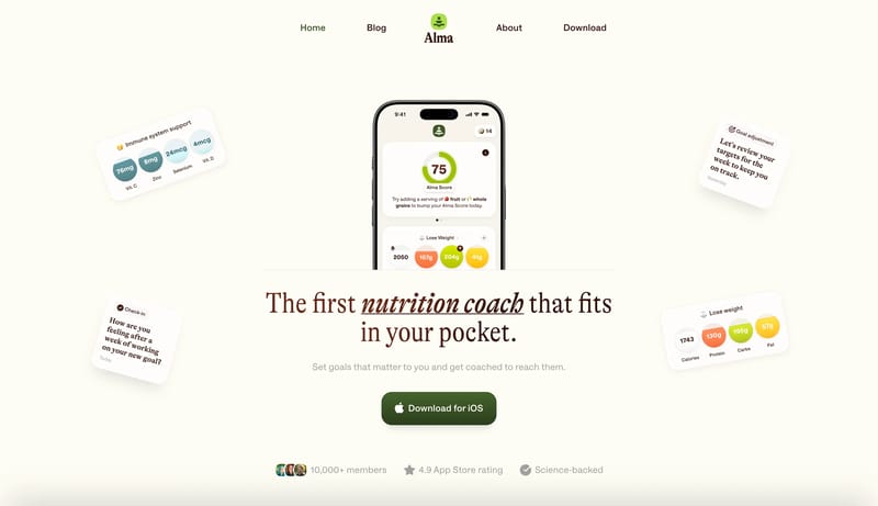
Warm Nutrition Companion is a friendly wellness system that pairs editorial warmth with app-like clarity. The first fold should feel like a helpful coach rather than a hard-selling product page: cream shell, chocolate di...

  • Primary ( 3C5627): Main action fill and high-intent coaching signal.
  • Secondary ( FFFDFC): Card and note surface.
Open example

Continue Exploring

Use these adjacent facet and workflow pages to connect layout principles analysis with other structured design-system concerns across the site.

Layout Principles FAQ

What should I study on this page?

Study how these examples describe white space, grid logic, pacing, and layout hierarchy in a way implementation teams can actually reuse.

Why browse this as a dedicated DESIGN.md collection?

A focused collection makes it easier to compare how teams describe one system concern consistently across many examples instead of mixing unrelated signals on a single page.