Design Analysis
What stands out in Light websites
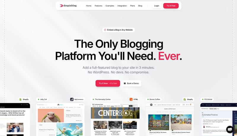
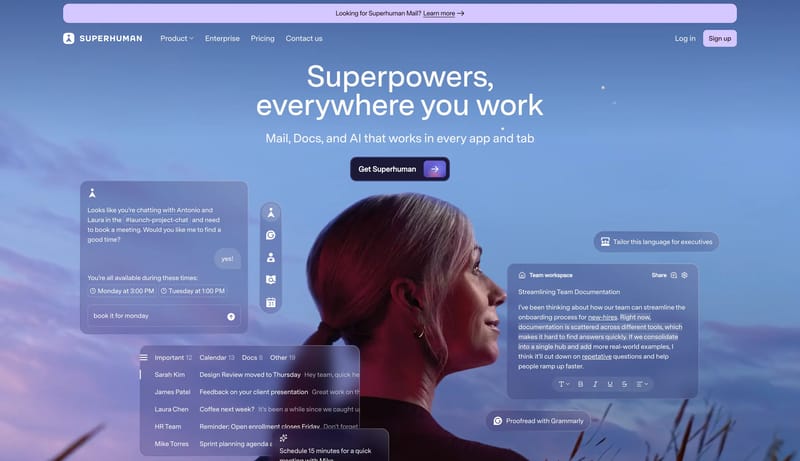
Soft Commerce Publishing is a bright, product-led system that feels polished without becoming sterile. It uses huge black headlines, a floating rounded navigation shell, and a single coral-red action color to make embedd... Iridescent Revenue Ledger is a finan...
Soft Commerce Publishing is a bright, product-led system that feels polished without becoming sterile. It uses huge black headlines, a floating rounded navigation shell, and a single coral-red action color to make embedd...
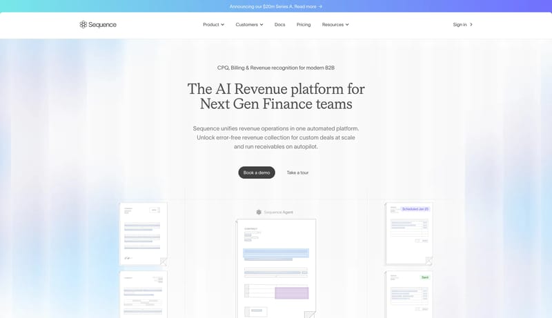
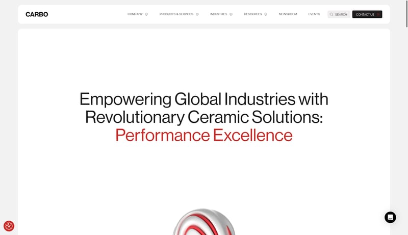
Open exampleIridescent Revenue Ledger is a financial-operations system that feels composed rather than flashy. It should read like a premium ledger sheet: pale shell, precise grid alignment, charcoal pill actions, serif statements f...
- Primary is charcoal and powers the main CTA.
- Secondary is a pale neutral support surface.
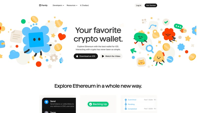
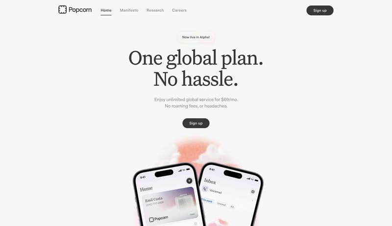
Open examplePlayful Wallet Utility is a consumer-facing system that softens financial software with mascots, rounded controls, and bright support accents while keeping the actual decision points crisp and black. It should feel appro...
Open example