Design Analysis
What stands out in Light websites
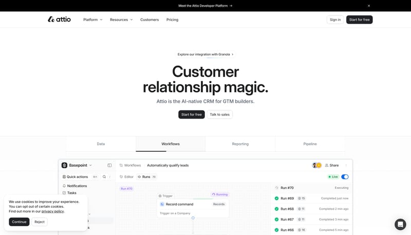
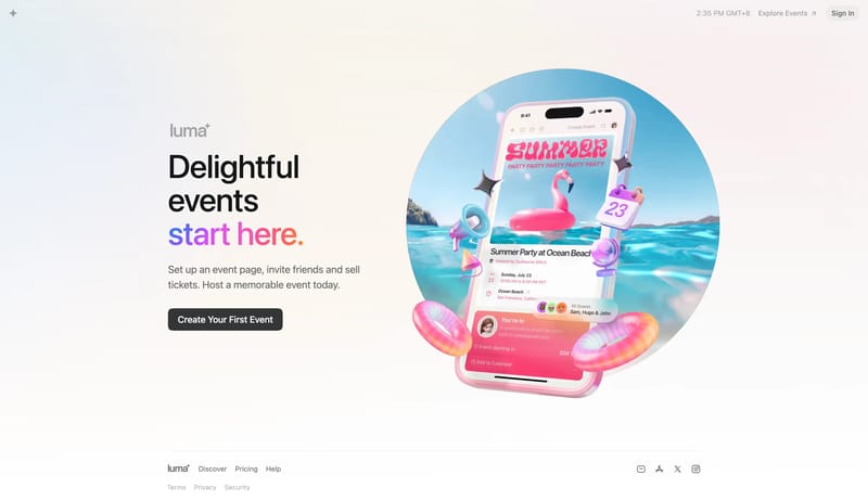
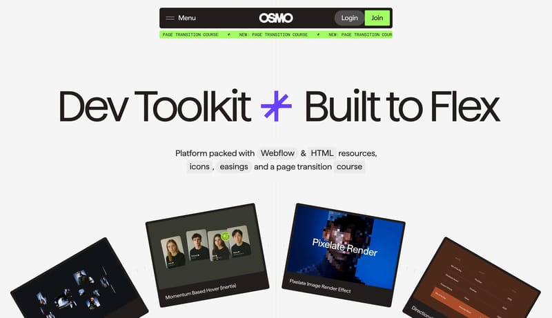
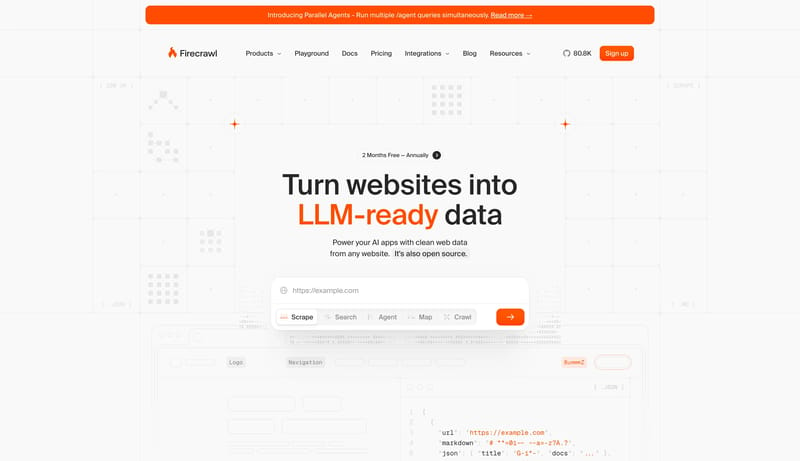
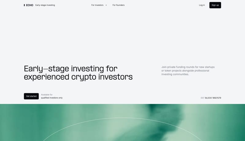
Build the experience as a near-white CRM field that feels spacious, exact, and product-led. Let faint guide systems, soft product windows, and crisp black CTAs carry the structure instead of dense feature clutter. Keep t... This design language is a high-contr...
Build the experience as a near-white CRM field that feels spacious, exact, and product-led. Let faint guide systems, soft product windows, and crisp black CTAs carry the structure instead of dense feature clutter. Keep t...
- Build the experience as a near-white CRM field that feels spacious, exact, and product-led.
- Let faint guide systems, soft product windows, and crisp black CTAs carry the structure instead of dense feature clutter.
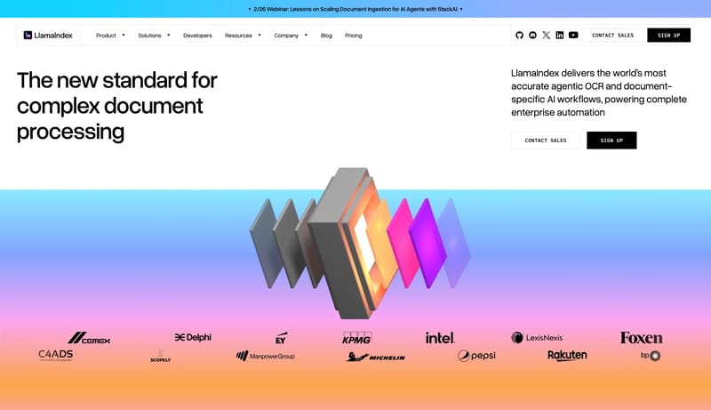
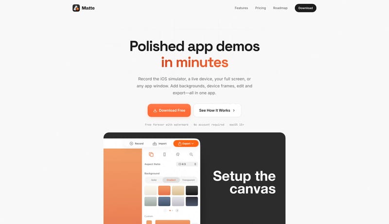
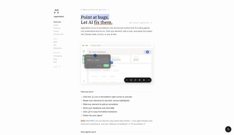
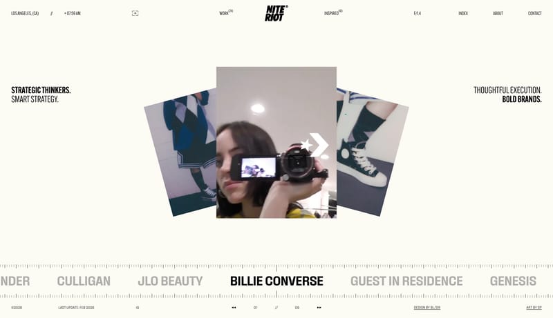
Open exampleThis design language is a high-contrast engineering system for document intelligence and agent workflows. It uses white space, hard black controls, large rounded-grotesk type, technical tables, and structured gradient ob...
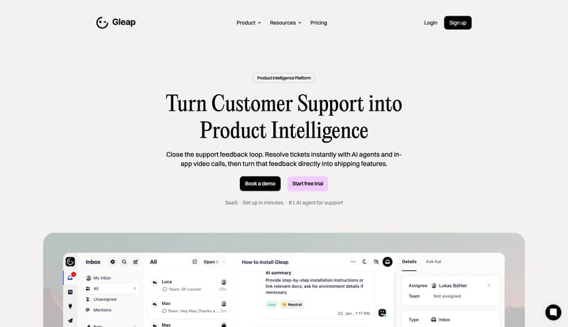
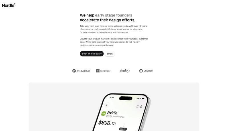
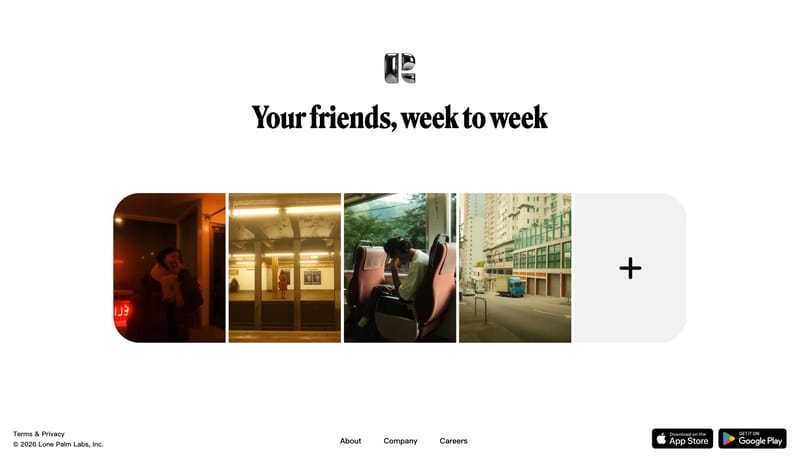
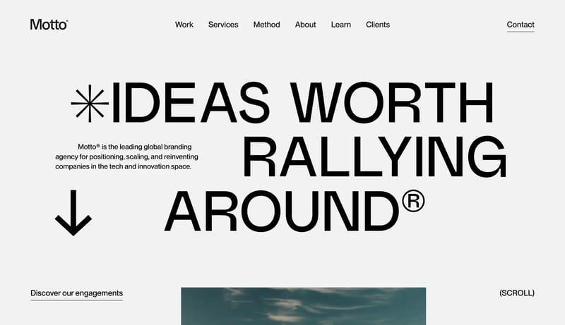
Open exampleUse a white, editorial SaaS language: large serif headlines, compact black actions, pastel secondary CTAs, rounded product panels, and calm pricing cards.
Open example