Macfolio
Home
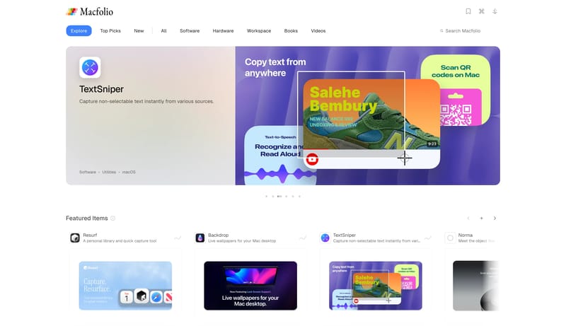
Build for a bright editorial catalog rather than a dark software landing page. Keep the shell quiet and spacious so the curation, not the chrome, defines the first impression. Mix practical browsing controls with more li...
- Build for a bright editorial catalog rather than a dark software landing page.
- Keep the shell quiet and spacious so the curation, not the chrome, defines the first impression.