Design Analysis
What stands out in Light websites
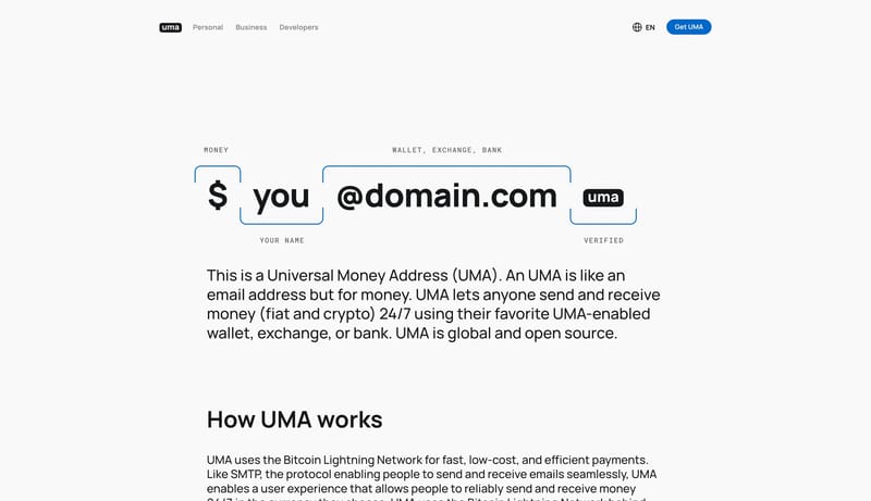
This design language explains a payment-address protocol through large, simple visual objects. The interface should feel open, trustworthy, and obvious: a white canvas, bold address syntax, blue verification marks, round... Build the system as white space, gia...
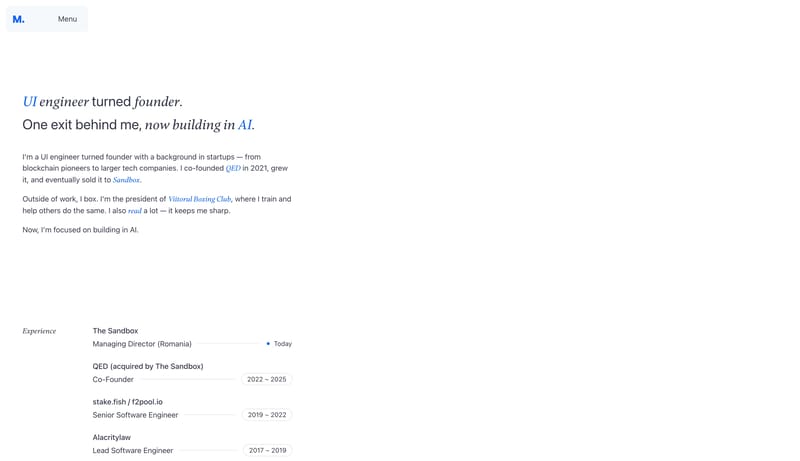
Universal Money Address
Home
This design language explains a payment-address protocol through large, simple visual objects. The interface should feel open, trustworthy, and obvious: a white canvas, bold address syntax, blue verification marks, round...
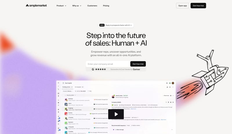
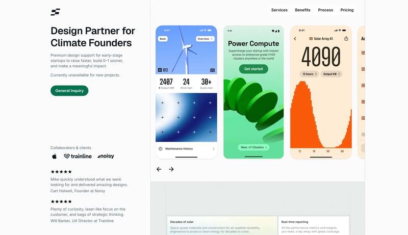
Open exampleBuild the system as white space, giant dark statements, and one orderly row of signal tiles. Use lilac and violet to energize proof without changing the page shell into an accent wash. Let monochrome pills keep the inter...
- Build the system as white space, giant dark statements, and one orderly row of signal tiles.
- Use lilac and violet to energize proof without changing the page shell into an accent wash.
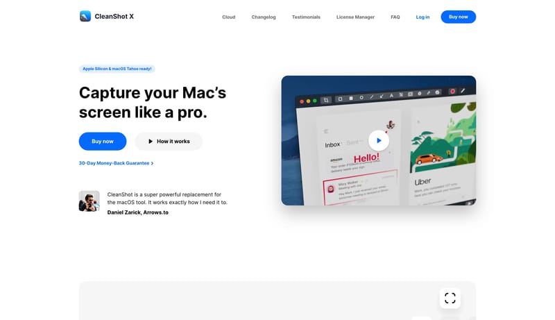
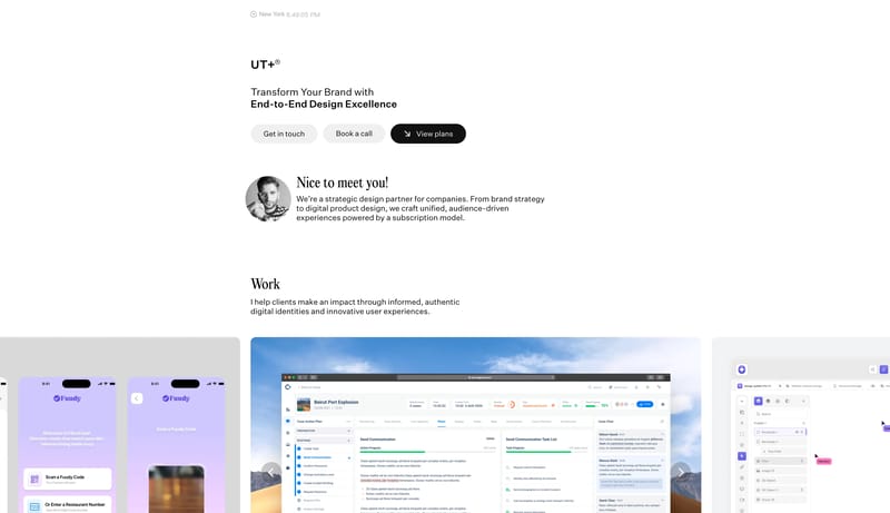
Open exampleBuild a service-page system that feels clear, dependable, and quietly premium. A clean Webflow-operator system built from white space, black call-to-action blocks, blue atmospheric blur, and oversized case panels.
Open example