Design Analysis
What stands out in Light websites
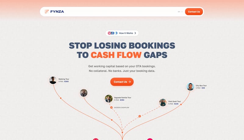
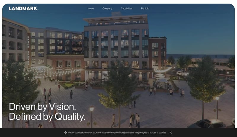
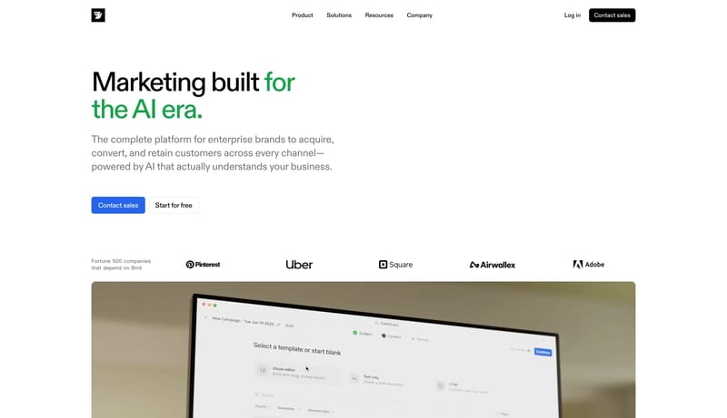
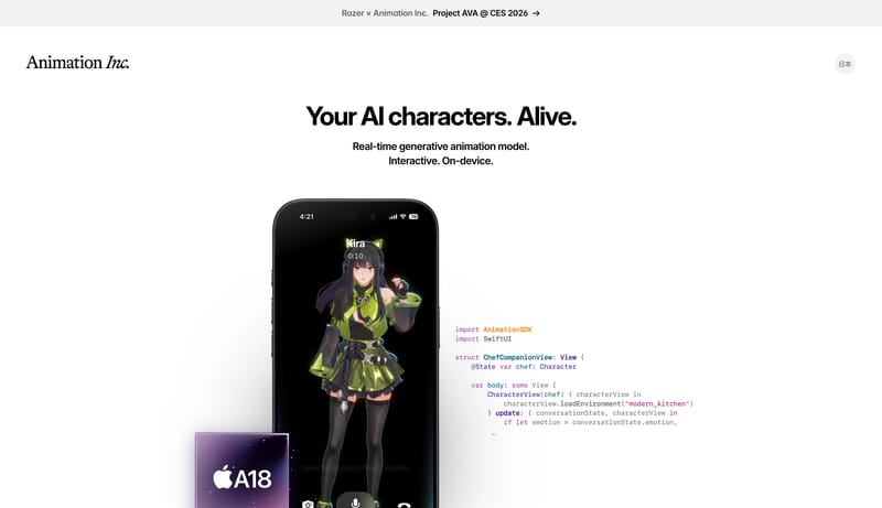
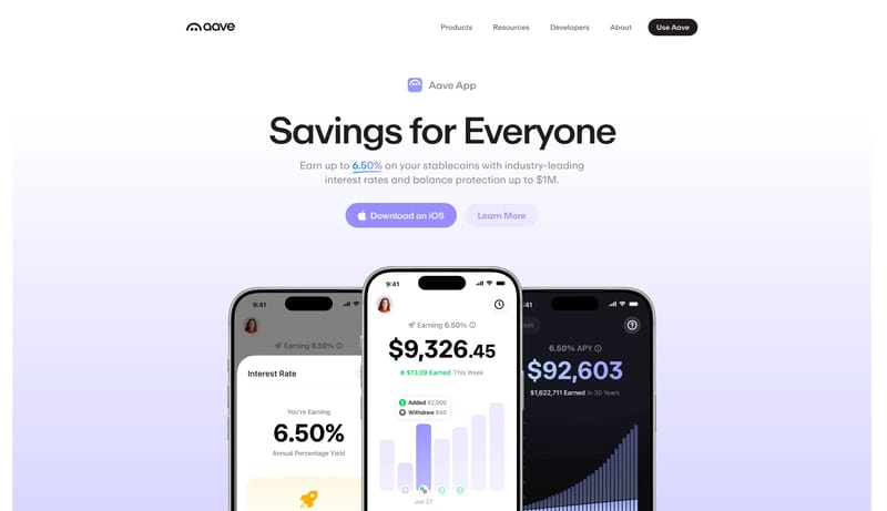
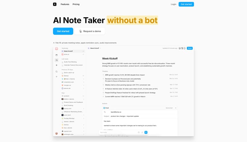
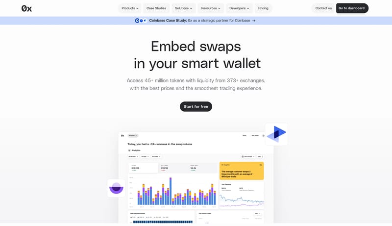
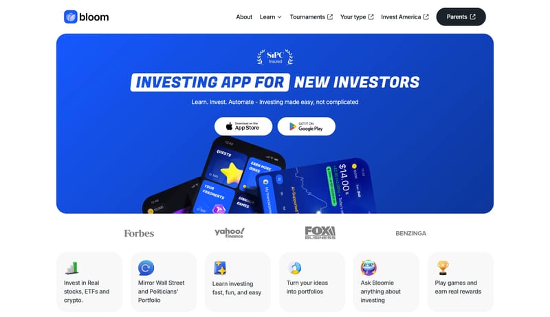
Build a finance shell that feels calm and operationally credible rather than flashy. Use white space, direct copy, and a narrow accent range to signal trust. Keep proof and action modules simple and grounded. Favor restr... Build a selective studio shell where...
Build a finance shell that feels calm and operationally credible rather than flashy. Use white space, direct copy, and a narrow accent range to signal trust. Keep proof and action modules simple and grounded. Favor restr...
- Build a finance shell that feels calm and operationally credible rather than flashy.
- Use white space, direct copy, and a narrow accent range to signal trust.
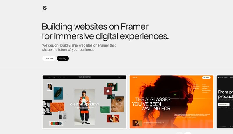
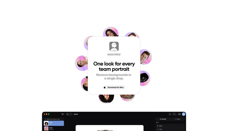
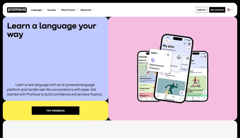
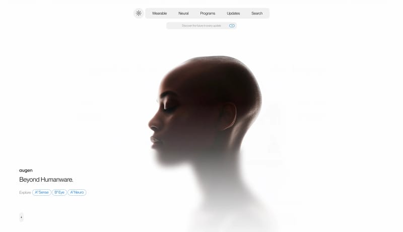
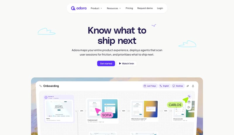
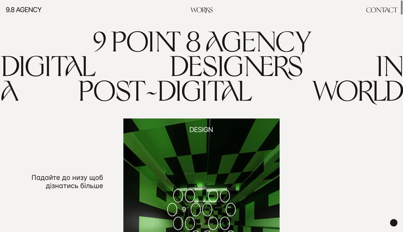
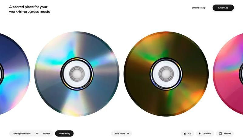
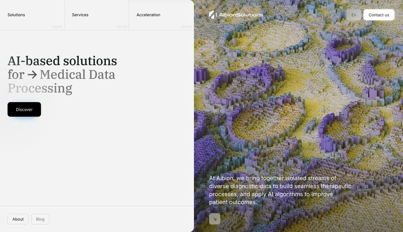
Open exampleBuild a selective studio shell where type, spacing, and media carry most of the brand weight. Keep interfaces visually quiet so case-study imagery or hero moments stay primary. Let one accent or one tonal inversion punct...
- Build a selective studio shell where type, spacing, and media carry most of the brand weight.
- Keep interfaces visually quiet so case-study imagery or hero moments stay primary.
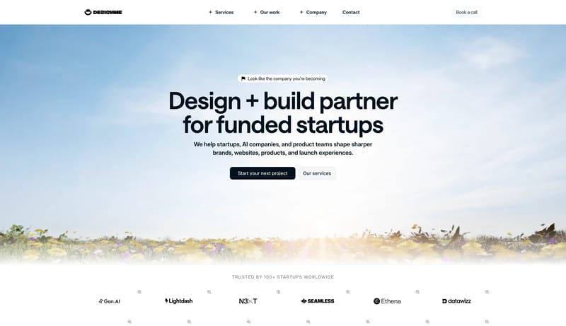
Open example