Design Analysis
What stands out in Light websites
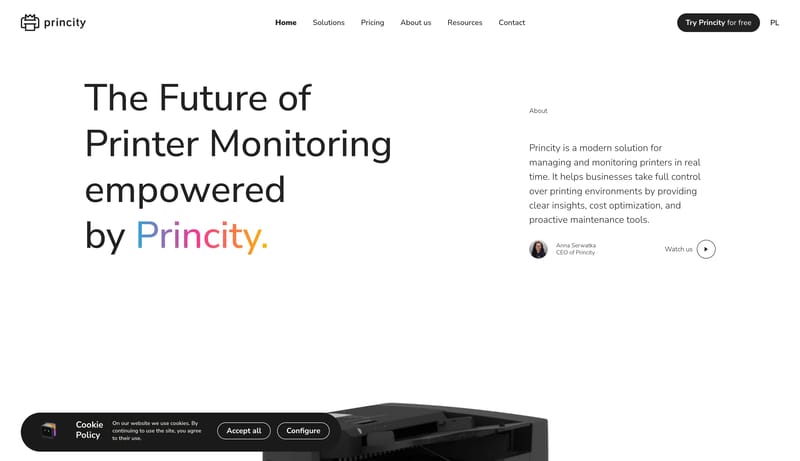
Build for a product that wants to sound useful, local, and technically honest. Keep the page stripped down. Big typography and product proof should do almost all the work. Avoid the usual glossy fintech tone. This system... Build for a cheerful consumer writin...
Recurring Signals
- Build for a product that wants to sound useful, local, and technically honest.
- Keep the page stripped down. Big typography and product proof should do almost all the work.
- Avoid the usual glossy fintech tone. This system should feel closer to a good CLI tool than to a finance lifestyle brand.
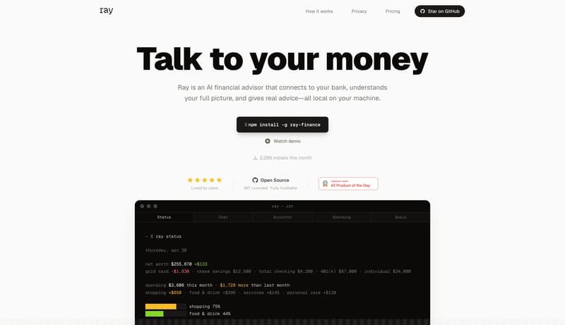
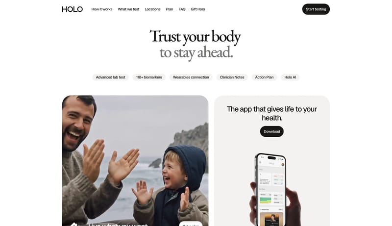
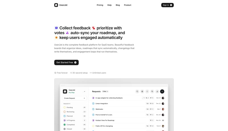
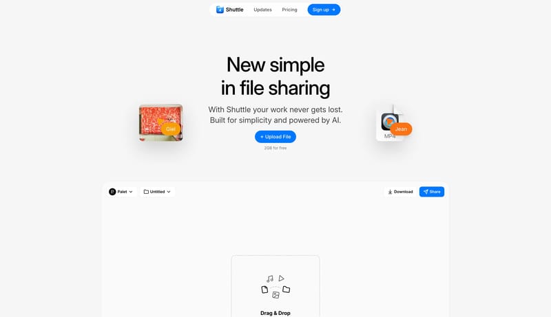
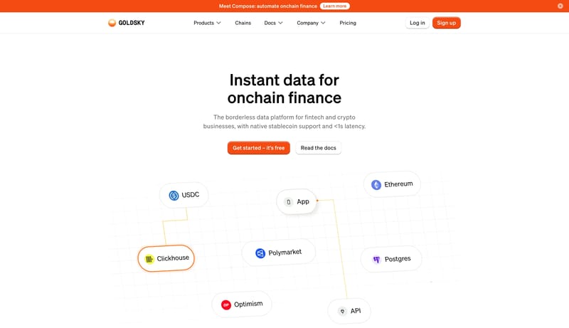
- Use dark terminal or app windows as the main visual proof.
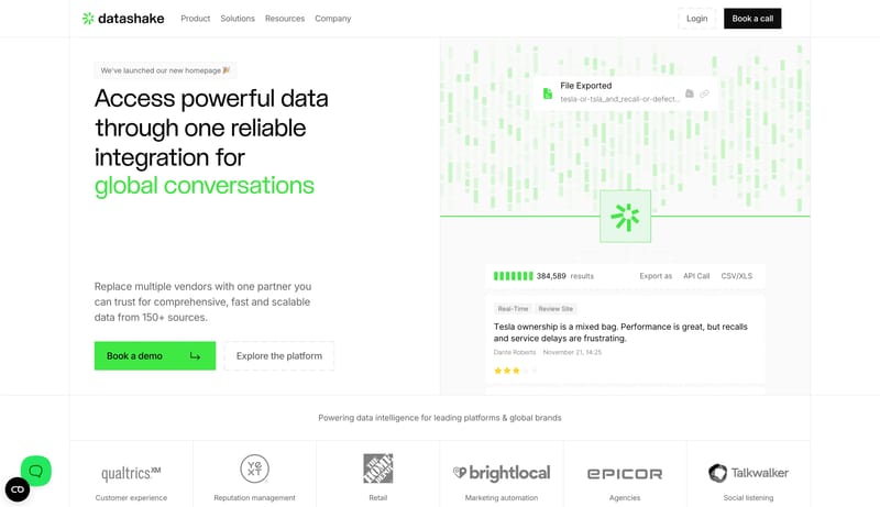
- Support them with simple light cards and plain documentation layouts.
- Keep color bursts small and data-driven, mostly inside the product frame.
Related Keywords
OverviewImage DirectionColorsTypographyLayoutPrimary ( 111111): headline, body, and rule colorSecondary ( F1F1ED): muted module surfaceTertiary ( BEBEB7): diagram and utility support colorDisplay: oversized and poster-likeBody: concise and structured, not chattyUtility: mono labels, tags, and section annotationsKeep the shell near-white and highly legible
Build for a product that wants to sound useful, local, and technically honest. Keep the page stripped down. Big typography and product proof should do almost all the work. Avoid the usual glossy fintech tone. This system...
- Build for a product that wants to sound useful, local, and technically honest.
- Keep the page stripped down. Big typography and product proof should do almost all the work.
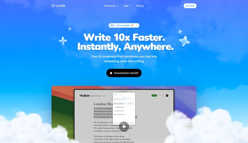
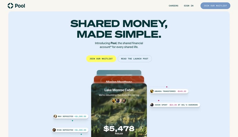
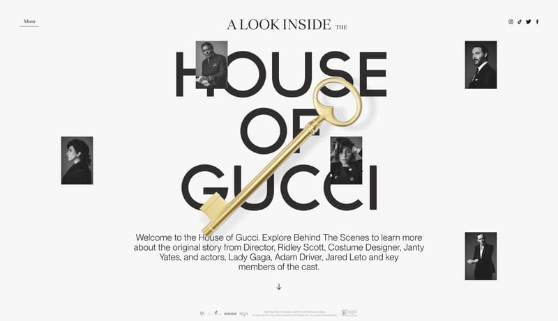
Open exampleBuild for a cheerful consumer writing tool with a strong first-screen personality. Let the hero feel bright, buoyant, and instantly legible. Keep secondary pages calmer and cleaner, but still clearly part of the same fri...
- Build for a cheerful consumer writing tool with a strong first-screen personality.
- Let the hero feel bright, buoyant, and instantly legible.
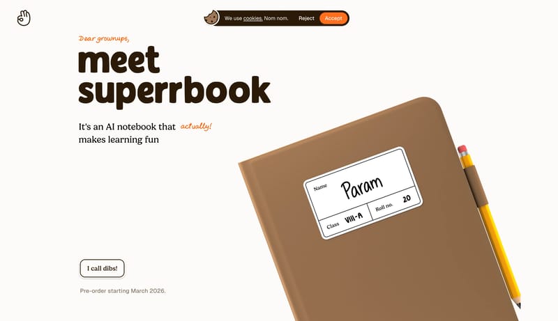
Open exampleThis design language treats a learning product like a tactile children’s book. It uses ivory paper, chocolate serif type, hand-drawn orange annotations, illustrated notebook scenes, meadow-like bands, and very large paus...
Open example