Overview
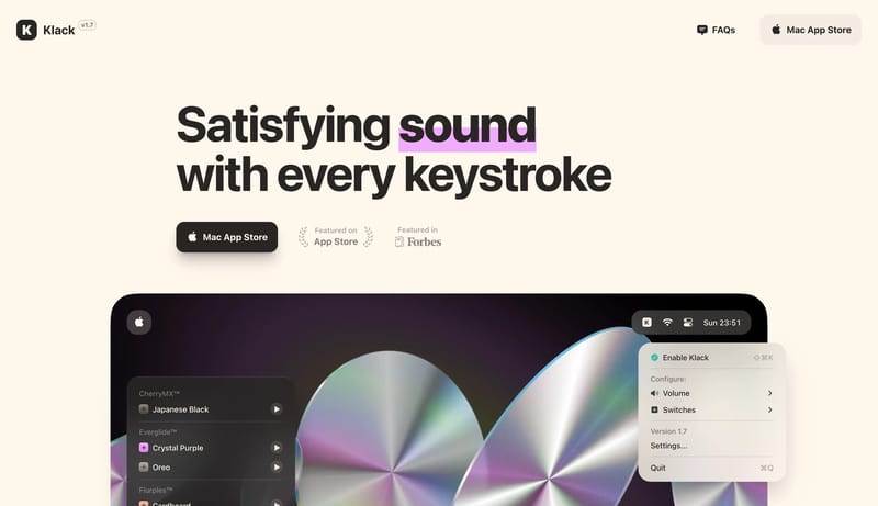
Use a warm cream canvas, huge bold type, dark rounded download buttons, tactile product mockups, and oversized line icons. The interface should feel satisfying and physical.

Design Analysis
Use a warm cream canvas, huge bold type, dark rounded download buttons, tactile product mockups, and oversized line icons. The interface should feel satisfying and physical.
Use a warm cream canvas, huge bold type, dark rounded download buttons, tactile product mockups, and oversized line icons. The interface should feel satisfying and physical.
Use cream instead of white as the main atmosphere. Use warm dark ink for text, icons, and primary buttons. Use purple as a small highlight behind important words or active switch states.
Use system sans typography with heavy weight. Hero type can be 96px / 96px; feature labels should be bold and large.
Lead with a big left-aligned headline and product proof below. Follow with large icon feature grids. Support pages may invert to a dark shell with cream text.