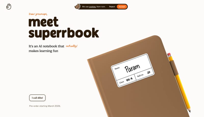
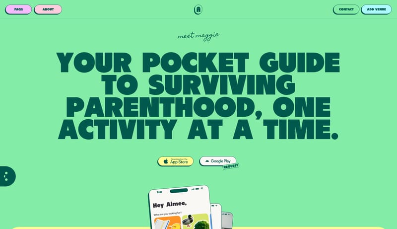
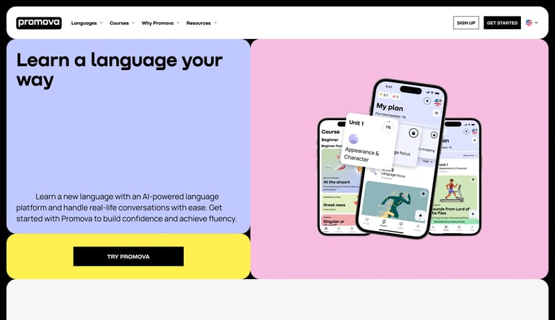
Root Square

Root Square

Online math tutoring for expat and international school students. Bilingual lessons in English and Russian, tailored to each child.

4.0
5
Visits
Visit

Available Pages

Version History

Design Analysis

Root Square Home design analysis

Build a learning shell that feels encouraging and characterful without becoming chaotic. Use playful type, illustration, and color as the trust engine before adding dense product UI. Keep actions obvious and high-contras...

Key Takeaways

  • Build a learning shell that feels encouraging and characterful without becoming chaotic.
  • Use playful type, illustration, and color as the trust engine before adding dense product UI.
  • Keep actions obvious and high-contrast for parents or first-time visitors.
  • Favor illustrated characters, soft diagrams, or bright learning scenes over sterile stock photography.
  • Use color-blocked panels that feel classroom-friendly and easy to scan.
  • Base the shell on EDF5E9 and keep 0E2A1B as the primary reading color.

Overview

  • Build a learning shell that feels encouraging and characterful without becoming chaotic.
  • Use playful type, illustration, and color as the trust engine before adding dense product UI.
  • Keep actions obvious and high-contrast for parents or first-time visitors.

Image Direction

  • Favor illustrated characters, soft diagrams, or bright learning scenes over sterile stock photography.
  • Use color-blocked panels that feel classroom-friendly and easy to scan.

Colors

  • Base the shell on EDF5E9 and keep 0E2A1B as the primary reading color.
  • Use 195736 as the main emphasis color and keep it scarce enough to preserve hierarchy.
  • Let FFFFFF and B7D3B5 separate secondary surfaces without introducing noisy ornament.

Typography

  • Use Neucha as the display voice. It should read as assertive display sans.
  • Use sans-serif for body copy, controls, and supporting metadata.
  • Let scale and spacing create emphasis before adding extra font families or decorative effects.

Design.md

System Overview

Core identity and authoring metadata from the refto.one design model.

Illustrated Mint Learning Playground

A playful education system with mint paper backgrounds, handwritten display type, cartoon illustration blocks, and rounded card scaffolding.

friendly, illustrative, and reassuring

Primary mode: lighteducation marketingui-rich

Theme

Fields outside the primary renderer remain visible here as structured fallback content.

Visual atmosphere
Summary
friendly, illustrative, and reassuring
Density
3
Variance
3
Motion
2
Signals
primary background #EDF5E9 · primary action #195736 · display font Neucha · body font sans-serif

Colors

Primitive palettes and resolved token colors for the active preview mode.

Palette colors
Primary
#195736
Secondary
#EDF5E9
Neutral
#EDF5E9
Surface
#FFFFFF
On Surface
#0E2A1B
Usage rules
Keep #195736 reserved for intentional emphasis.
Use #FFFFFF and #B7D3B5 to separate layers without over-framing them.

Token Spacing

Spacing scales rendered as tokens with a simple length specimen.

xs
0.5rem
sm
0.75rem
md
1rem
lg
1.5rem
xl
2.5rem
section_gap
clamp(4rem, 8vw, 7rem)

Token Radii

Corner radii tokens with a live surface sample.

control
14px
card
24px
full
999px

Typography Families

Font families from the current design YAML, including fallback stacks and usage character.

Display
Neucha
assertive display sans
Body
sans-serif
practical UI sans

Typography Scale

Top-level typography scale rendered as live text specimens.

Display
4.5rem/—
Display
H2
2.75rem/—
H2
Body
1rem/—
Body
Label
0.9rem/—
Label

Typography Rules

Fields outside the primary renderer remain visible here as structured fallback content.

Rules
Keep the display voice dominant in headlines only. · Use the body family consistently for UI and supporting text.

Motion

Motion tokens rendered as resolved values for timing and personality.

Duration
150ms-220ms
Easing
cubic-bezier(.3,0,.2,1)

Motion

Resolved motion token values.

PropertyValue
duration150ms-220ms
easingcubic-bezier(.3,0,.2,1)

Layout Principles

Break the page into rounded modules with generous spacing and obvious reading order.
Use a simple grid and let illustrations interrupt it in controlled ways.

Component Preview

Low-complexity component tokens rendered as design-system specimens.

Buttons primary
Base Attributes
Background
#F6E38D
Text
#195736
Border
1px solid rgba(25,87,54,0.22)
Radius
999px
Padding
0 24px
Min height
42px
Shadow
none
Font family
"Baloo 2", system-ui, sans-serif
Font size
13px
Font weight
600
Specimen label
Find me my tutor
Buttons secondary
Base Attributes
Background
#3FD07D
Text
#195736
Border
none
Radius
999px
Padding
0 18px
Min height
38px
Shadow
none
Font family
"Baloo 2", system-ui, sans-serif
Font size
12px
Font weight
600
Specimen label
Talk to Us
Cards default
Lesson Card
Component preview content
Base Attributes
Background
#FFFFFF
Text
#195736
Border
2px solid rgba(25,87,54,0.18)
Radius
20px
Padding
22px
Min width
280px
Shadow
none
Specimen label
Lesson Card
Navigation desktop
OverviewFeaturesDocs
Base Attributes
Background
transparent
Text
#195736
Height
24px
Active text
#195736
Item padding
0 8px
Item radius
0px
Specimen label
Our Approach
Inputs default
Base Attributes
Background
#FFFFFF
Text
#195736
Placeholder color
rgba(17,17,17,0.45)
Border
1px solid rgba(25,87,54,0.2)
Radius
999px
Padding
0 16px
Min height
40px
Font family
"Baloo 2", system-ui, sans-serif
Font size
14px
Placeholder
Email Us
Specimen label
Email Us

Anti Patterns

Compact list of patterns the design system explicitly avoids.

  • -
    Do not promote default browser blue links into the canonical palette.
  • -
    Do not treat low-confidence DOM wrappers as polished component evidence.
  • -
    Do not add extra accent colors that were not visually supported by the source.