Browse all DESIGN.md examples

Component Rules

Browse DESIGN.md examples that make component rules explicit through buttons, navigation, cards, variants, and state definitions.

178 curated examples24 per pagePage 6 of 8

What To Review

Compare how teams define reusable components, state logic, emphasis levels, and naming conventions so implementation becomes less ambiguous.

What To Compare

Look for state coverage, component naming clarity, variant strategy, interaction rules, and whether the system is strong enough to support repeated UI work without ad hoc decisions.

Design Analysis

Common component rules signals

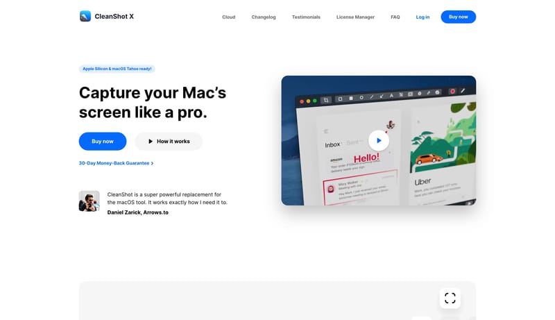
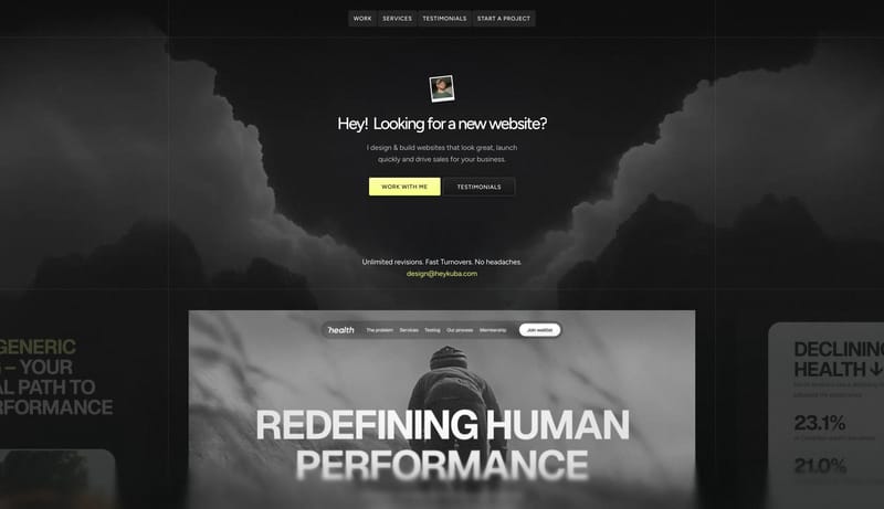
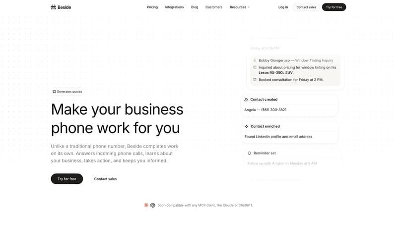
Keep the interface almost austere. Use white space and quiet confidence as the premium signal. Let the black CTA and subtle warm accents carry the few moments of emphasis. White should dominate. Black should be used for... Build for a premium Mac-utility store...
Recurring System Signals

  • Keep the interface almost austere.
  • Use white space and quiet confidence as the premium signal.

  • Let the black CTA and subtle warm accents carry the few moments of emphasis.
  • White should dominate.
  • Black should be used for text and high-intent actions.
  • Warm beige accents should stay faint and localized.

Related Keywords

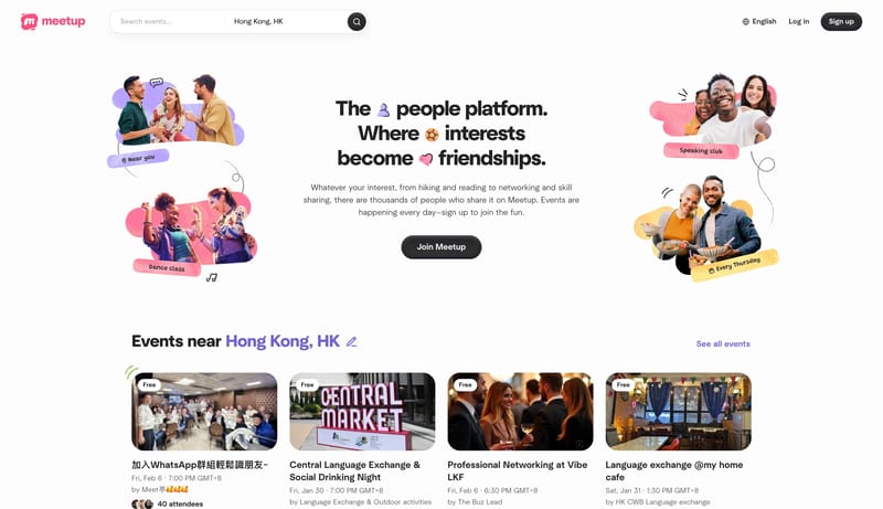
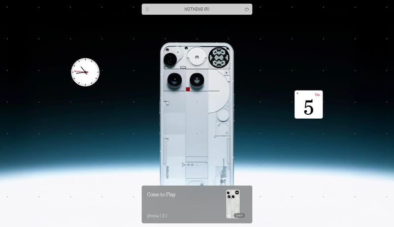
OverviewColorsTypographyLayoutKeep the interface almost austereWhite should dominateWarm beige accents should stay faint and localizedImage DirectionPrimary ( FF5A5F): the warm social signalTertiary ( B79CFF): soft lavender support accentDisplay: compact, strong, and highly legibleBody: short and practical, supporting dense metadata

Beside

Home

2026-03-31

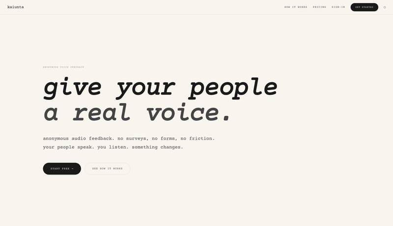
Keep the interface almost austere. Use white space and quiet confidence as the premium signal. Let the black CTA and subtle warm accents carry the few moments of emphasis. White should dominate. Black should be used for...
  • Keep the interface almost austere.
  • Use white space and quiet confidence as the premium signal.

Open example

Backdrop

Home

2026-04-30

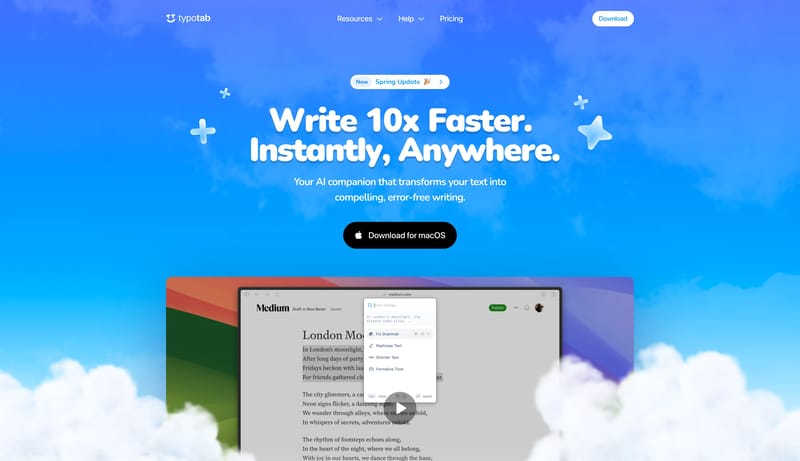
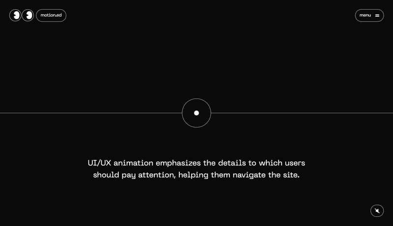
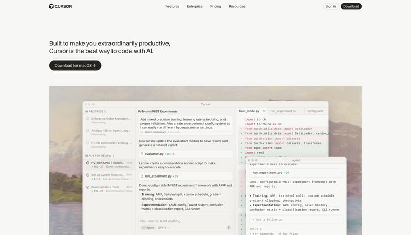
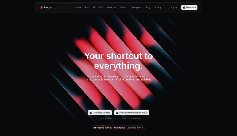
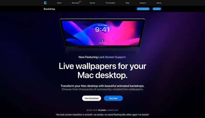
Build for a premium Mac-utility storefront with strong Apple-adjacent polish. Let the first impression come from cinematic product art and large dark product banners. Keep the voice direct and product-centered rather tha...
  • Build for a premium Mac-utility storefront with strong Apple-adjacent polish.
  • Let the first impression come from cinematic product art and large dark product banners.
Open example

Keeby

Home

2026-04-30

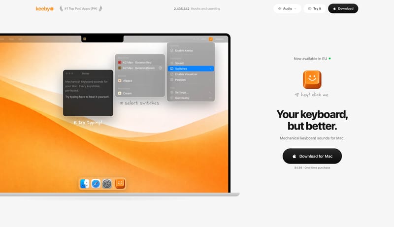
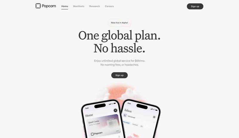
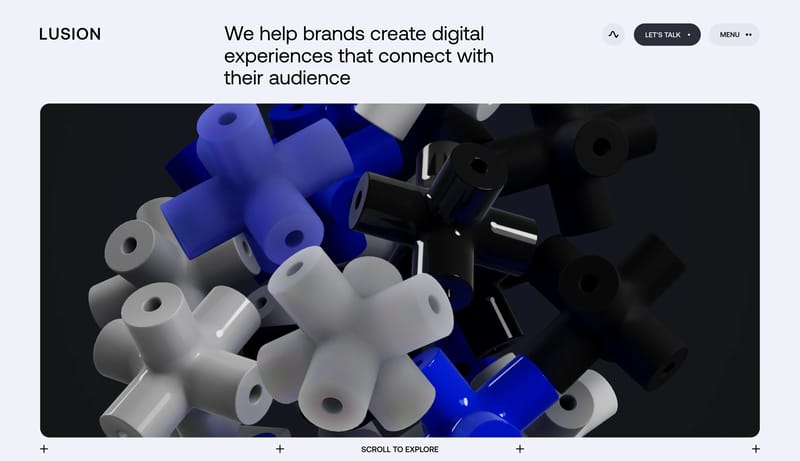
Build for a consumer Mac utility with a lot of confidence in one single demo scene. Keep the page visually sparse. Empty space is part of the product story. Let the hero feel playful and tangible rather than technical or...

  • Build for a consumer Mac utility with a lot of confidence in one single demo scene.
  • Keep the page visually sparse. Empty space is part of the product story.
Open example

Continue Exploring

Use these adjacent facet and workflow pages to connect component rules analysis with other structured design-system concerns across the site.

Component Rules FAQ

What should I study on this page?

Compare how teams define reusable components, state logic, emphasis levels, and naming conventions so implementation becomes less ambiguous.

Why browse this as a dedicated DESIGN.md collection?

A focused collection makes it easier to compare how teams describe one system concern consistently across many examples instead of mixing unrelated signals on a single page.