Browse all DESIGN.md examples

Component Rules

Browse DESIGN.md examples that make component rules explicit through buttons, navigation, cards, variants, and state definitions.

151 curated examples24 per pagePage 5 of 7

What To Review

Compare how teams define reusable components, state logic, emphasis levels, and naming conventions so implementation becomes less ambiguous.

What To Compare

Look for state coverage, component naming clarity, variant strategy, interaction rules, and whether the system is strong enough to support repeated UI work without ad hoc decisions.

Design Analysis

Common component rules signals

--- version: alpha name: "Ledger Artifact Minimalism" description: "A sparse archival portfolio language built from white voids, thin rules, barcode-like utility detail, and restrained dark artifact imagery." colors: pri... --- version: alpha name: Desktop Ops...

Recurring System Signals

  • Build the experience as an index, dossier, or ledger rather than a promotional portfolio.
  • Let whitespace do most of the talking.
  • Use thin rules, utility stamps, and microtype to organize information with extreme restraint.
  • Use sparse archival imagery, muted product stills, and occasional dark slabs to punctuate the page.
  • Keep every image isolated and surrounded by substantial white space.
  • Let visual artifacts feel collected, documented, or filed rather than marketed.

Related Keywords

OverviewImage DirectionColorsTypographyLet whitespace do most of the talkingLayoutPrimary ( FF5A5F): the warm social signalTertiary ( B79CFF): soft lavender support accentDisplay: compact, strong, and highly legibleBody: short and practical, supporting dense metadataKeep the shell near-white and highly legibleUse lime for the clearest conversion action

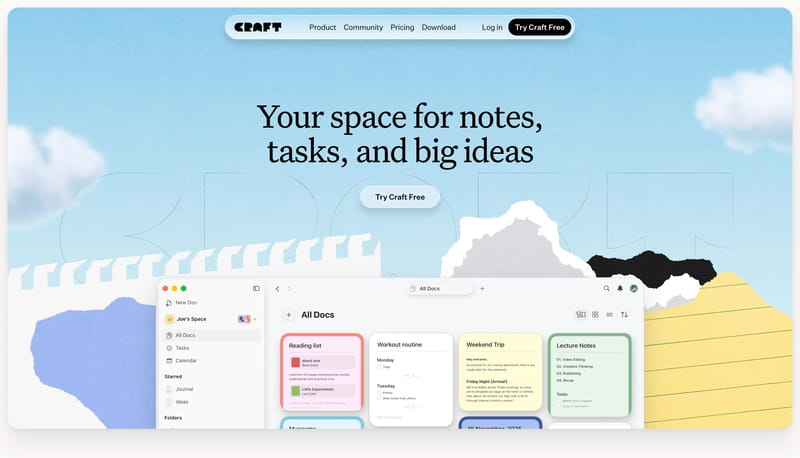
Aaron Sananes

Home

2026-01-06

--- version: alpha name: "Ledger Artifact Minimalism" description: "A sparse archival portfolio language built from white voids, thin rules, barcode-like utility detail, and restrained dark artifact imagery." colors: pri...

  • Build the experience as an index, dossier, or ledger rather than a promotional portfolio.
  • Let whitespace do most of the talking.
Open example

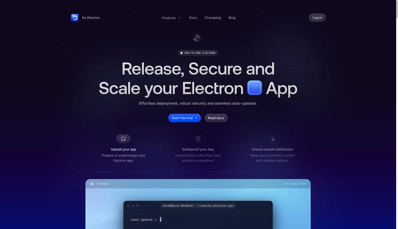
ToDesktop

Home

2026-02-22

--- version: alpha name: Desktop Ops Nebula description: A desktop release-platform design language with dark nebula hero stages, circuit-line framing, blue action buttons, translucent nav, light documentation shells, an...

Open example
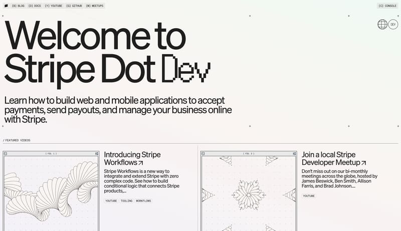
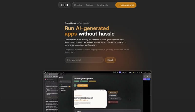
Backdrop

Home

2026-04-30

--- version: alpha name: "Cindori Design Language" description: "A cinematic dark storefront for polished Mac utilities, driven by large product banners, premium app imagery, and clear purchase actions." colors: primary:...

  • Build for a premium Mac-utility storefront with strong Apple-adjacent polish.
  • Let the first impression come from cinematic product art and large dark product banners.
Open example
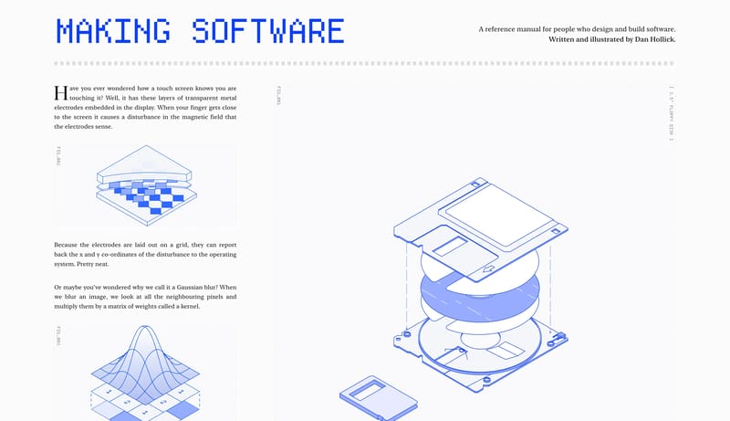
Component Rules FAQ

What should I study on this page?

Compare how teams define reusable components, state logic, emphasis levels, and naming conventions so implementation becomes less ambiguous.
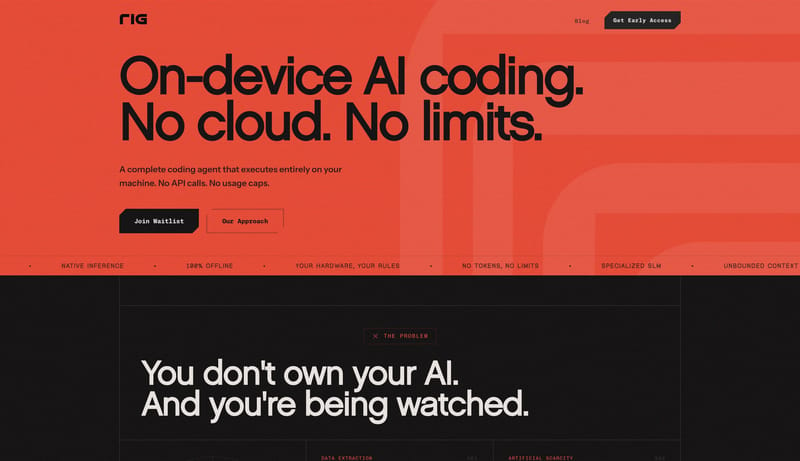

Why browse this as a dedicated DESIGN.md collection?

A focused collection makes it easier to compare how teams describe one system concern consistently across many examples instead of mixing unrelated signals on a single page.