Design Analysis
Common color systems signals
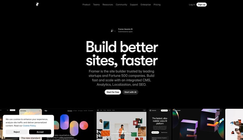
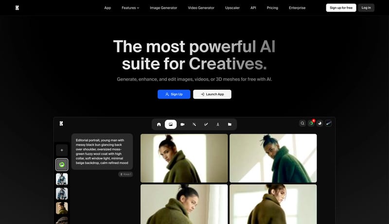
Midnight Builder Marquee is a black-first launch system that sells speed and polish through reduction. The shell should feel almost empty at first glance: one oversized white headline, one short block of cool-gray suppor... Build for a developer and enterprise...
Recurring System Signals
- Primary ( FFFFFF): Display text and the highest-intent CTA fill.
- Secondary ( 1B1B1B): Quiet dark support action fill and panel tone.
- Tertiary ( 8E8E93): Support copy, muted navigation, and low-priority labels.
- Display: Very large, bold, tightly tracked, and tightly leaded.
- Body: Neutral and readable, with restrained width under the hero.
- Labels: Slightly heavier than body copy so small navigation items do not disappear on black.
Related Keywords
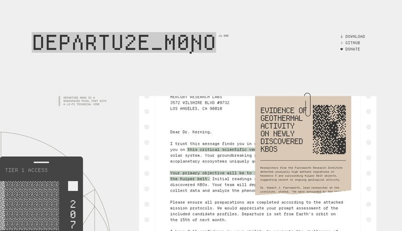
OverviewImage DirectionColorsTypographyAvoid mixing in extra decorative type familiesPrimary ( 444444): Main text and structural inkKeep all visible type mono and pixel-drivenSecondary ( D7E0DB): calm technical backdropTertiary ( EEDB3C): tiny observational signalDisplay: very large, sparse, and low-dramaBody: concise, explanatory, and calmLabels: minimal, mostly for navigation or tiny metadata
Midnight Builder Marquee is a black-first launch system that sells speed and polish through reduction. The shell should feel almost empty at first glance: one oversized white headline, one short block of cool-gray suppor...
- Primary ( FFFFFF): Display text and the highest-intent CTA fill.
- Secondary ( 1B1B1B): Quiet dark support action fill and panel tone.
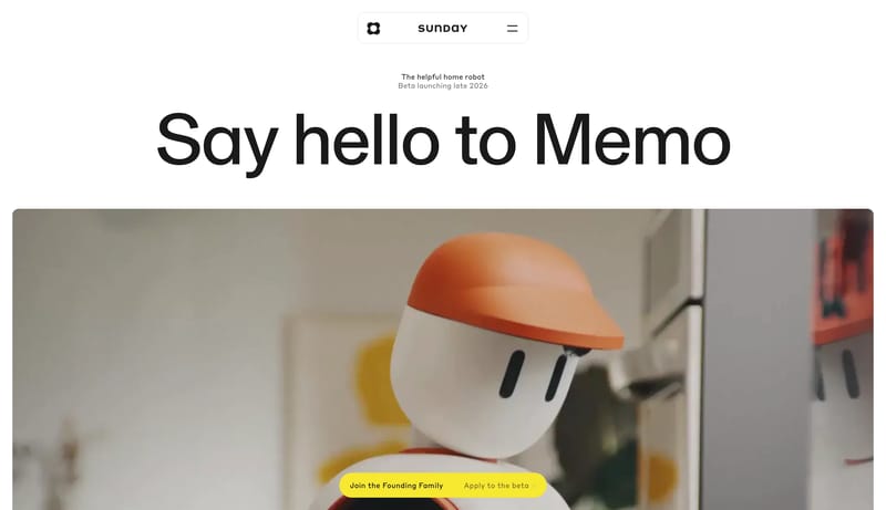
Open exampleBuild for a developer and enterprise audience that expects speed, clarity, and proof. Keep the outer shell warm and editorial so the system does not feel sterile, even when the content gets technical. Let one wide media...
- Build for a developer and enterprise audience that expects speed, clarity, and proof.
- Keep the outer shell warm and editorial so the system does not feel sterile, even when the content gets technical.
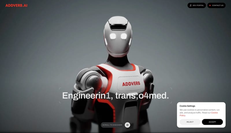
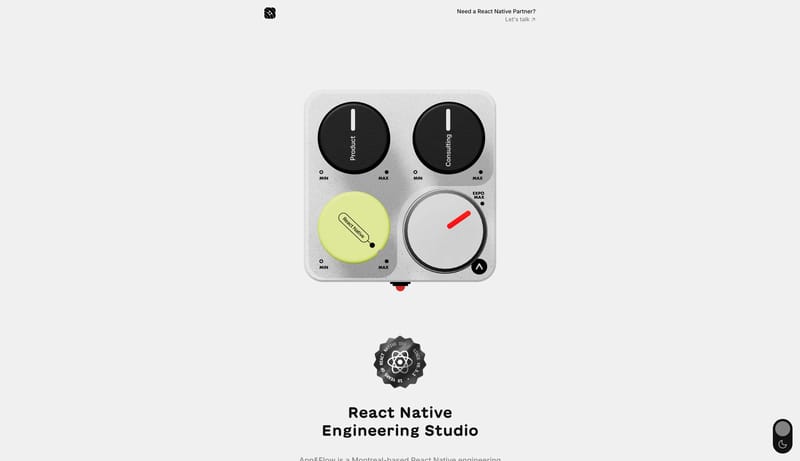
Open exampleMidnight Robotics Stage is a product-stage system that uses black void space and glossy mechanical renders to make the hardware feel singular and cinematic. The interface should behave like a quiet frame around the robot...
Open example