Browse all DESIGN.md examples

Color Systems

Browse DESIGN.md examples where palette systems, semantic tokens, and color logic are described as reusable design infrastructure.

178 curated examples24 per pagePage 7 of 8

What To Compare

Study how these systems document surfaces, accents, text contrast, semantic states, and token naming so color decisions remain durable across implementation.

What To Compare

Pay attention to token structure, contrast strategy, accent restraint, light/dark mode logic, and whether color intent is obvious from the system itself.

Design Analysis

Common color systems signals

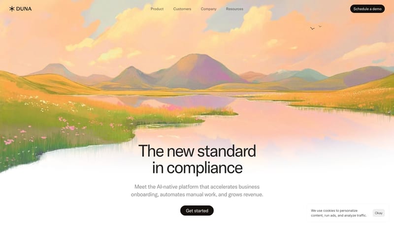
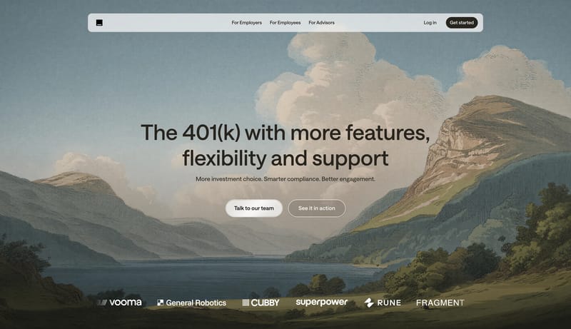
Blend enterprise clarity with scenic emotional softening. Keep the core UI neutral, structured, and trustworthy. Use paintings as a brand atmosphere layer, not as the main information surface. Use romantic landscape pain... Build for a product that wants to so...

Recurring System Signals

  • Blend enterprise clarity with scenic emotional softening.
  • Keep the core UI neutral, structured, and trustworthy.
  • Use paintings as a brand atmosphere layer, not as the main information surface.
  • Use romantic landscape paintings or similarly muted scenic imagery.
  • Keep painted scenes wide and quiet.
  • Pair imagery with orderly comparison or dashboard blocks.

Related Keywords

OverviewImage DirectionColorsTypographyBlend enterprise clarity with scenic emotional softeningKeep the core UI neutral, structured, and trustworthyKeep painted scenes wide and quietPair imagery with orderly comparison or dashboard blocksKeep supporting imagery minimal and mostly structuralPrimary ( 000000): Main text and iconographyUse one sans family throughoutKeep body copy calm and evenly spaced

Basic Capital

Home

2026-03-31

Blend enterprise clarity with scenic emotional softening. Keep the core UI neutral, structured, and trustworthy. Use paintings as a brand atmosphere layer, not as the main information surface. Use romantic landscape pain...

  • Blend enterprise clarity with scenic emotional softening.
  • Keep the core UI neutral, structured, and trustworthy.
Open example

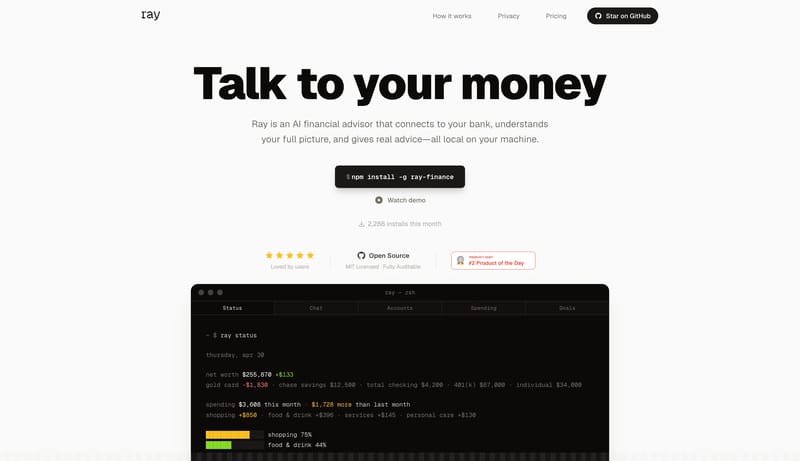
Ray

Home

2026-04-30

Build for a product that wants to sound useful, local, and technically honest. Keep the page stripped down. Big typography and product proof should do almost all the work. Avoid the usual glossy fintech tone. This system...

  • Build for a product that wants to sound useful, local, and technically honest.
  • Keep the page stripped down. Big typography and product proof should do almost all the work.
Open example

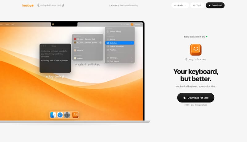
Keeby

Home

2026-04-30

Build for a consumer Mac utility with a lot of confidence in one single demo scene. Keep the page visually sparse. Empty space is part of the product story. Let the hero feel playful and tangible rather than technical or...

  • Build for a consumer Mac utility with a lot of confidence in one single demo scene.
  • Keep the page visually sparse. Empty space is part of the product story.
Open example
Continue Exploring

Use these adjacent facet and workflow pages to connect color systems analysis with other structured design-system concerns across the site.

Color Systems FAQ

What should I study on this page?

Study how these systems document surfaces, accents, text contrast, semantic states, and token naming so color decisions remain durable across implementation.

Why browse this as a dedicated DESIGN.md collection?

A focused collection makes it easier to compare how teams describe one system concern consistently across many examples instead of mixing unrelated signals on a single page.