Browse all DESIGN.md examples

Color Systems

Browse DESIGN.md examples where palette systems, semantic tokens, and color logic are described as reusable design infrastructure.

178 curated examples24 per pagePage 8 of 8

What To Compare

Study how these systems document surfaces, accents, text contrast, semantic states, and token naming so color decisions remain durable across implementation.

What To Compare

Pay attention to token structure, contrast strategy, accent restraint, light/dark mode logic, and whether color intent is obvious from the system itself.

Design Analysis

Common color systems signals

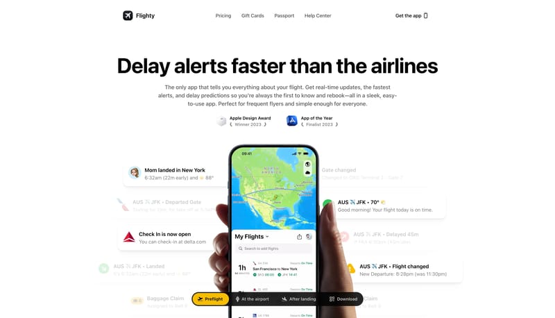
Build the experience around one centered handset and a small set of floating status cards. Let the system feel trustworthy and crystal clear rather than adventurous or noisy. Use the cobalt strip as the clearest signal o... This design language treats a learni...

Recurring System Signals

  • Build the experience around one centered handset and a small set of floating status cards.
  • Let the system feel trustworthy and crystal clear rather than adventurous or noisy.
  • Use the cobalt strip as the clearest signal of live status.
  • Use app-realistic maps, delay cards, and flight alerts around one phone mockup.
  • Keep the rest of the field extremely clean.
  • Use white and black for most of the page.

Related Keywords

OverviewImage DirectionColorsTypographyKeep the rest of the field extremely cleanLayout

Flighty

Home

2026-01-14

Build the experience around one centered handset and a small set of floating status cards. Let the system feel trustworthy and crystal clear rather than adventurous or noisy. Use the cobalt strip as the clearest signal o...

  • Build the experience around one centered handset and a small set of floating status cards.
  • Let the system feel trustworthy and crystal clear rather than adventurous or noisy.
Open example

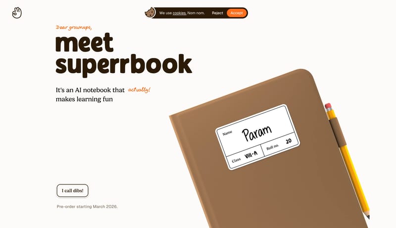
SuperrBook

Home

2026-02-13

This design language treats a learning product like a tactile children’s book. It uses ivory paper, chocolate serif type, hand-drawn orange annotations, illustrated notebook scenes, meadow-like bands, and very large paus...

Open example

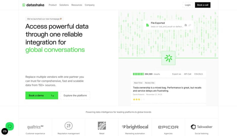
Datashake

Home

2026-02-20

This design language turns data infrastructure into a crisp commercial interface. It uses white space, large editorial sans headlines, dashed utility borders, structured data cards, black commitment CTAs, and green live-...

Open example

Continue Exploring

Use these adjacent facet and workflow pages to connect color systems analysis with other structured design-system concerns across the site.

Color Systems FAQ

What should I study on this page?

Study how these systems document surfaces, accents, text contrast, semantic states, and token naming so color decisions remain durable across implementation.

Why browse this as a dedicated DESIGN.md collection?

A focused collection makes it easier to compare how teams describe one system concern consistently across many examples instead of mixing unrelated signals on a single page.