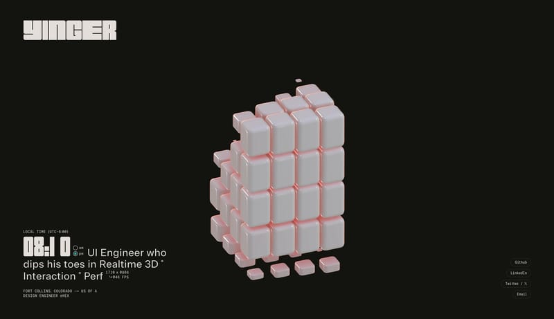
Design Analysis
What stands out in Single Page websites
Build the experience as an index, dossier, or ledger rather than a promotional portfolio. Let whitespace do most of the talking. Use thin rules, utility stamps, and microtype to organize information with extreme restrain... Grainy Conversion Studio is a dark p...
Build the experience as an index, dossier, or ledger rather than a promotional portfolio. Let whitespace do most of the talking. Use thin rules, utility stamps, and microtype to organize information with extreme restrain...
- Build the experience as an index, dossier, or ledger rather than a promotional portfolio.
- Let whitespace do most of the talking.
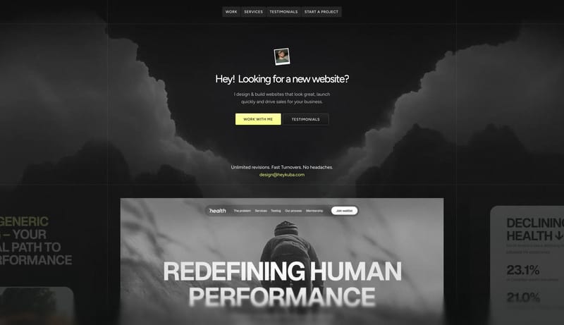
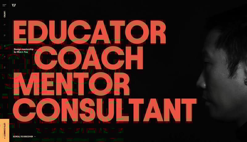
Open exampleGrainy Conversion Studio is a dark portfolio system that leads with directness instead of flourish. The page should feel like a sharp studio pitch: grainy charcoal shell, large white statement, one coral conversion actio...
- Primary ( FF6A45): Main call-to-action and urgency signal.
- Secondary ( 171717): Support panel and card fill.
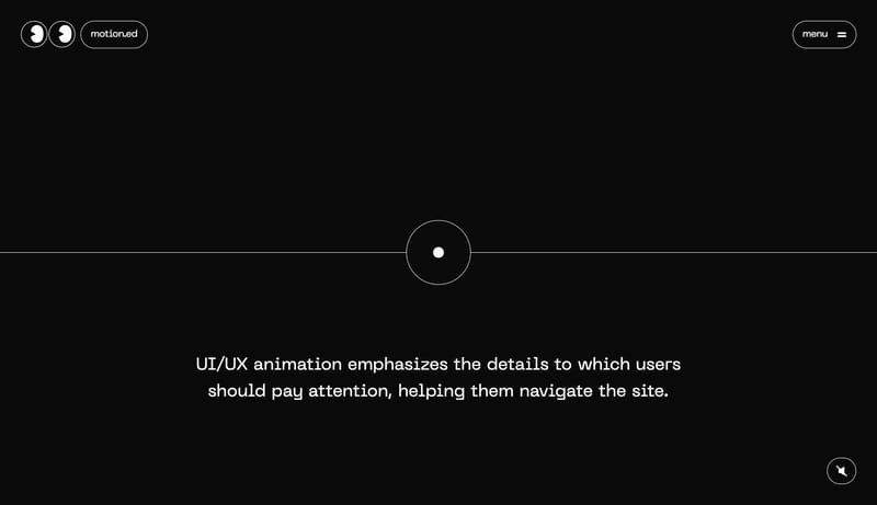
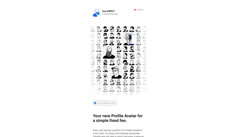
Open exampleMotion Graphic Design
Home
Build the experience as a long teaching corridor on a black field. Let one concept dominate one chapter plate at a time. Treat motion as the teaching method, not as garnish. Use wireframe diagrams, tiny embedded screensh...
- Build the experience as a long teaching corridor on a black field.
- Let one concept dominate one chapter plate at a time.
Open example