Dot
Home
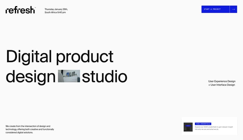
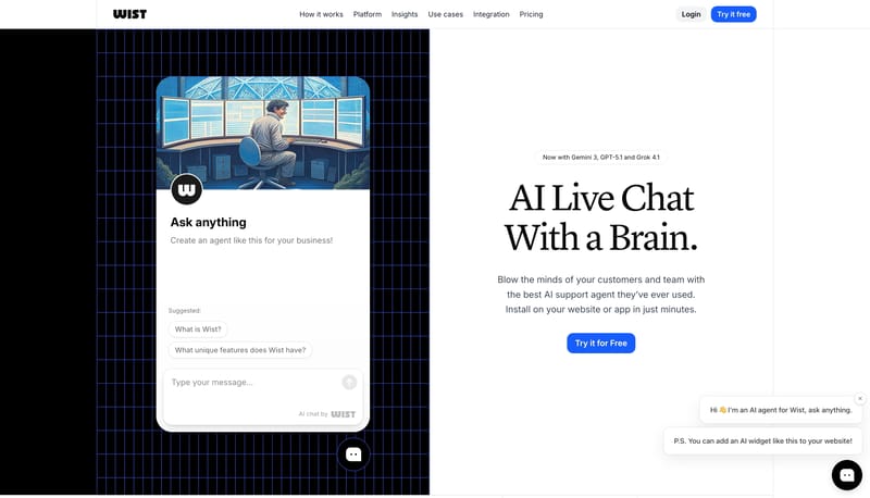
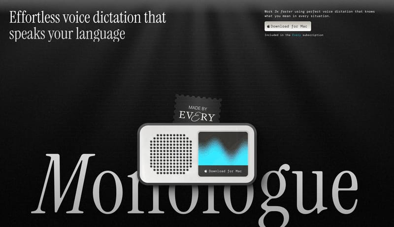
This design language presents a desktop utility as quiet, warm, and immediately understandable. The page should feel like a refined paper surface with one centered promise, a floating pill nav, a dark tactile action, and...
Open exampleSection
Browse 98 curated Single Page website examples to compare repeated section patterns, layout systems, messaging structure, and interaction details.
What To Compare
Review how teams design Single Page sections through layout choices, copy hierarchy, media usage, interaction patterns, and CTA placement.
What To Compare
Pay attention to heading rhythm, supporting copy, cards, imagery, interaction cues, and what each Single Page section asks the user to do next.
Design Analysis
This design language presents a desktop utility as quiet, warm, and immediately understandable. The page should feel like a refined paper surface with one centered promise, a floating pill nav, a dark tactile action, and... Design event pages like a typographi...
Dot
Home
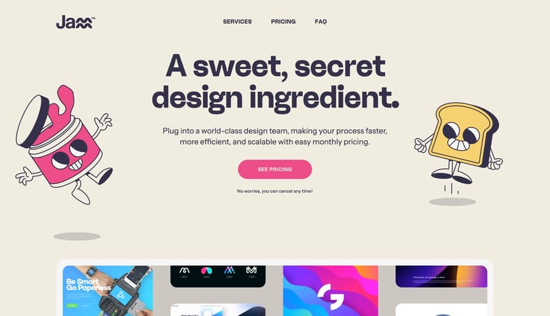
This design language presents a desktop utility as quiet, warm, and immediately understandable. The page should feel like a refined paper surface with one centered promise, a floating pill nav, a dark tactile action, and...
Open exampleLaracon 2026
Home
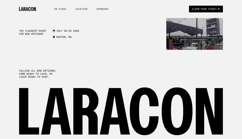
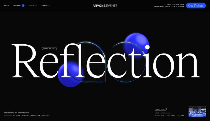
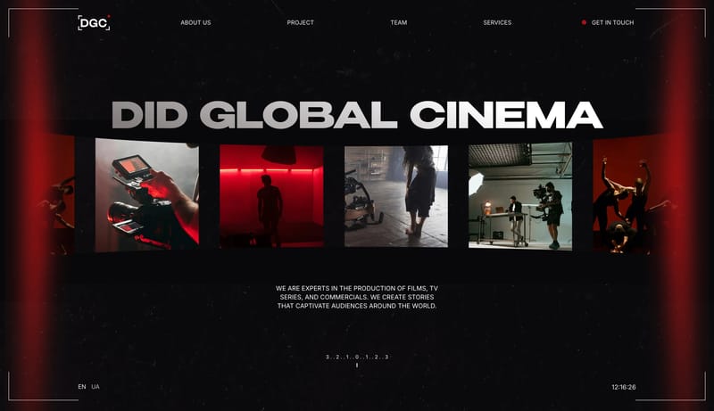
Design event pages like a typographic poster first and a website second. The identity should come from giant black mono forms, disciplined white space, and one or two sharp accents rather than a busy conference-brand too...
Open exampleFlowFest
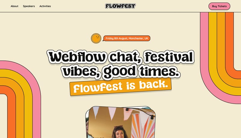
Home
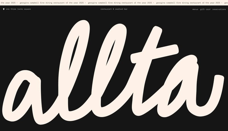
Build a system that feels like joyful printed ephemera brought online. A poster-like event system built from cream paper, chunky bubble display, outlined stickers, and candy-bright ticket controls.
Open exampleUse these internal hubs to keep branching from Single Page into broader design research, structured design analysis, or adjacent website inspiration taxonomies.
Hub
Return to the broader sections hub if you want to branch into adjacent topics beyond Single Page.
Related Hub
Browse pages grouped by repeated design signals when you want inspiration organized by visual patterns instead of taxonomy alone.
Related Hub
Study structured design analysis, reusable tokens, and AI-readable system guidance tied back to real production websites.
Workflow Collection
Landing page references and related tools for launches, product storytelling, hero sections, and conversion-focused marketing.
Workflow Collection
SaaS landing pages, product-marketing references, and tools for teams shaping B2B software sites.
Workflow Collection
References and tools for docs-heavy products, developer tooling, terminals, dashboards, SDK workflows, and technical product surfaces.
Explore More
Switch to the categories hub to compare Single Page inspiration against a different browsing dimension.
Explore More
Switch to the styles hub to compare Single Page inspiration against a different browsing dimension.
Explore More
Switch to the markers hub to compare Single Page inspiration against a different browsing dimension.
Compare heading structure, supporting copy, media choice, CTA placement, content density, and how each Single Page section supports the broader page narrative.
A focused Single Page collection removes unrelated page sections, which makes it easier to spot repeated layout and messaging patterns across many sites.