Browse all Sections

Section

Single Page Website Inspiration

Browse 100 curated Single Page website examples to compare repeated section patterns, layout systems, messaging structure, and interaction details.

100 curated examples24 per pagePage 5 of 5

What To Compare

Review how teams design Single Page sections through layout choices, copy hierarchy, media usage, interaction patterns, and CTA placement.

What To Compare

Pay attention to heading rhythm, supporting copy, cards, imagery, interaction cues, and what each Single Page section asks the user to do next.

Design Analysis

What stands out in Single Page websites

Build the experience like a quiet exhibition catalog. Use a narrow left rail for metadata, navigation, and lightweight framing. Let the main work live in a long vertical gallery strip with minimal interruption. Use produ... Lead with one giant statement, one s...

Recurring Signals

  • Build the experience like a quiet exhibition catalog.
  • Use a narrow left rail for metadata, navigation, and lightweight framing.
  • Let the main work live in a long vertical gallery strip with minimal interruption.
  • Use product samples as catalogued plates rather than as cinematic hero moments.
  • Favor clean mockups, isolated web captures, and softly sunwashed visual plates.
  • Keep imagery aligned and orderly inside the broader gallery strip.

Related Keywords

OverviewImage DirectionColorsTypographyBuild the experience like a quiet exhibition catalogKeep the personality soft rather than hyper-illustratedLayout

Endless

Home

2026-01-06

Build the experience like a quiet exhibition catalog. Use a narrow left rail for metadata, navigation, and lightweight framing. Let the main work live in a long vertical gallery strip with minimal interruption. Use produ...

  • Build the experience like a quiet exhibition catalog.
  • Use a narrow left rail for metadata, navigation, and lightweight framing.
Open example

Ghost Designer

Home

2026-01-20

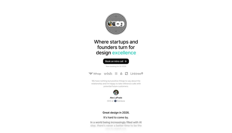
Lead with one giant statement, one simple CTA, and one playful mascot cue. Use white chips and dark slabs to keep the commercial structure obvious. Keep the personality soft rather than hyper-illustrated. Use soft mascot...

  • Lead with one giant statement, one simple CTA, and one playful mascot cue.
  • Use white chips and dark slabs to keep the commercial structure obvious.
Open example

Schema

Home

2026-03-31

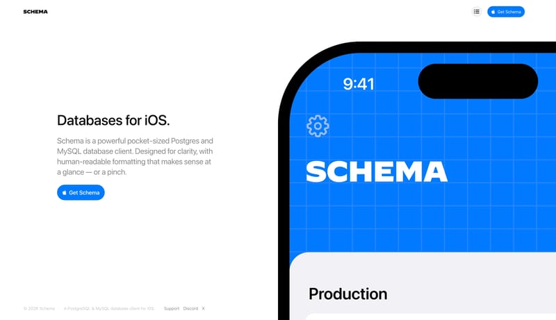
Use a native iOS marketing language: white space, system type, a blue product object, cropped phone mockups, and simple support diagrams.

Open example

Continue Exploring

Use these internal hubs to keep branching from Single Page into broader design research, structured design analysis, or adjacent website inspiration taxonomies.

Single Page Inspiration FAQ

What should I compare on a Single Page section page?

Compare heading structure, supporting copy, media choice, CTA placement, content density, and how each Single Page section supports the broader page narrative.

Why browse Single Page references as a dedicated collection?

A focused Single Page collection removes unrelated page sections, which makes it easier to spot repeated layout and messaging patterns across many sites.