Design Analysis
What stands out in Single Page websites
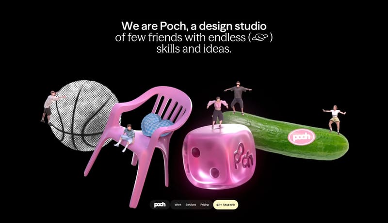
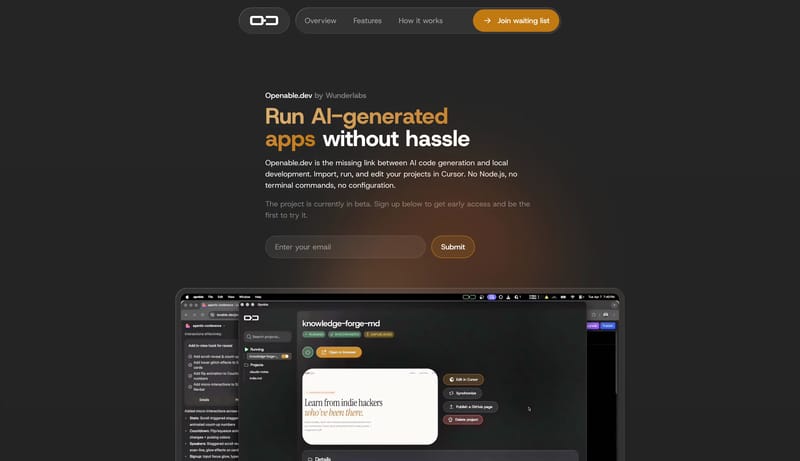
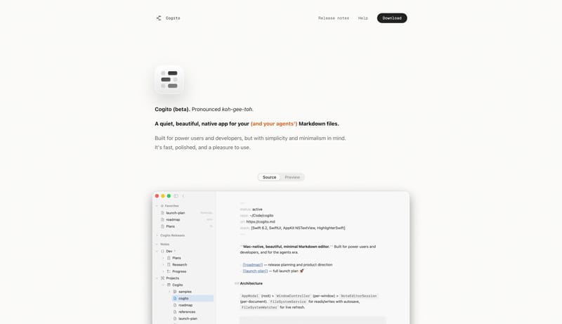
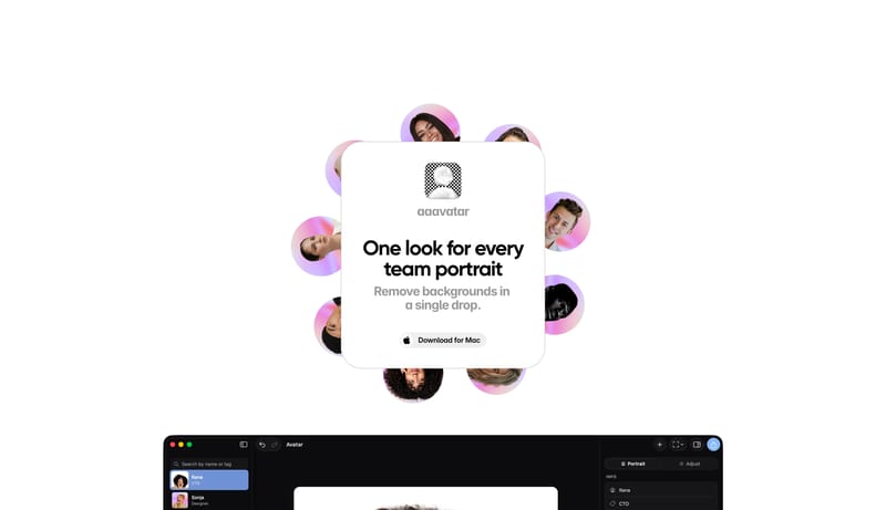
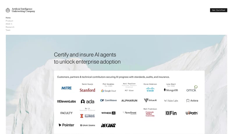
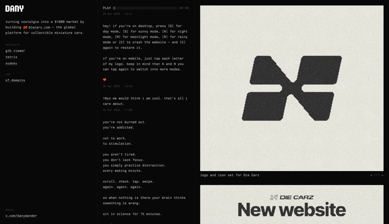
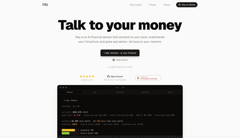
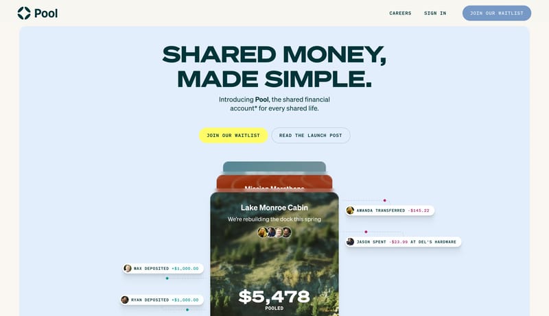
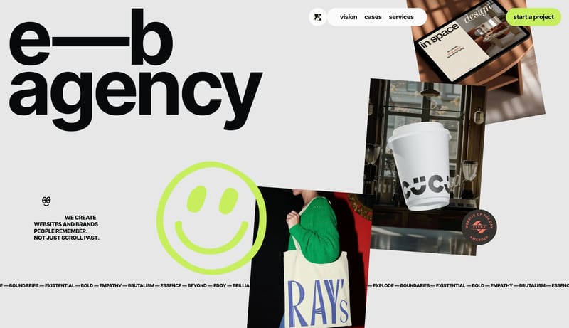
Build a selective studio shell where type, spacing, and media carry most of the brand weight. Keep interfaces visually quiet so case-study imagery or hero moments stay primary. Let one accent or one tonal inversion punct... Build a campaign shell that feels li...
Build a selective studio shell where type, spacing, and media carry most of the brand weight. Keep interfaces visually quiet so case-study imagery or hero moments stay primary. Let one accent or one tonal inversion punct...
- Build a selective studio shell where type, spacing, and media carry most of the brand weight.
- Keep interfaces visually quiet so case-study imagery or hero moments stay primary.
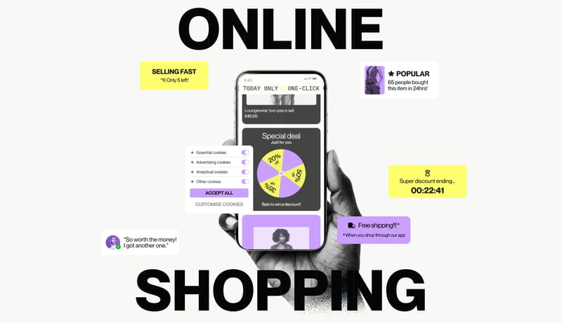
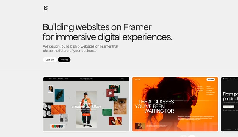
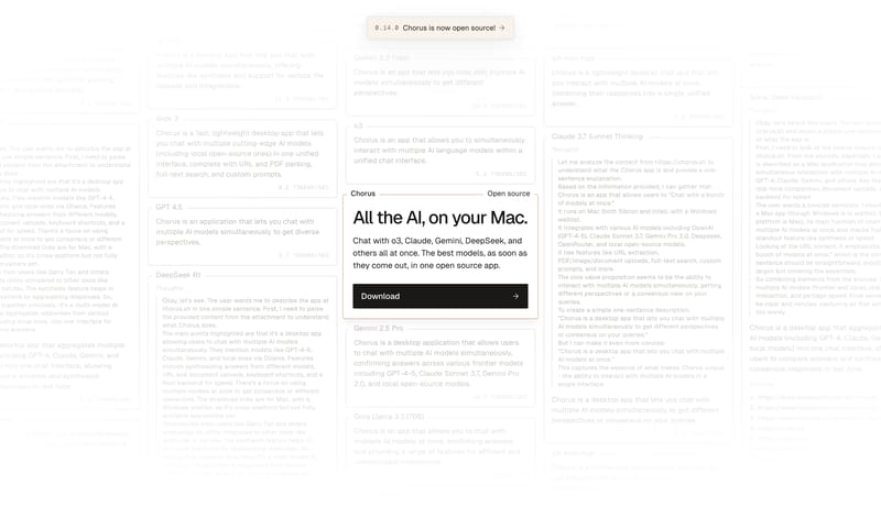
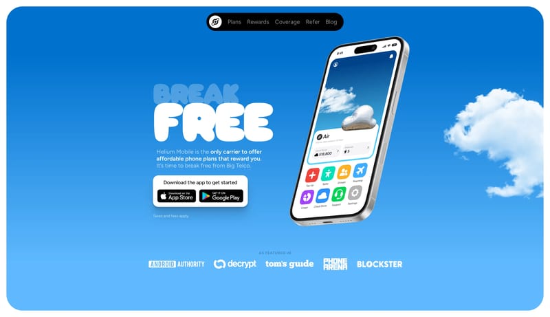
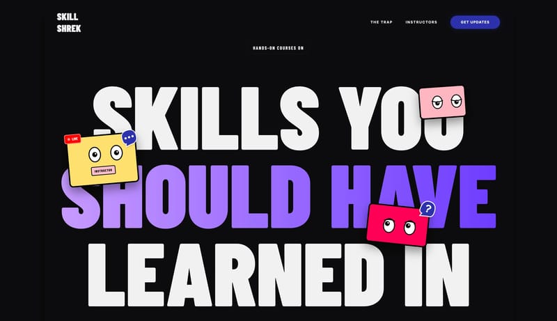
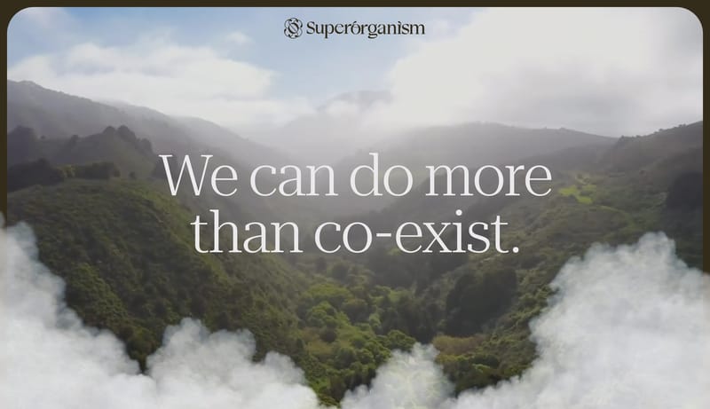
Open exampleBuild a campaign shell that feels like an editorial poster system translated into the web. Use sharp contrast, oversized type, and loud color interrupts to create argument and momentum. Let motion guide chapter transitio...
- Build a campaign shell that feels like an editorial poster system translated into the web.
- Use sharp contrast, oversized type, and loud color interrupts to create argument and momentum.
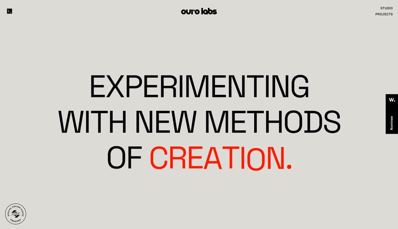
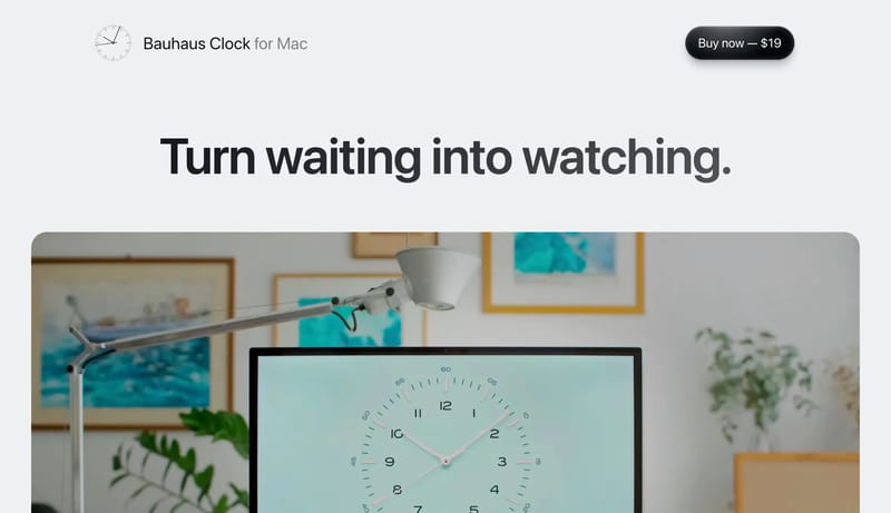
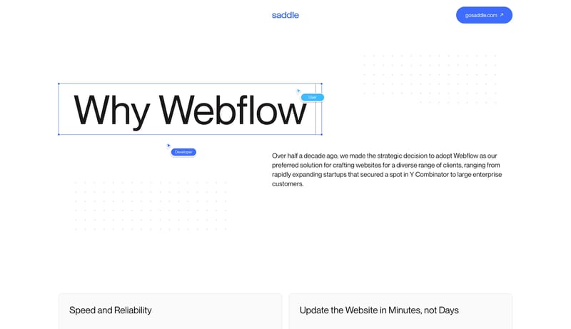
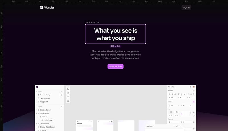
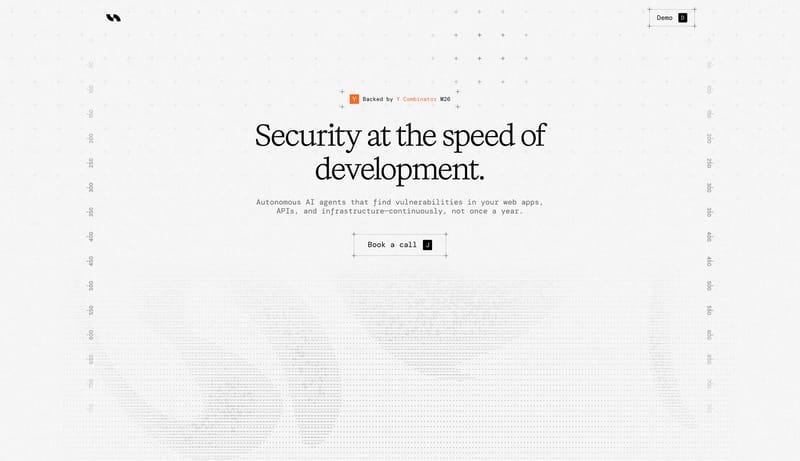
Open exampleBuild a selective studio shell where type, spacing, and media carry most of the brand weight. Keep interfaces visually quiet so case-study imagery or hero moments stay primary. Let one accent or one tonal inversion punct...
- Build a selective studio shell where type, spacing, and media carry most of the brand weight.
- Keep interfaces visually quiet so case-study imagery or hero moments stay primary.
Open example