Browse all DESIGN.md examples

Color Systems

Browse DESIGN.md examples where palette systems, semantic tokens, and color logic are described as reusable design infrastructure.

178 curated examples24 per pagePage 6 of 8

What To Compare

Study how these systems document surfaces, accents, text contrast, semantic states, and token naming so color decisions remain durable across implementation.

What To Compare

Pay attention to token structure, contrast strategy, accent restraint, light/dark mode logic, and whether color intent is obvious from the system itself.

Design Analysis

Common color systems signals

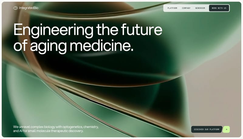
Build the first impression around one immersive rounded hero frame with biomorphic color motion frozen in a settled state. Let the rest of the system oscillate between pale laboratory calm and dark utility concentration.... Build the experience as a near-white...

Recurring System Signals

  • Build the first impression around one immersive rounded hero frame with biomorphic color motion frozen in a settled state.
  • Let the rest of the system oscillate between pale laboratory calm and dark utility concentration.
  • Use chartreuse only as a spark for direction, arrows, or key action handoffs.
  • Use biomorphic, glassy, out-of-focus gradient imagery that feels cellular or material rather than illustrative.
  • Pair those fields with clean scientific typography and generous negative space.
  • Keep the base canvas clinical and pale outside the hero.

Related Keywords

OverviewImage DirectionColorsTypographyFavor honesty and clarity over spectacleLet whitespace do most of the talking"white interface shell with black CTA punctuation""painterly industrial landscapes""stacked rounded comparison cards"name: "Anchor Black"name: "Factory White"name: "Signal Orange"

Integrated Biosciences

Home

2026-01-13

Build the first impression around one immersive rounded hero frame with biomorphic color motion frozen in a settled state. Let the rest of the system oscillate between pale laboratory calm and dark utility concentration....

  • Build the first impression around one immersive rounded hero frame with biomorphic color motion frozen in a settled state.
  • Let the rest of the system oscillate between pale laboratory calm and dark utility concentration.
Open example

Attio

Home

2026-01-07

Build the experience as a near-white CRM field that feels spacious, exact, and product-led. Let faint guide systems, soft product windows, and crisp black CTAs carry the structure instead of dense feature clutter. Keep t...

  • Build the experience as a near-white CRM field that feels spacious, exact, and product-led.
  • Let faint guide systems, soft product windows, and crisp black CTAs carry the structure instead of dense feature clutter.
Open example

Vercel

Home

2026-01-09

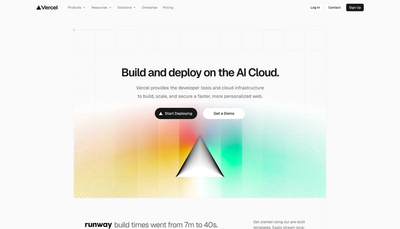
Build the experience as a visible infrastructure grid with just enough warmth to avoid feeling sterile. Let black pills and speech-like slabs create rhythm inside the larger white technical field. Pair sparse copy with o...

  • Build the experience as a visible infrastructure grid with just enough warmth to avoid feeling sterile.
  • Let black pills and speech-like slabs create rhythm inside the larger white technical field.
Open example


Continue Exploring

Use these adjacent facet and workflow pages to connect color systems analysis with other structured design-system concerns across the site.

Color Systems FAQ

What should I study on this page?

Study how these systems document surfaces, accents, text contrast, semantic states, and token naming so color decisions remain durable across implementation.
Why browse this as a dedicated DESIGN.md collection?

A focused collection makes it easier to compare how teams describe one system concern consistently across many examples instead of mixing unrelated signals on a single page.