Design Analysis
What stands out in Large Type websites
This system should feel like a design portfolio that trusts scale more than interface decoration. Build it from giant grotesk statements, deliberate emptiness, and a sharp alternation between pale gallery surfaces and bl... Build a system that feels like joyfu...
Recurring Signals
- Primary ( 010A21): Main type, lines, and structural emphasis.
- Secondary ( 6D7483): Supporting paragraphs and secondary nav tone.
- Tertiary ( FFF35A): CTA fill and geometric highlight cells.
- Use the display grotesk for large conceptual statements only.
- Keep body copy calm and evenly spaced.
- Avoid ornamental type choices that would dilute the scientific tone.
Related Keywords
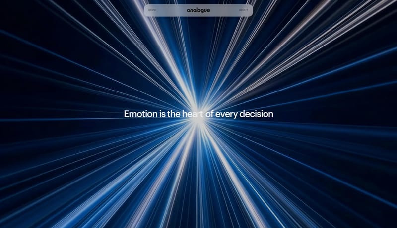
OverviewImage DirectionColorsTypographyKeep body copy calm and evenly spacedPrimary ( 050505): heavy type and dark stageSecondary ( BFD9F6): airy sky-blue stageTertiary ( FF5A1F): hot poster orangeDisplay: huge, black, compressed, and impossible to ignoreBody: short, practical, and clearly secondaryLabels: compact and utilitarianPrimary ( 040404): the dominant black field
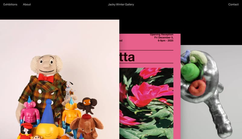
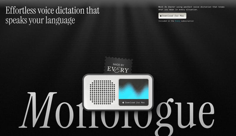
This system should feel like a design portfolio that trusts scale more than interface decoration. Build it from giant grotesk statements, deliberate emptiness, and a sharp alternation between pale gallery surfaces and bl...
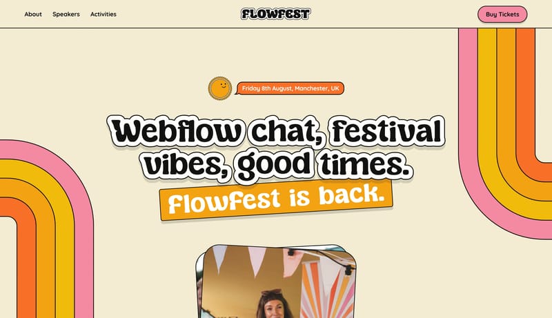
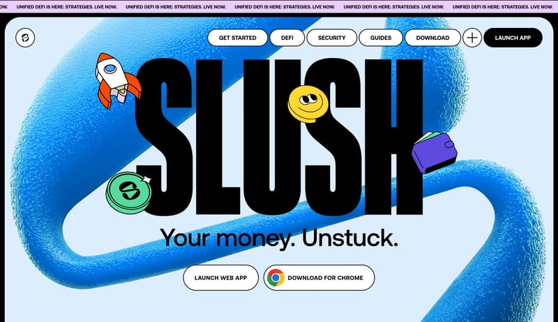
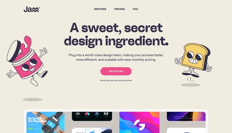
Open exampleBuild a system that feels like joyful printed ephemera brought online. A poster-like event system built from cream paper, chunky bubble display, outlined stickers, and candy-bright ticket controls.
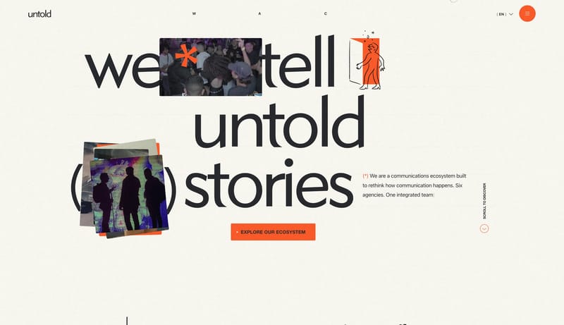
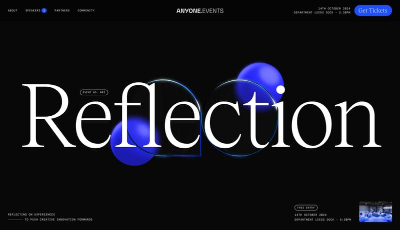
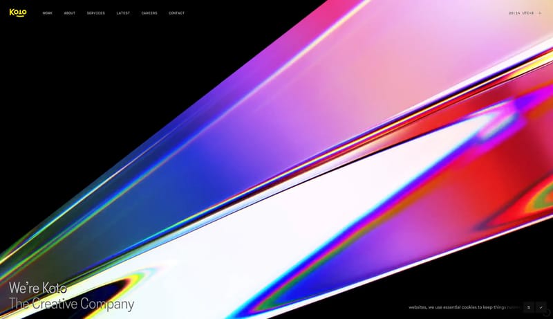
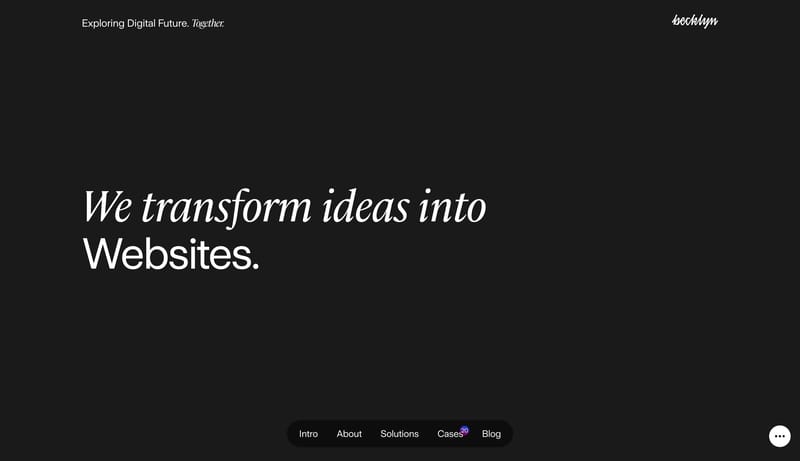
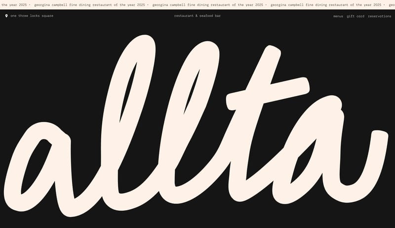
Open exampleBuild a system that feels rare, dramatic, and invitation-only. A noir event microsite built from black stage space, luminous cobalt ticket pills, giant serif statements, and tiny all-caps metadata.
Open example